Tutorial: Creating Photo Collages in Photoshop Elements with Cassie
I’ll be the first to admit that I “might” take too many photos while traveling. Which then leads to the inevitable question: what actually makes it onto a scrapbook layout? Because let’s be real, taking photos and scrapping them definitely feel like two separate hobbies at this point.
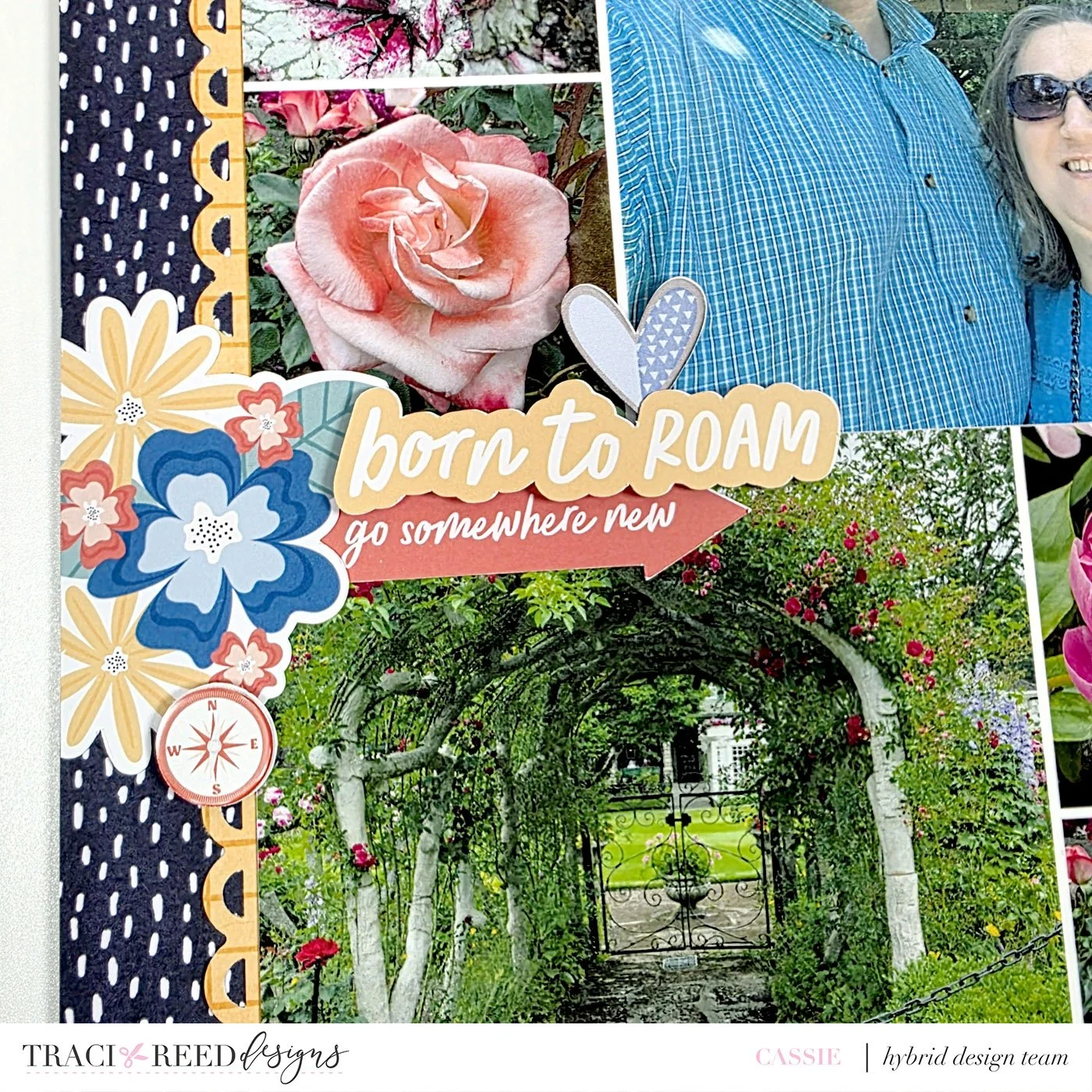
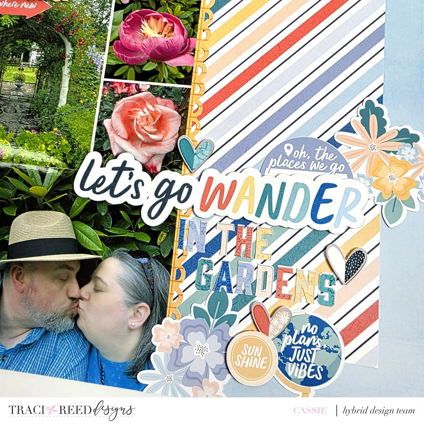
On a recent trip, we visited this absolutely stunning 121-year-old, 55-acre display garden. Naturally, I went a little overboard with floral photos (can you blame me?). But once I got home, I found myself wondering how I could scrap a bunch of them on one page without it feeling cluttered or overwhelming.
That’s when I decided to create a large photo block using just 4x6 prints - and it worked so well! Here’s the finished layout, and then I’ll walk you through how I made these prints using Photoshop Elements.

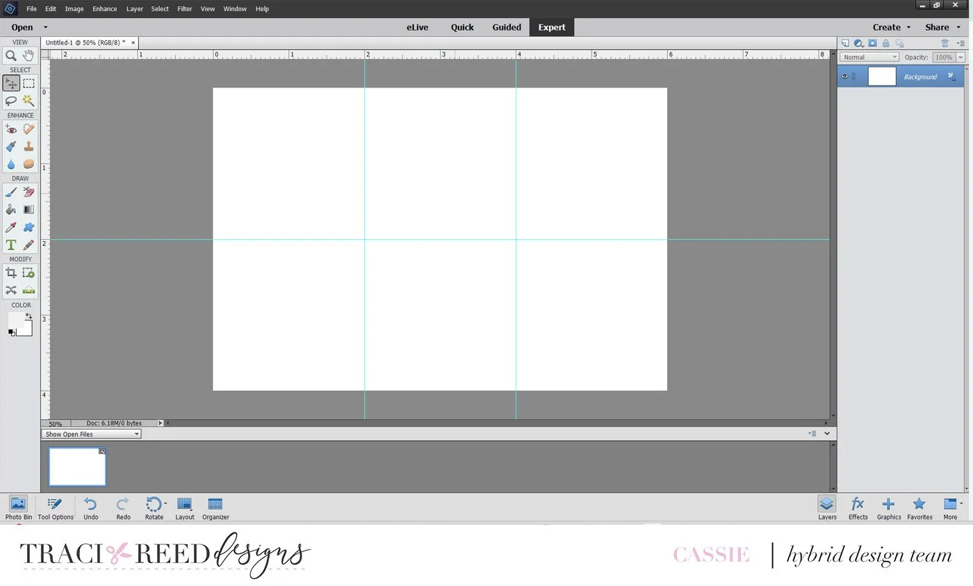
I’m using an older version of Photoshop Elements, but the process should be pretty similar across versions. I started by creating a “New Blank File” using my paper size dimensions with a Resolution of 300 Pixels/inch.

Next, I added guide lines every 2 inches, both vertically and horizontally. This step isn’t totally necessary, but I find really helpful for keeping everything lined up nicely. To do this, just click on the rulers and drag guides across your blank canvas.
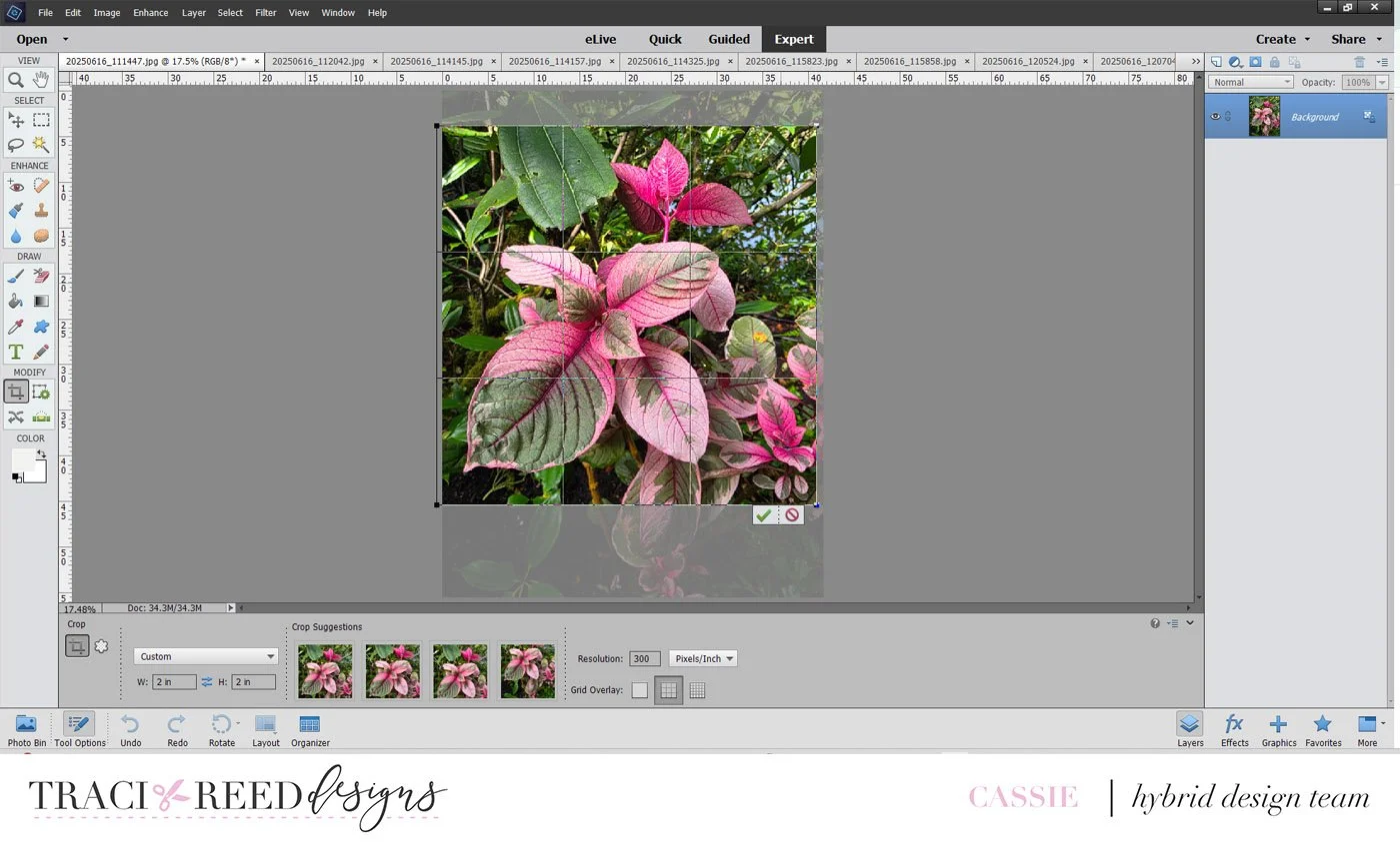
With my photos open in Photoshop, I cropped them to fit my layout plan. For each 4x6 print, I added one 4x4 photo and two 2x2 photos.

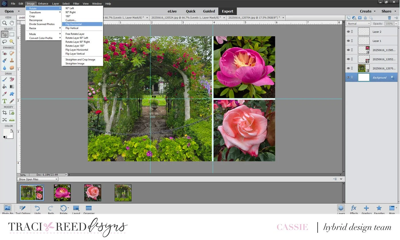
Once everything was cropped, I dragged the photos from the photo bin at the bottom of the screen to my blank file and position them in place. At this point, I also added two new layers with small white lines for between the photos to give them a bit of visual breathing room.

I made and printed two 4x6 prints with the larger photo on the right, but for my third print, I wanted the large photo on the left. Instead of moving the white divider lines around, I just flipped the whole page horizontally and then swapped out the images. That way, the spacing stayed consistent and none of the photos got mirrored.
These three prints gave me nine photos total, and when stacked vertically they took up a neat 6”x12” space on my layout. That still left me plenty of room for a title and embellishments - without the page feeling overloaded.

Thank you so much for stopping by! I hope this quick tutorial gave you some ideas on how to include more photos on a single layout using just 4x6 prints. Scroll down for a few close-ups of the title block and embellishments.