Three Tips to Level Up Your Scrapbook Pages (Without Comparison Indecision!)
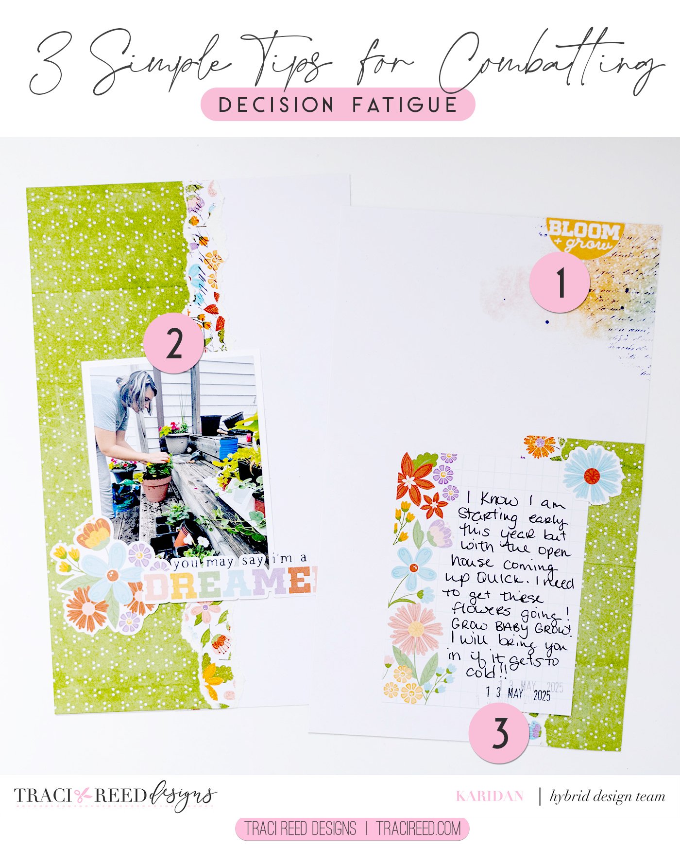
I used to feel all the time that there was just something missing from my layouts. I looked at others and I just always felt like theirs came together so much better than mine! Well my first lesson was NOT TO COMPARE my work to others so let’s just start there! We do this for ourselves and families and honestly they don’t see what we see but here are a few tips and tricks that I have implemented into my design process!
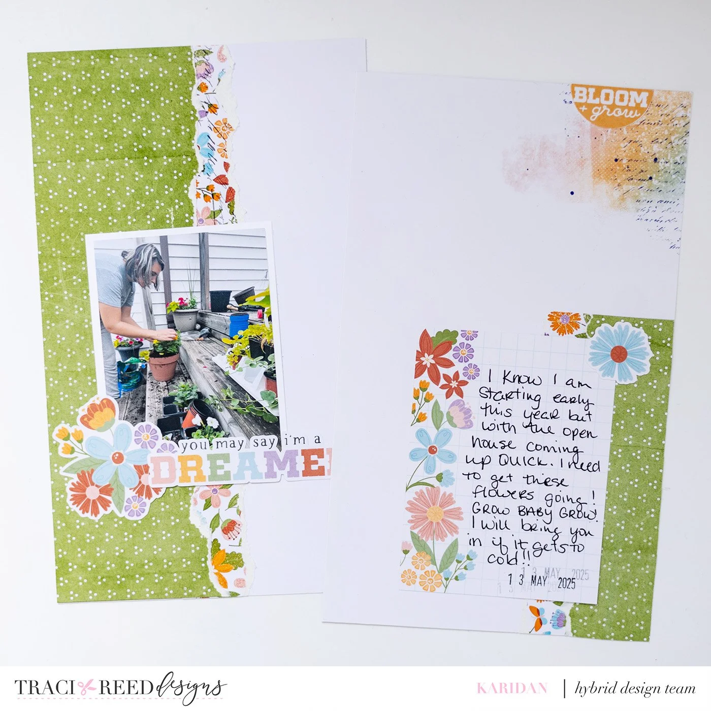
Go Digital/Hybrid
The first thing that I believe helped my process so much was incorporating DIGITAL!!! I could fuss and fight with my spreads until I got them completely right or how I wanted them without the decision fatigue I got with physical items all surrounding me! This is why I fell in love with Traci’s kits! I am able to size elements exactly how I want them AND use all different size spreads in my albums!
Mix Busy + Basic for Easy Layering
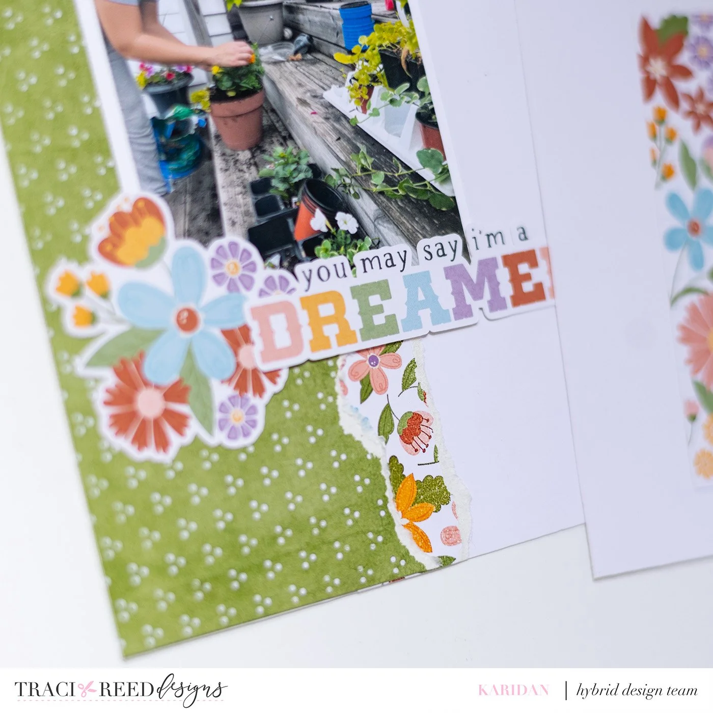
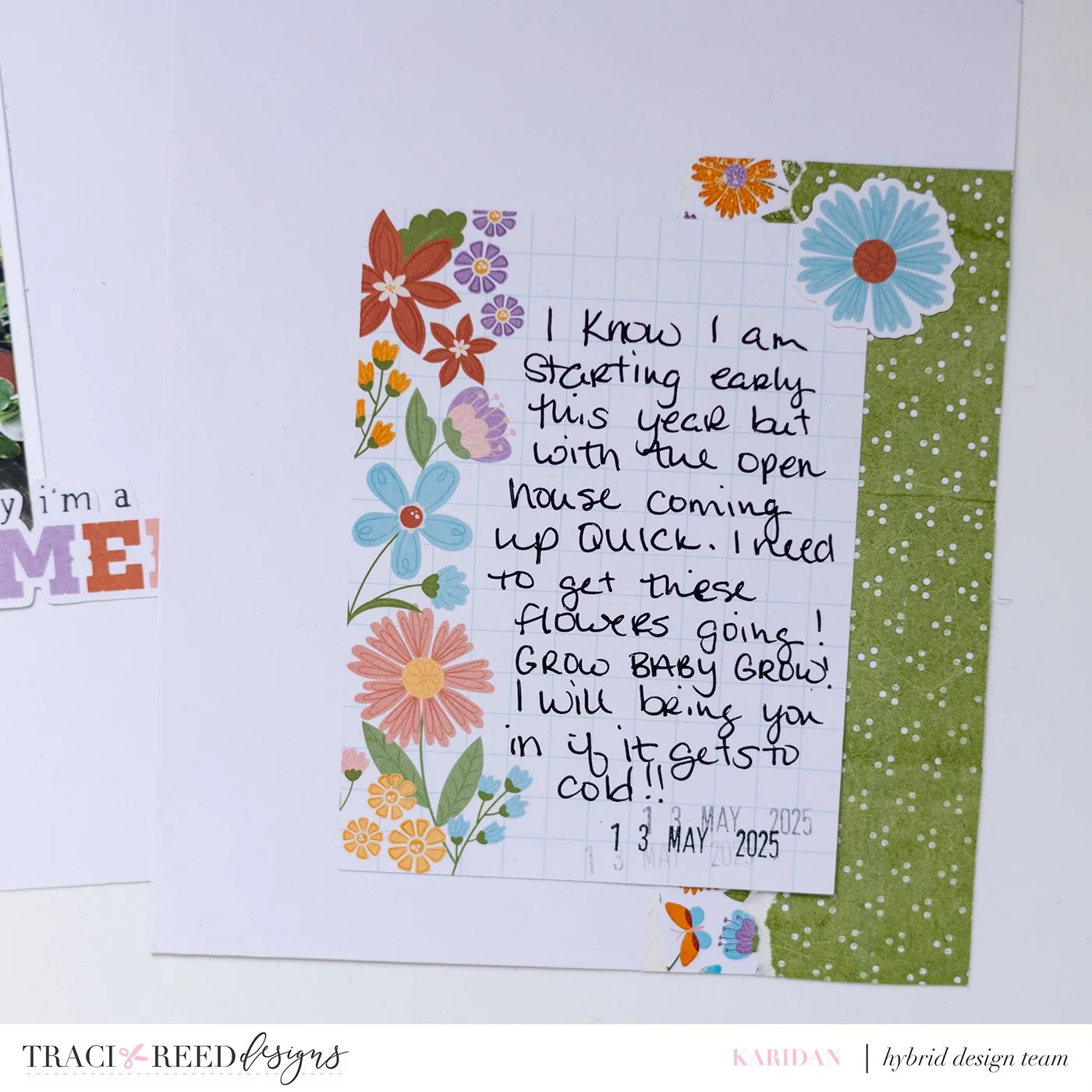
I also feel like learning how to use strong layers like a busy layer complimented with a bold but basic layer like I did here with the green and flower layered worked perfectly to make my photo stand out a bit!
Use a Smaller Color Palette
Lastly picking a smaller color palette has definitely helped with the cohesive look of my layouts! Now kits usually help you with this for the most part BUT Traci’s kit tend to incorporate 5-6 colors into them so I will go through and trying and pick 3 MAIN ones! That doesn’t mean you just can not use other colors like I did with the flower paper!
I hope these three tips and tricks will help your scrapbooking go easier from now on and you will be able to achieve that“professional” look like I strived to do for so long!