Project Life 2026 Week 2: Exploring Color Mixing with the Story Foundations Collections!
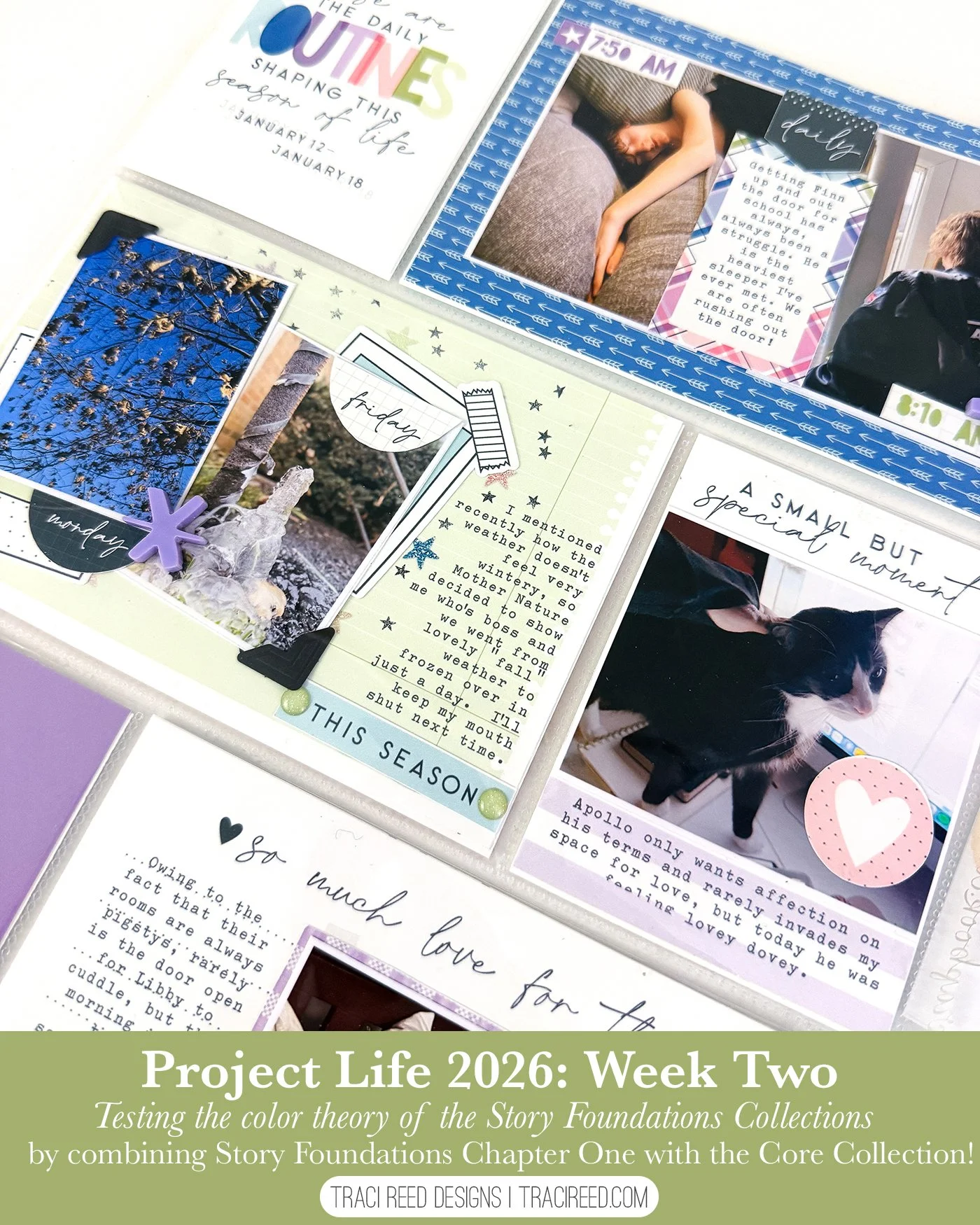
It’s week 2 in my 2026 Project life album and this week I wanted to experiment with how easily the colors in the Story Foundations Core Kit could mix and match with its more limited-palette Chapters. I worked mainly with Story Foundations: Routines while intentionally pulling in a few pieces from the Core Collection. This spread became a study in how introducing an unexpected color, like the warm yellow from the Core Collection, can add interest without disrupting the calm, cohesive flow of the page.
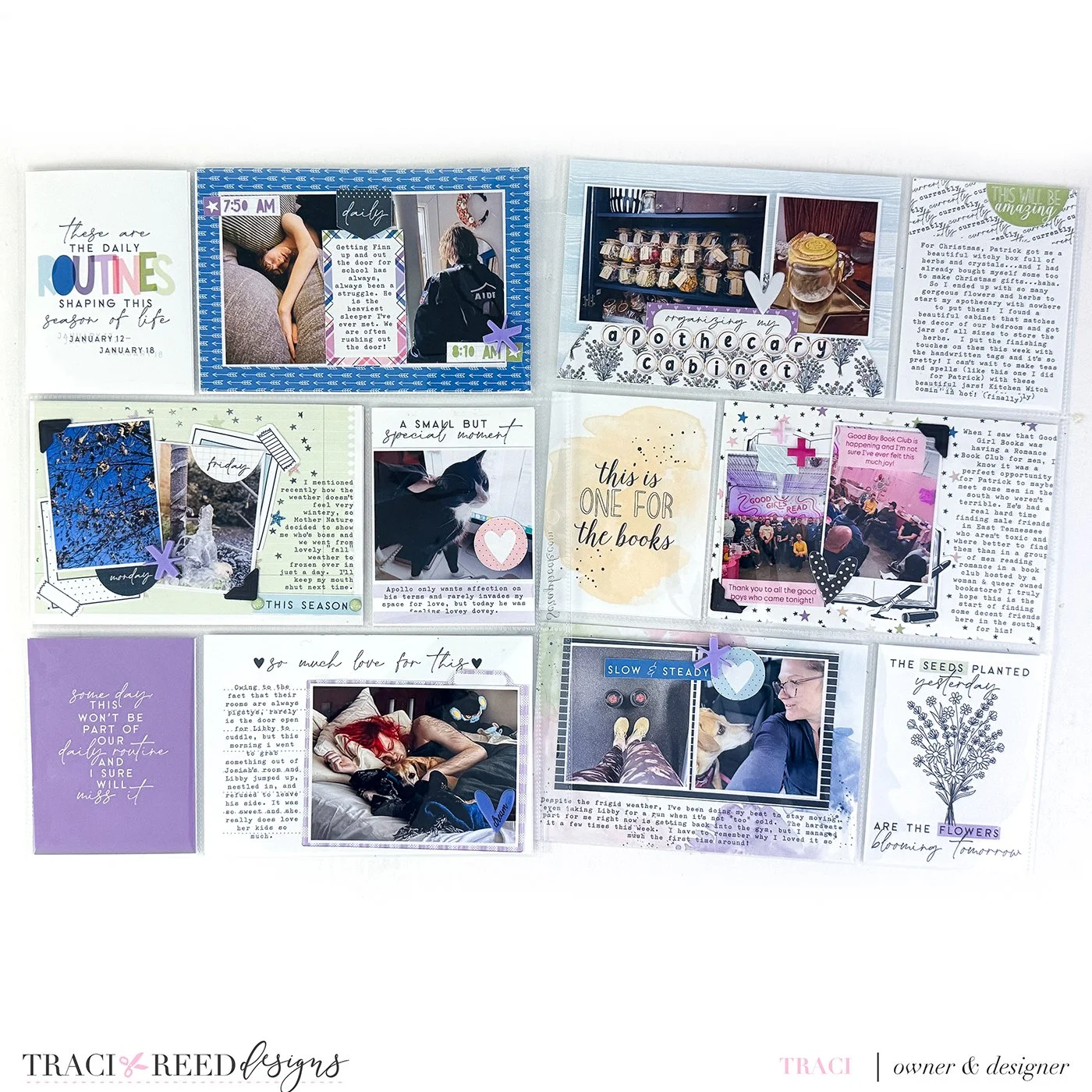
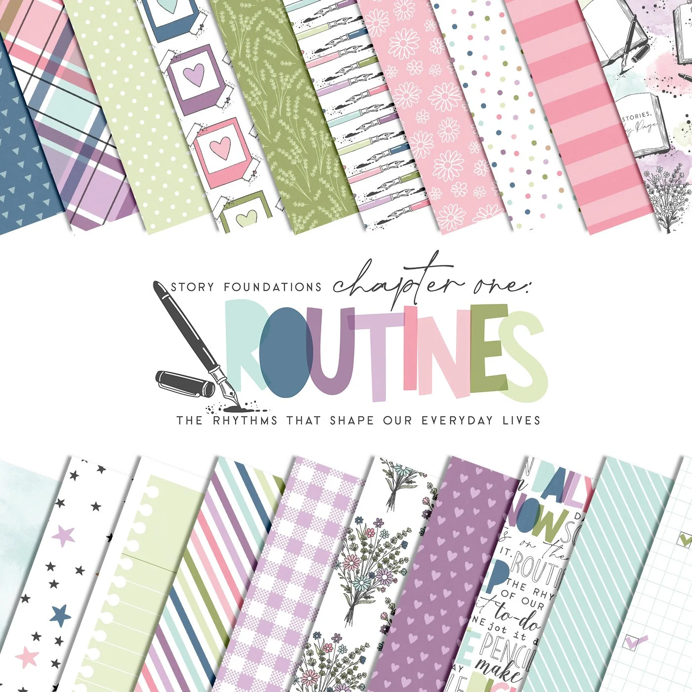
At first glance, Routines has a very distinct color story. Soft blues, purples, greens, and neutrals create a calm, steady rhythm that feels perfect for everyday documentation. What I wanted to explore was whether introducing a color that isn’t strongly featured in Routines, like the warm yellow from the Core Collection, would disrupt that rhythm or enhance it. The answer, happily, was the latter. The yellow card and a few coordinating stickers add just enough contrast to create visual interest without pulling focus away from the overall spread.
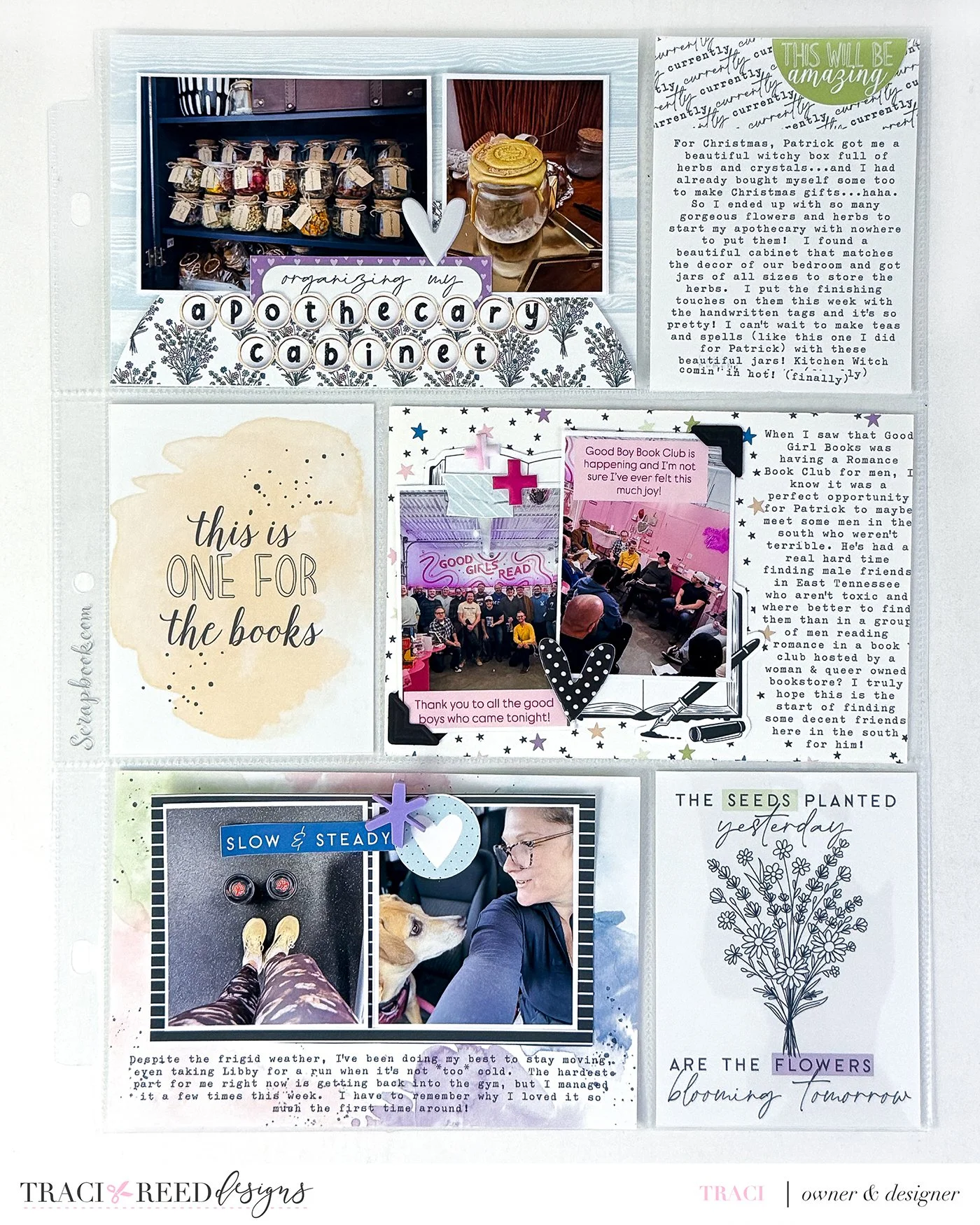
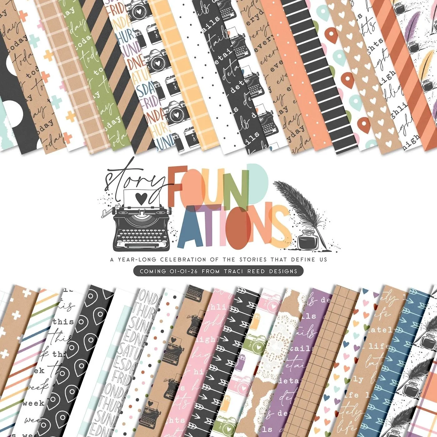
One of the strengths of the Story Foundations system is that the Chapters are designed to speak the same visual language. Even when a color isn’t dominant in a specific chapter, it’s still part of the broader palette. That shared foundation means you can borrow pieces across collections without the layout feeling disjointed or accidental. In this spread, the yellow acts almost like a gentle highlight, guiding the eye and breaking up cooler tones while still feeling intentional.
From a process standpoint, I approached this spread the same way I did my first. I used a mix of patterned cards, journal cards, and stickers, printing my journaling directly onto the cards. This allows me to include longer stories while keeping everything visually clean and easy to read. I prefer this approach over handwritten journaling in pockets, especially for Project Life, because it gives me more control over spacing and consistency across the spread.
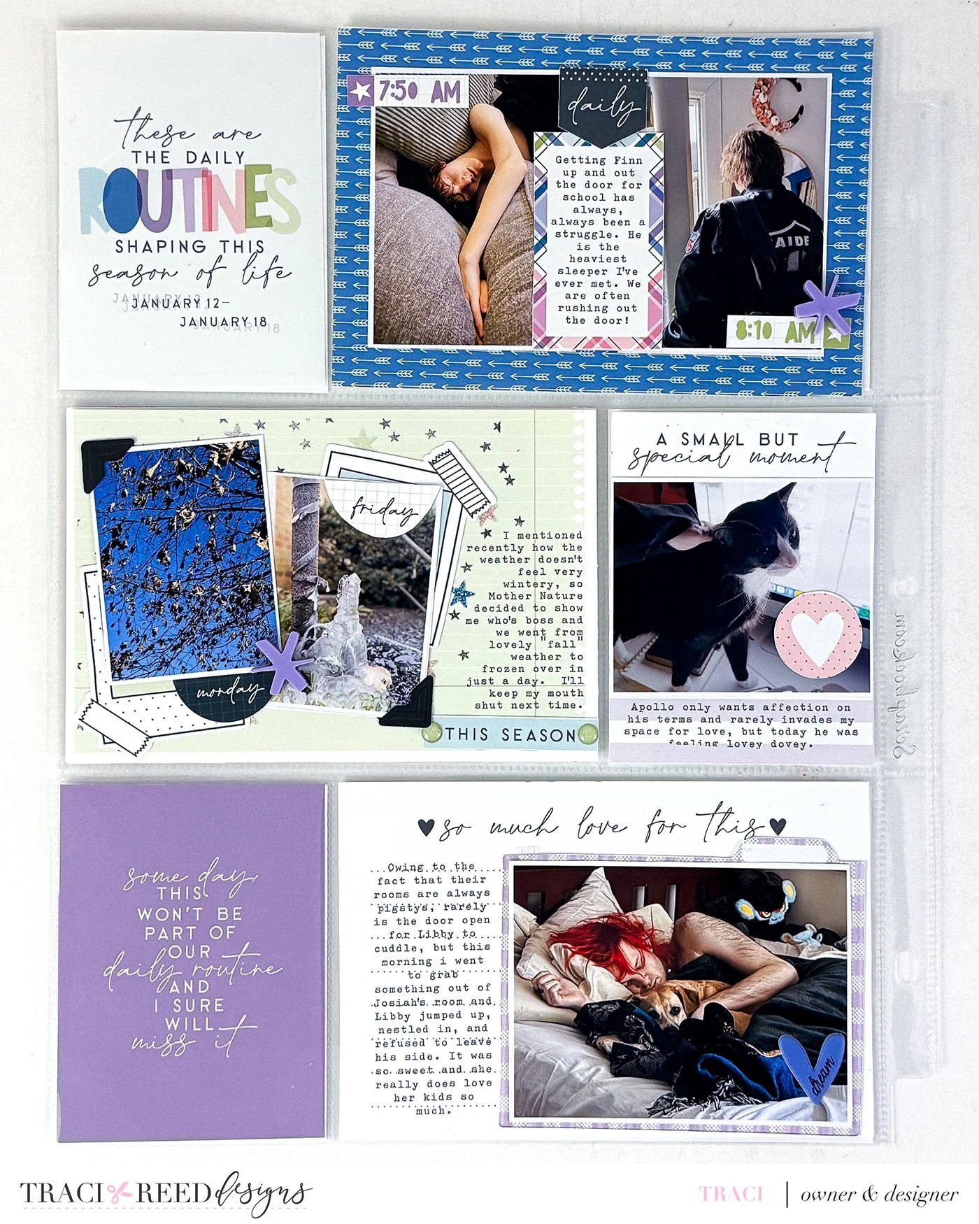
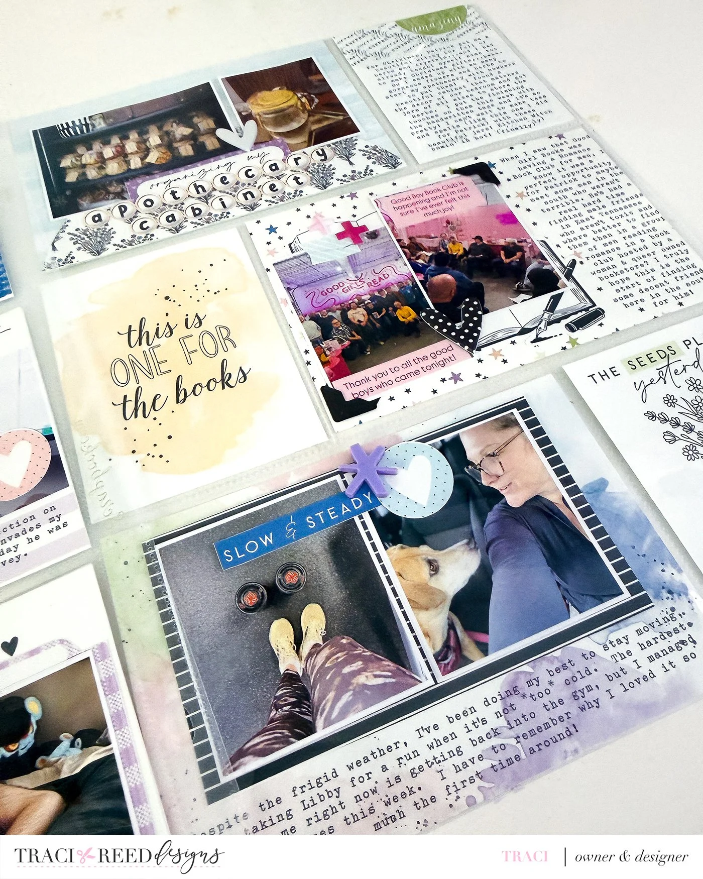
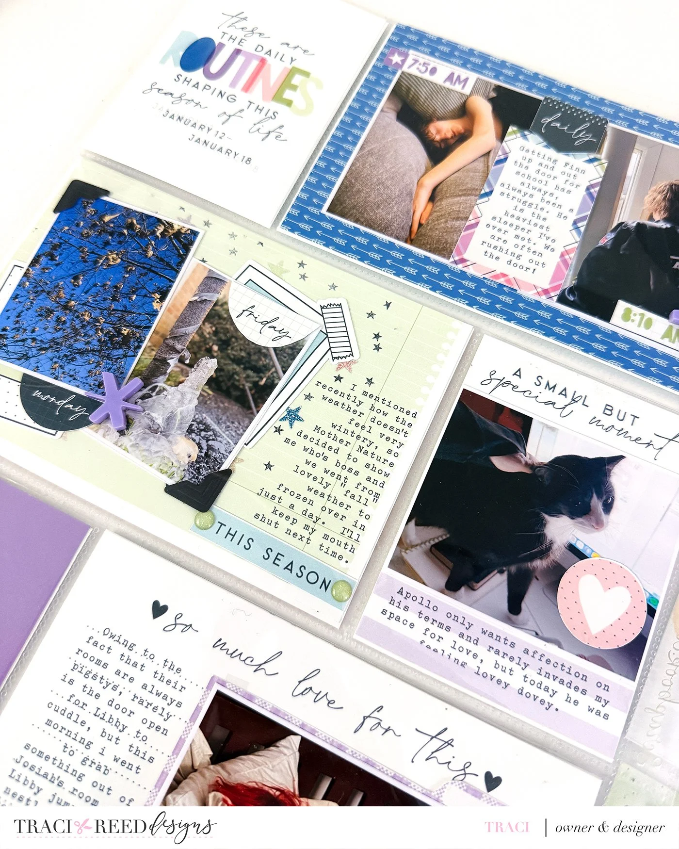
You’ll also notice that my photos don’t fill the pockets edge to edge. I intentionally print them smaller and layer them on top of cards or patterned backgrounds. This keeps the spread from becoming photo-heavy and lets the color and design elements do more of the storytelling work. It also makes it easier to introduce accent colors, like the yellow here, without overwhelming the photos themselves.
Ultimately, this spread reinforced something I already suspected but wanted to see in practice. You don’t have to stay strictly within one chapter or collection to create a cohesive Project Life layout. The Story Foundations Chapters are built to support flexibility, allowing you to mix, layer, and experiment while still maintaining flow. For me, that freedom is what makes this style of memory keeping feel sustainable and creatively energizing again.
Process Video
Products Used In This Post: