From Meh To Magic: Transform Layouts With The 70/20/10 Color Theory
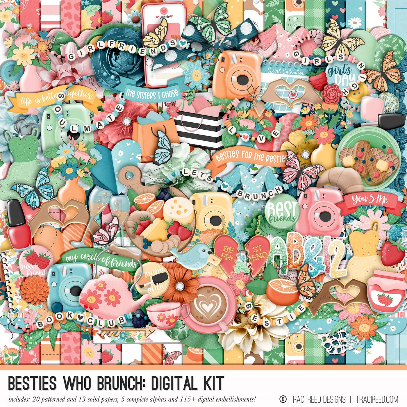
Hi! Tara here to share a layout that I created using the 70/20/10 color theory to create a layout with the newest release, Besties Who Brunch. This design theory states that 70% of your layout is using a dominant color, 20% for a secondary color, and 10% for a nice POP of color. For my layout, I used pink as my dominant color, brown as my secondary color, and green as my pop of color. The reasoning behind this theory is to provide overall balance and visual interest.

For my layout, I used one of the coffee cup digital embellishments and printed the whole embellishment two times on 12x12 paper. One of the coffee cups will be my background paper.

I fussy cut the second coffee cup out and used foam adhesive to pop it up onto the background to help create texture and depth for my background.

Once I created my background, I matted my photos onto the green gingham patterned paper from the collection and cut a couple of leafy sprigs from it using a metal die. I used some flower dies to cut some pretty layered flowers out of some of the Traveler’s Notebook papers, both solids and patterns.

I also used my Cameo to print and cut butterflies, smaller flowers, and letters from the collection. I added my photos in a wonky cluster to the right side of the background.

Once my photo cluster was adhered to my background, I added my embellishments and title. I finished off the layout with the round circle journaling spot from the collection to write a small sentence for the story of this layout.