From Boring to Fabulous: 3 Simple Ways to Elevate Your Pocket Scrapbook Pages
We all know that pocket scrapbooking is designed to be simple. Slide in some photos, maybe a journaling card or two, and call it a day. And listen, I love a quick win as much as the next person. But if you’re like me, you sometimes look at those finished pages and think, “This could be more.”
The good news? It doesn’t take a ton of time or effort to transform those basic pocket pages into something way more engaging and personal. You can still keep the ease and speed of the pocket format while adding just enough creative flair to make your layouts stand out. Here are four easy ways to take your pocket scrapbook pages from boring to fabulous—without giving up the convenience that made you fall in love with pockets in the first place.

1. Shrink Your Photos and Add Layers
Most pocket scrapbookers are working with 4x6 and 3x4 pockets, which makes it tempting to print your photos at those exact sizes. But when you print your photos a little smaller—say 2.5x3.5 or 3x4 on a 4x6—you open up a world of design possibilities. This simple tweak gives you room to layer patterned papers, journaling cards, or die cuts behind your photos for added texture and interest. It breaks up the grid in a way that’s still clean and organized, but far more dynamic. You’ll be amazed how much depth and style you can bring to your pocket pages just by creating those extra visual layers.
2. Journal or Add Mixed Media On Your Photos (Yes, Even in Pockets!)
Journaling cards are great, but they don’t always end up where your story is happening. That’s why one of my favorite tricks is to journal directly on my photos. Whether you’re using digital text, handwritten journaling with a pen, or adding labels and word strips in strategic places, this technique draws the eye and makes your story more integrated. You can also layer stamps, date circles, or mixed media right on top of your photo to enhance the moment instead of separating it out. It’s a great way to use up space on your photo without adding extra bulk or interrupting the flow of your spread.
You don’t have to be a paint-splattering art journaler to bring mixed media into your pocket pages. A little ink blending, some watercolor splashes, or a few textured stencils can make a huge difference, especially when layered under or around your photos and embellishments. If you’re working digitally, try adding paint splatters or brush elements. Mixed media can help break up the uniformity of a grid layout, adding softness, movement, and a handmade feel. The key is to keep it light and intentional—just enough to bring some energy to your pockets without overwhelming the rest of the design.

4. Build Embellishment Clusters
Instead of spreading embellishments evenly across your layout, try clustering them for a more focused and professional look. Think visual triangle, think layering—start with a larger piece like a tag or label, add a word strip or die cut, then finish with enamel dots, sequins, or thread. Clusters add interest and help guide the eye across your page. They’re also a great way to use up small scraps and leftover bits that might not have a home elsewhere. Plus, once you get into the rhythm of building a few go-to cluster styles, this step adds very little time to your process and makes a big impact.

Pocket scrapbooking doesn’t have to mean flat or fast in a boring way—it can still be easy and creative. These four steps—shrinking your photos, layering behind them, journaling directly on your images, and creating small embellishment clusters—are quick upgrades that make your layouts more vibrant and personal. Give just one a try and see how it transforms your next pocket page. Or combine all four and get ready for a pocket layout that’s anything but basic.
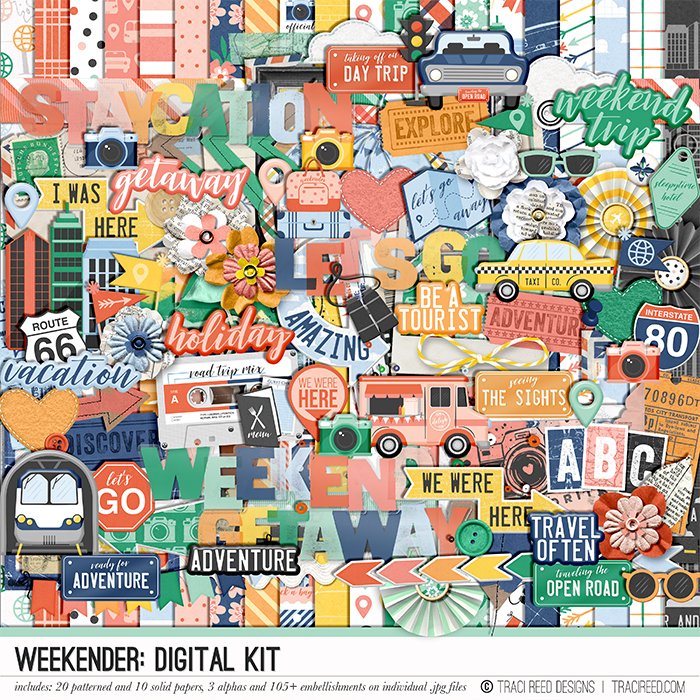
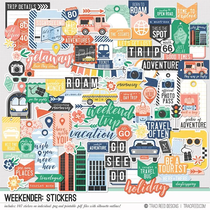
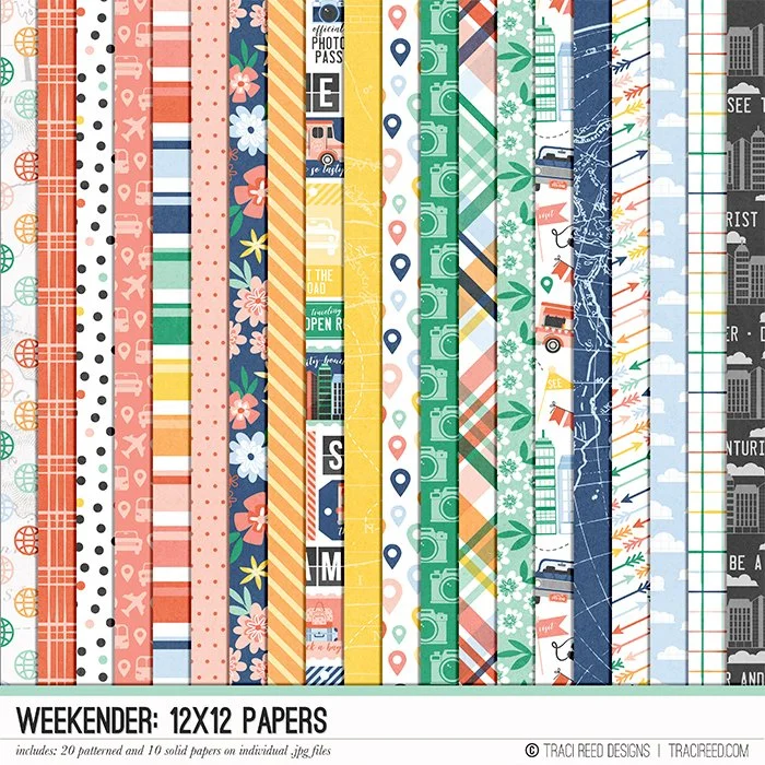
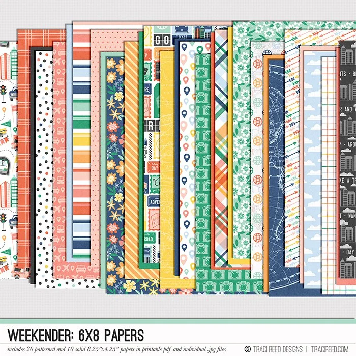
The Weekender Collection