Teach Me Tuesday: Customizing Fonts, Titles, and Alphas, Oh My!
Hey Hey Hey Scrappy people! It’s Teach Me Tuesday here on the blog and today Caroline, Trish and Stephanie are showing you 3 ways to up your title game with hybrid product!

Caroline - Adding Texture with Beautiful Dreamer
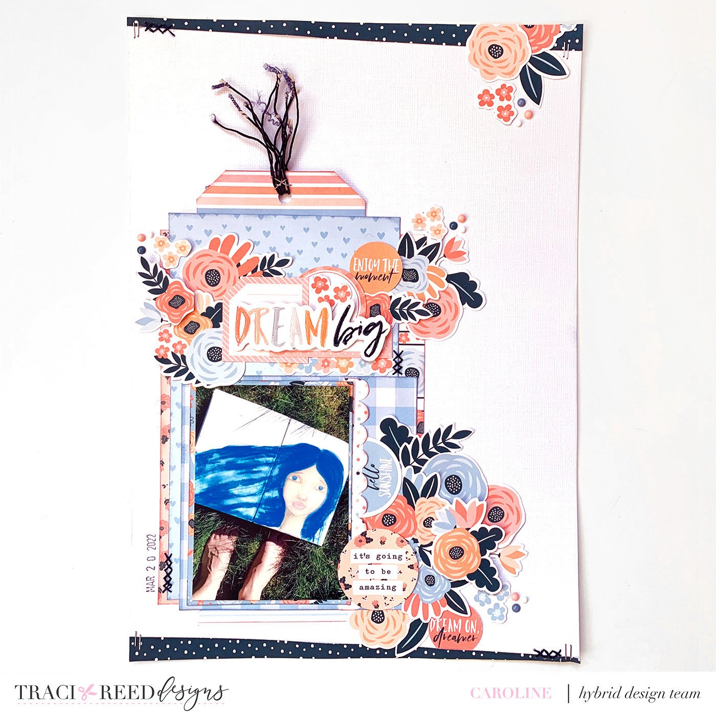
Part One - Creating Texture in your Titles
It is easy for a physical scrapbook layout made 100% with printable elements to look a little flat. The project will be made entirely with paper so there is a risk it will lack dimension.
I create texture and dimension on my pages in a number of ways and enjoyed the challenge of bringing those techniques to text this week.
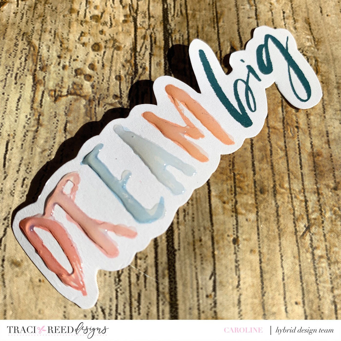
I chose to work with the fantastic new 2022 Freebie Collection - Beautiful Dreamer. It is packed full of digital and printable goodies. As there is no font within a freebie collection I choose to work with one of the die cuts as my title.
I love the brush lettering effect of the fonts used in this collection and didn’t want to lose that. So I turned to an old fave - glossy accents- to add dimension whilst retaining the gorgeous brush Iettering:
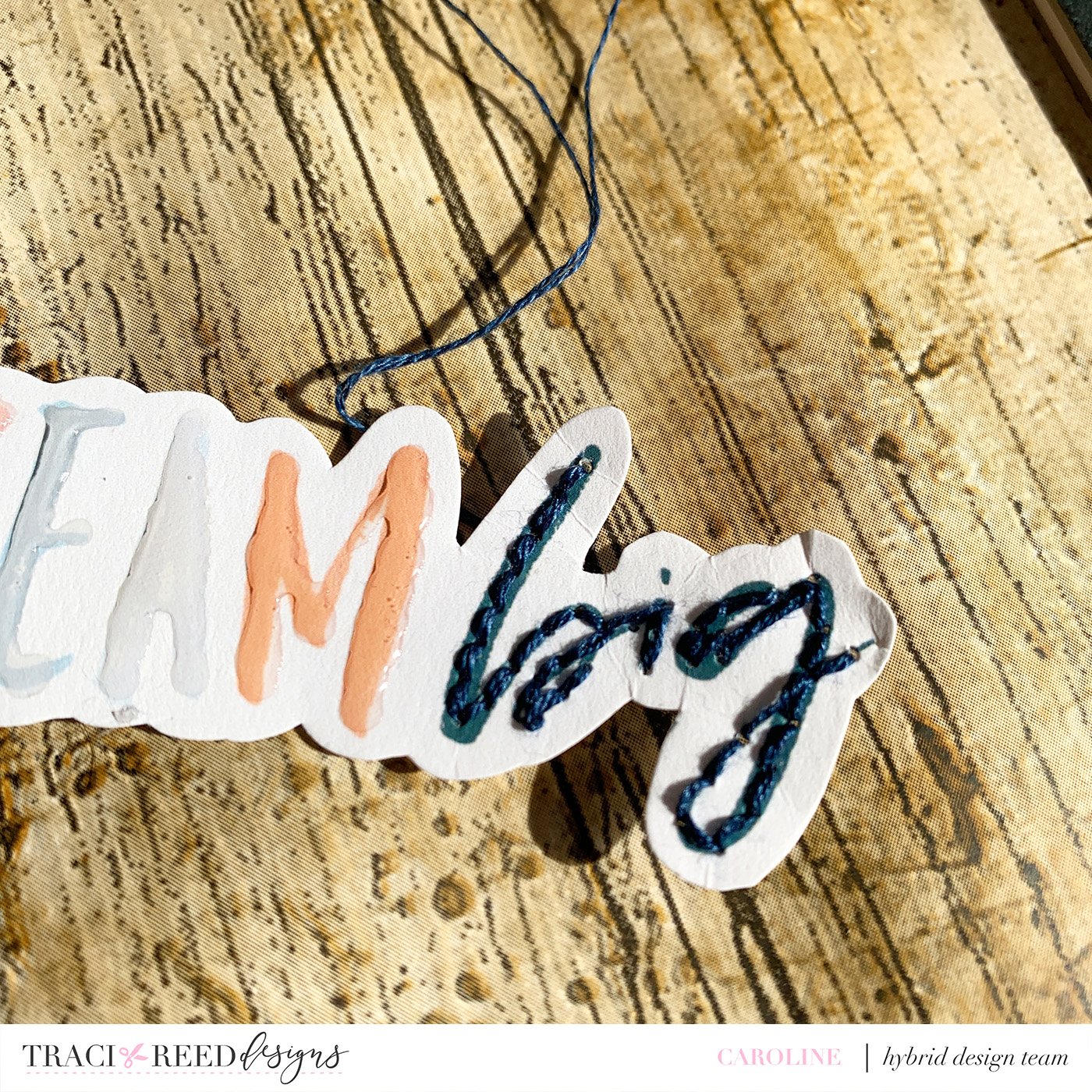
I wanted to keep on that texture train so then opted to do some stitching over the word “big” to bring in another dimension. I’m so glad I did this as I love the full on detail in this simple title:
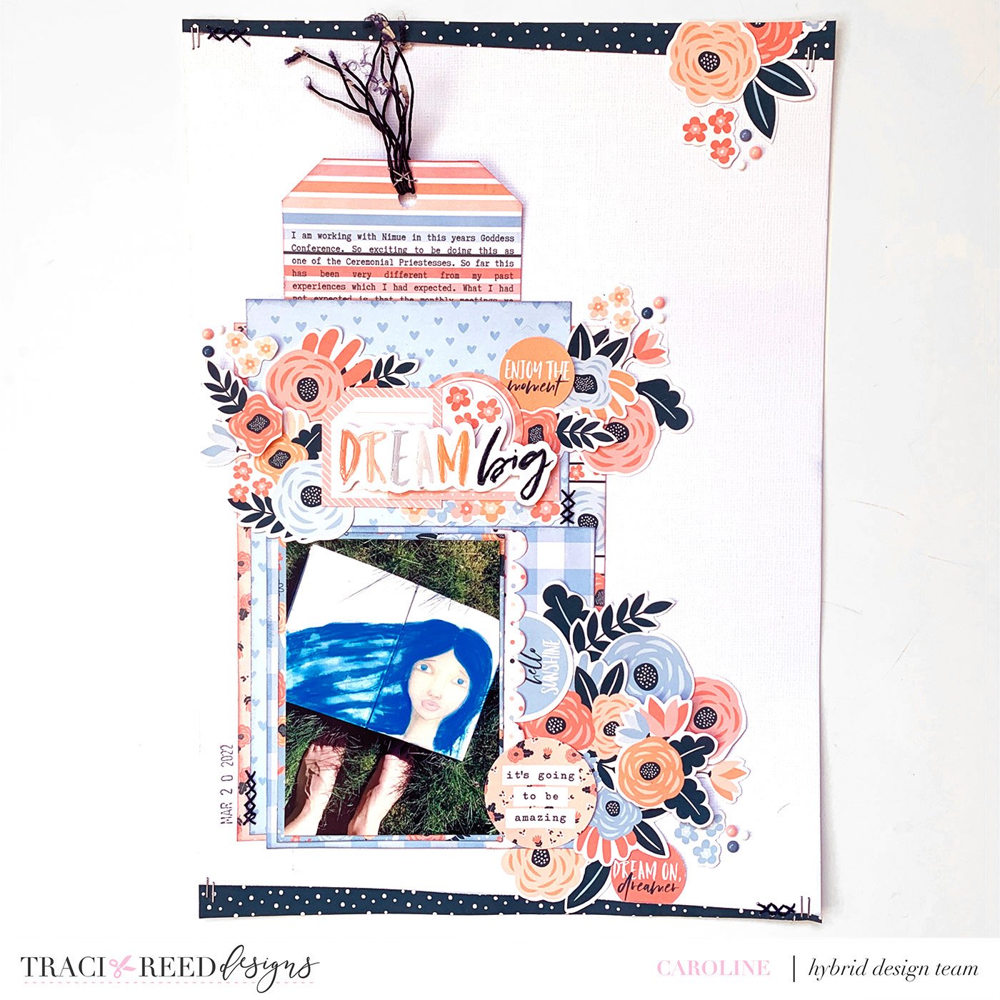
To complete the look I opted to pop this title piece up on pop dots for even more dimension. That way I could later lots of the gorgeous florals and labels from the collection behind.

Once I had completed the project I decided to go back in and add stitching in other places around the page - repetition really helps a technique to ground into eyes Project.
Part Two: Printing Your Journaling
I decided to use a 3x8 tag to capture my journaling for this layout as I had a lot to say. When I want to write more I ALWAYS turn to printing my journaling as I can reduce the font in size and everything is still legible.
There was no 3x8 tag in the collection but a few clicks in Canva and I had one.
I always opt to write my journaling up in Evernote before I copy it into Canva. I just find it easier to see what I am typing in that app.
I opted for one of the gorgeous striped TN papers as my background for my tag and so I had to adjust my line spacing a little to make the words fit in the lines.
Once I was happy with it I printed out the whole piece, trimmed it to the shape of a tag and started to build the page. I chose to hide my journaling behind the photo and paper stack as I wanted my photo, title and the florals to be the focal points.
Stephanie - Mixing and Matching with My Person

It’s easy to combine tools you already have in your stash to utilize printables in a new way! I used the red solid paper from the My Person Collection to make my own letters for my title using metal alpha dies!
To vary the title and make it more visually interesting, I doodled around two of the words to highlight them and used metallic puffy thickers for another two words to pop them off the page!

Lastly, I made a flap behind the photo and printed my journaling in an italic font on one of the Traveler’s Notebook Signatures from the My Person Collection!

Trish - Turning an Alpha into a Vellum Sticker with Anywhere But Here
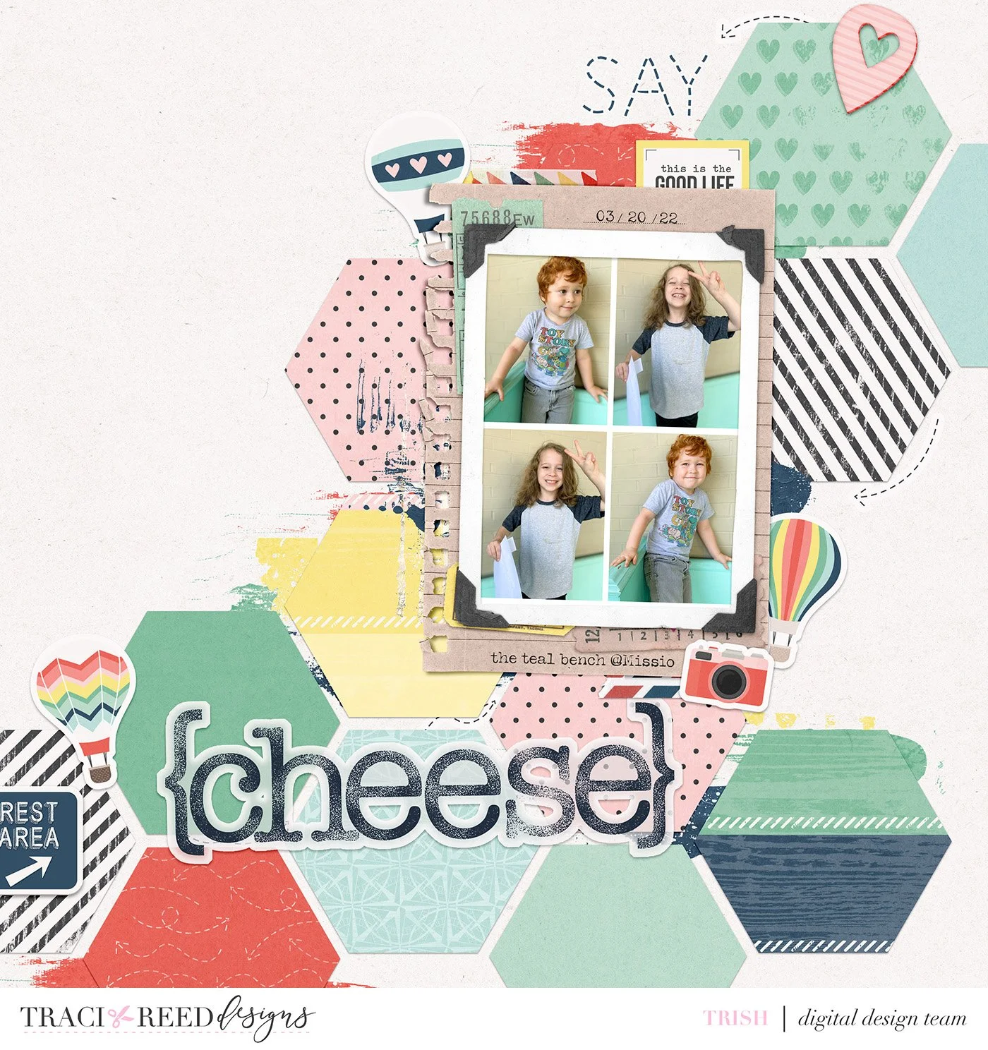
Sometimes when you are making your page and you get to your title you can feel a little stuck with your alpha and font choices that seem provided to you. So I have a few tips for looking digitally outside of the box when that happens.

Use a fun or handwritten style font that doesn’t necessarily seem like it goes with the alpha that you are planning to use, but instead, it matches an element on your page. I tend to stick with typewriter or script fonts for my titles and journaling if I am not using my own handwriting, but when neither of those styles seemed to go with my page I took inspiration from the dashed arrow elements and found a dashed font to match them. There are so many free font sites out there that a simple google search can often find you something to match for free.

The alpha that came with the collection that I used, Anywhere But Here, is lovely and one of my favorites, but the map design of it really seemed to get lost on top of all of the paper pieces that make up the background of my page. I knew that I wanted something more solid, but not so heavy that it was going to weigh down the page visually.
I decided to pull the stamped alpha that is in the My Story Matters collection for the page because it offered both of those things and also matched the colors beautifully. However, the stamped look sort of felt like it needed just a little something to make it pop more, so I gave it a sort of sticker effect to make it match the sticker elements that I used.
Making an alpha, or font, into a sticker is fairly easy to do and customize to your liking. Simply either merge your alpha into one layer or rasterize your font. Then, add an outside stroke layer style. If you want to go a little more in-depth like mine, which I made vellum because the solid white was still visually heavy, put the stroke on its own layer then lower the opacity and add a white inner glow to give it a vellum look.