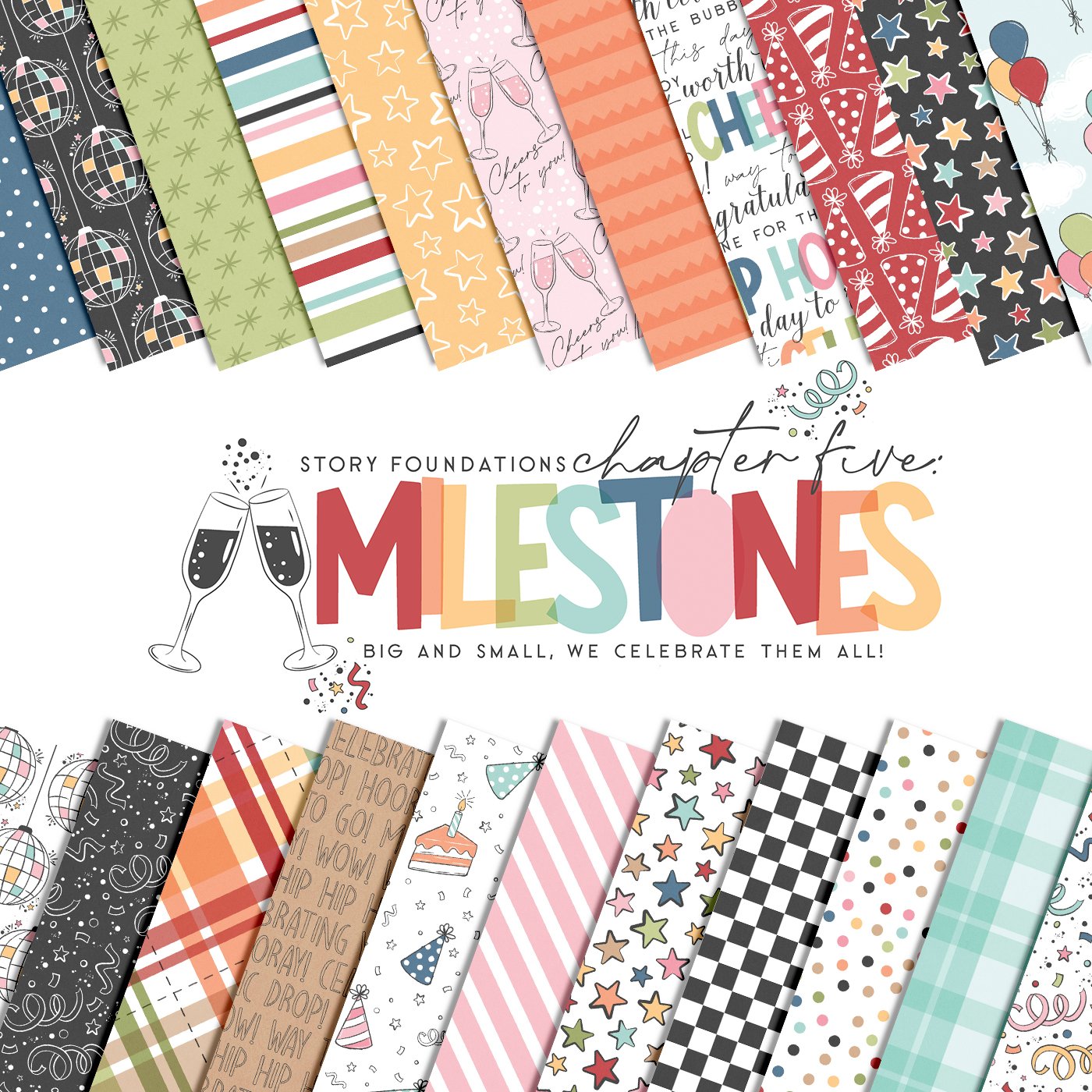
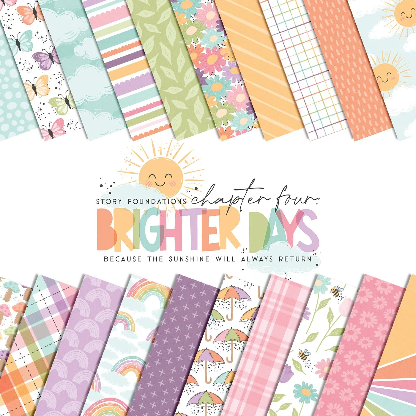
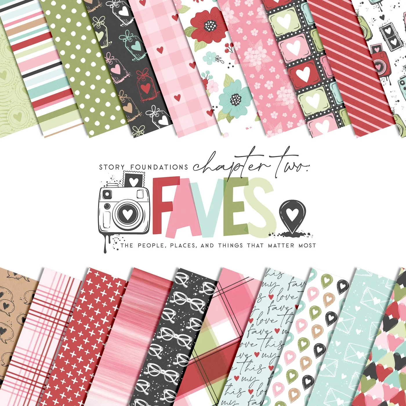
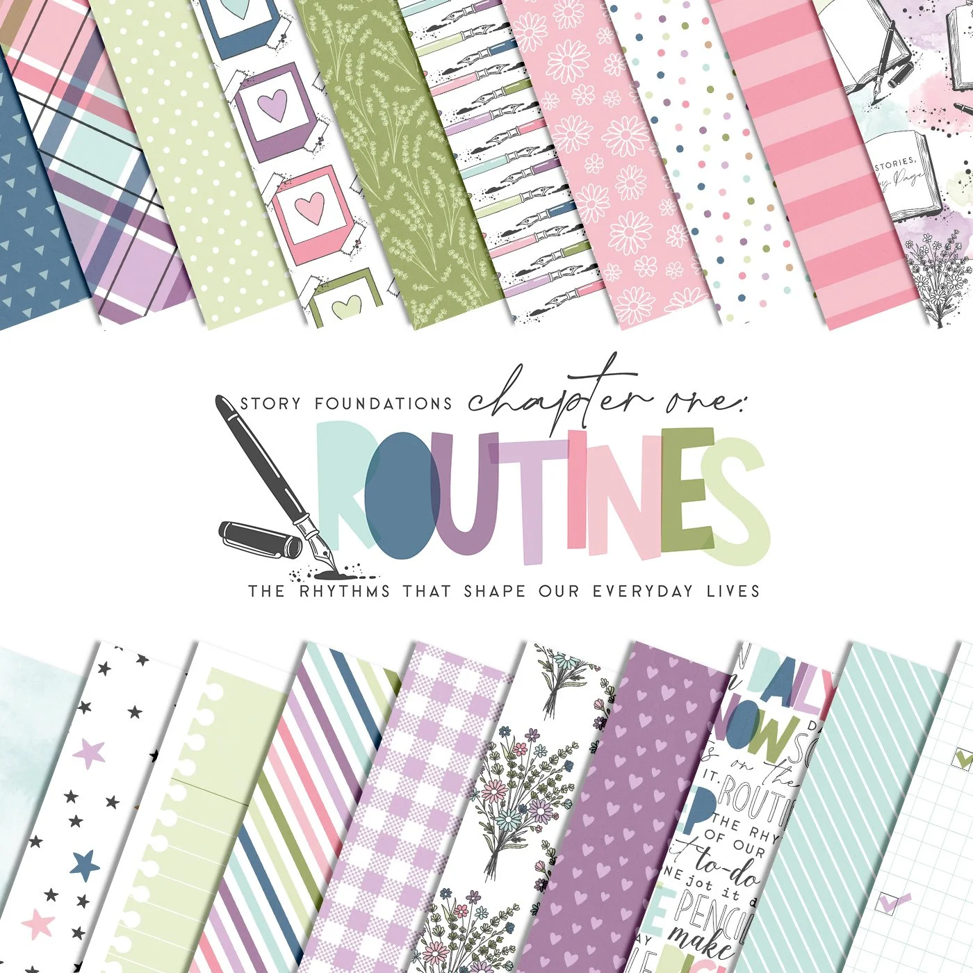
Project Life 2026 Week Eight: Documenting the Good, the Bad, & the Ugly with the Story Foundations Collections
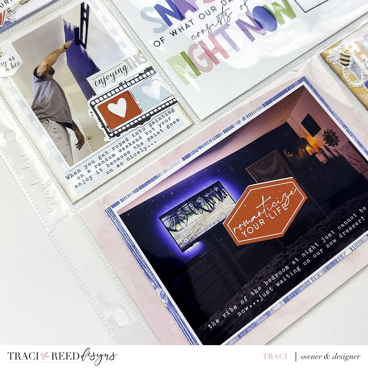
Week 8 in my Project Life album became one of those spreads that feels like a time capsule in every sense of the word. It holds the everyday routines, the little joys, the heavy headlines, and the personal moments that quietly changed the tone of an entire week. For this spread, I challenged myself to use every single piece of the Story Foundations lineup together: the Base kit, all four Chapters, and Footnote. I wanted to see if they could coexist naturally on one spread without feeling disconnected, and honestly, this layout reminded me exactly why the system was designed the way it was. Even with such a wide emotional range in the stories, everything still feels cohesive and grounded.
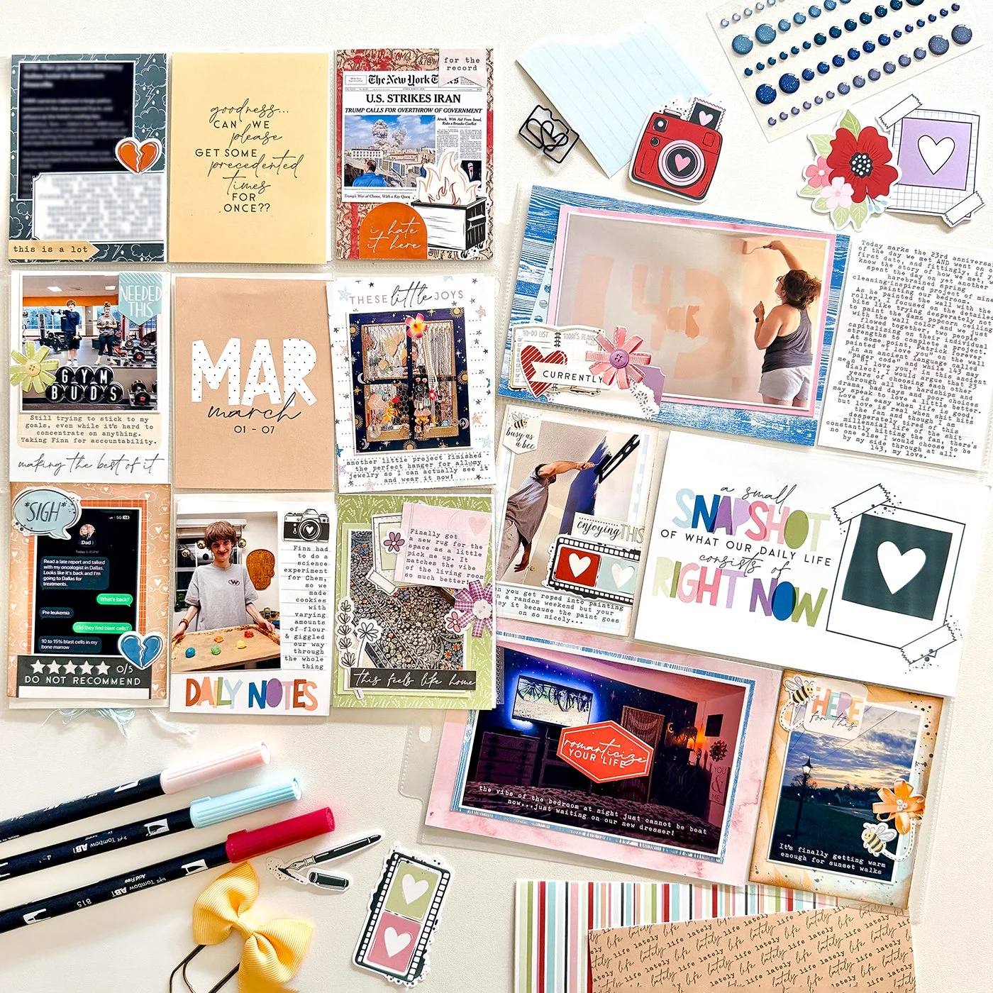
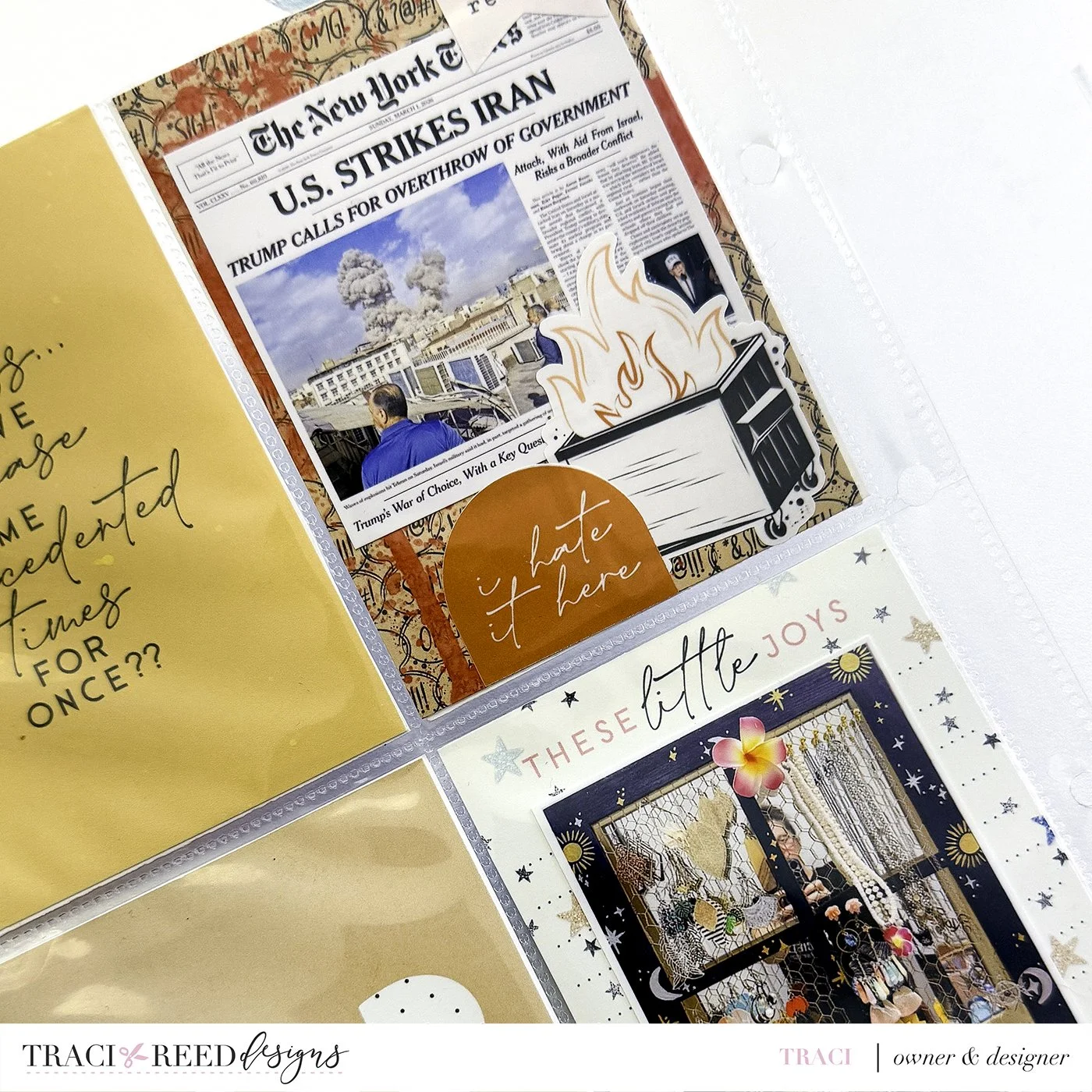
Before I ever printed a single card, I fully pre-planned the spread in Photoshop. I added journaling directly onto my cards and photos and even incorporated digital mixed media before printing everything out. This approach lets me control the visual balance of the spread while still leaving room for the tactile, handmade details I love most about Project Life. After printing, I brought some of the pages back to life with analog techniques by adding brown ink around several cards on the right-hand side to mimic the warmth of kraft paper. That little bit of inky distressing helped soften the digital edges and gave the spread more texture and depth without overwhelming the cleaner design.
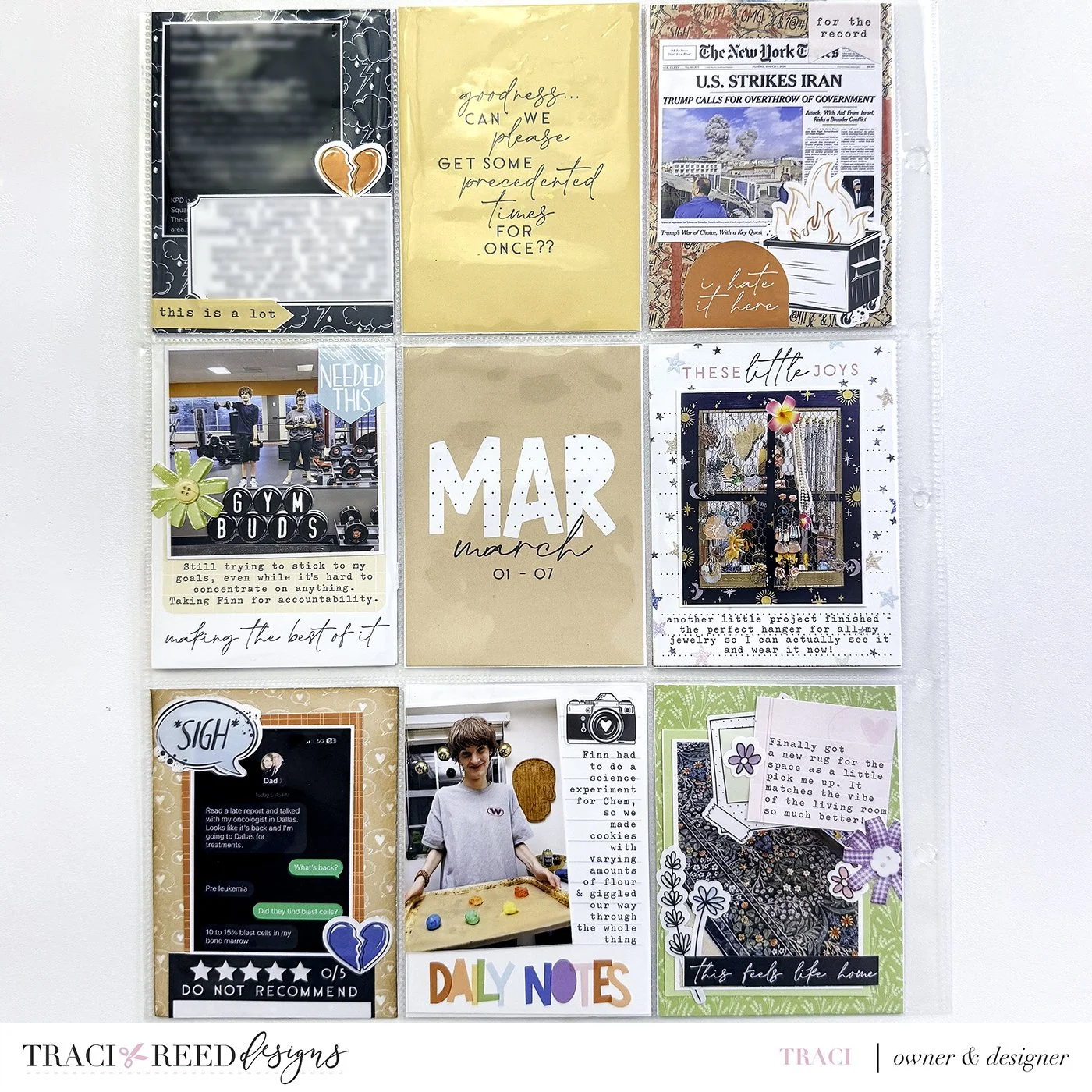
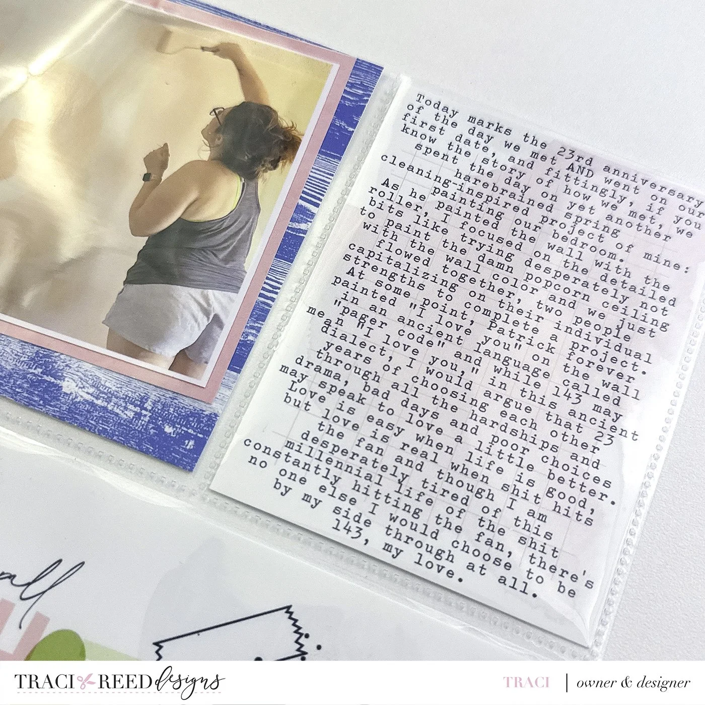
One thing I’ve always believed about Project Life is that it works best when it tells the truth. Not every week is made up of pretty photos and happy stories, and I never want my albums to feel like they skipped over the hard parts. This spread documents some genuinely difficult moments, including the card referencing the US bombing in Iran, a text from my dad about needing chemotherapy, and another story that hit very close to home that I chose to partially blur for privacy. Those pieces are painful to revisit, but they are still part of our lives and part of this week’s story. I think there’s something powerful about allowing those stories to exist beside the ordinary moments instead of separating them into different emotional boxes.
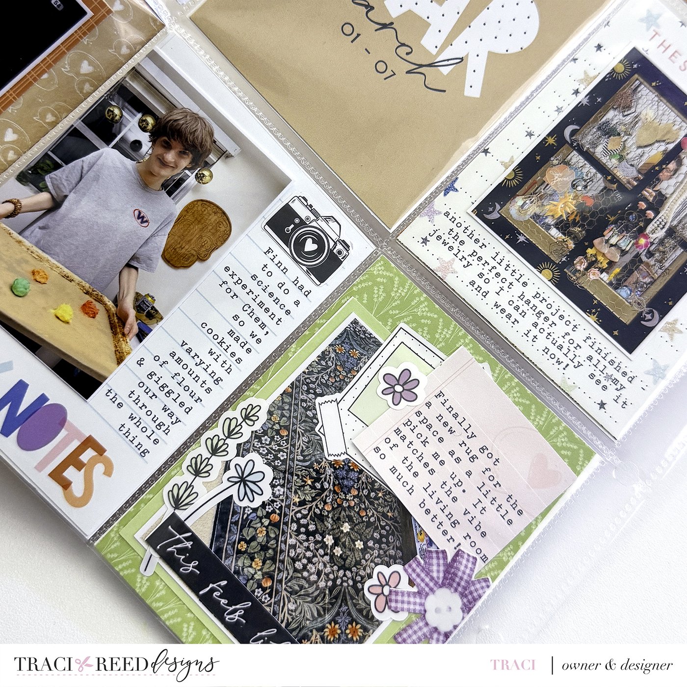
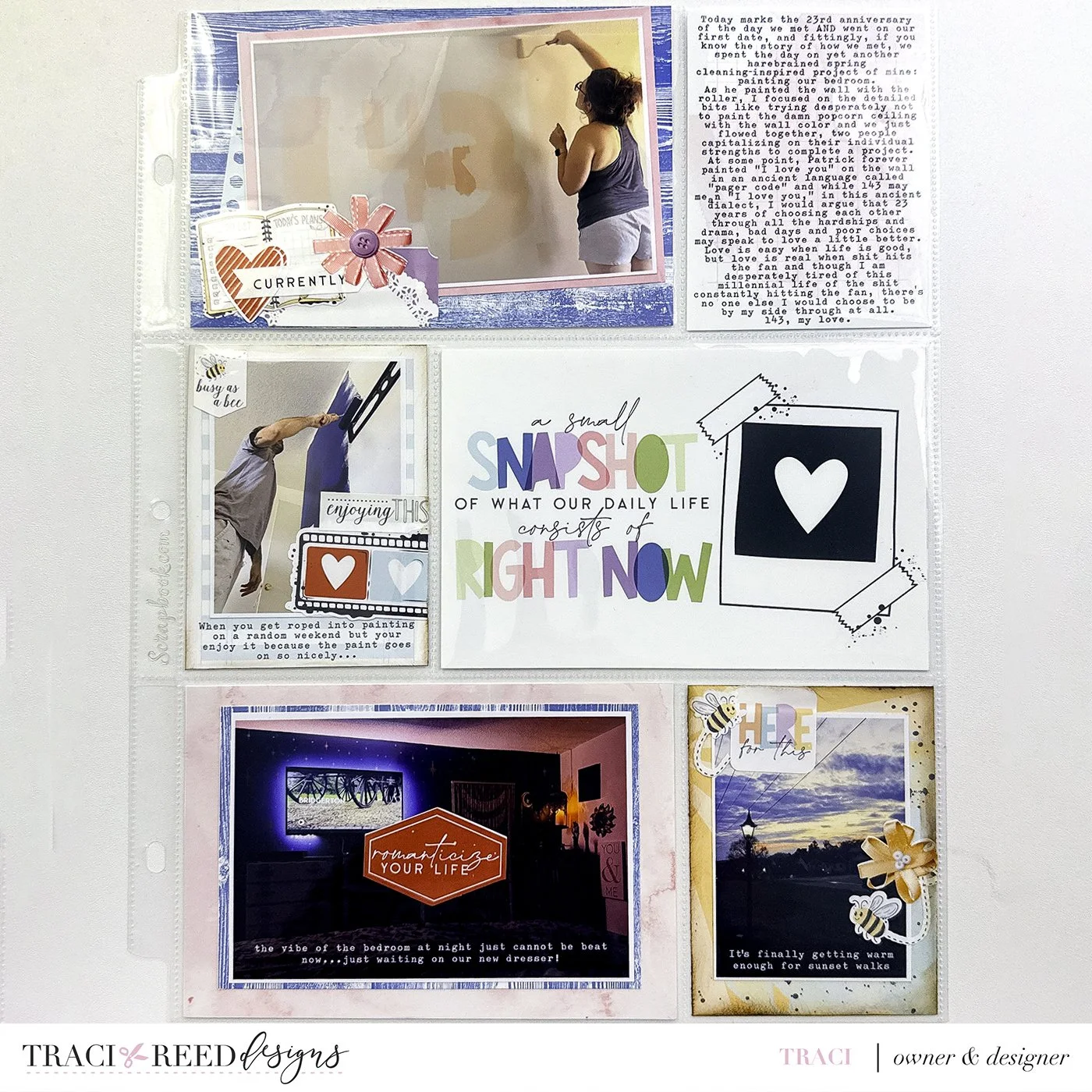
At the same time, the spread still carries so much light. There are snapshots of creativity, home projects, gym accountability, sunsets, and the tiny moments that would otherwise disappear into the blur of everyday life. That contrast is what makes Project Life feel meaningful to me. Life rarely arrives sorted neatly into “good” weeks and “bad” weeks. Most of the time it shows up as a strange collage of celebration, stress, hope, exhaustion, beauty, and heartbreak all sharing the same seven days. This spread captures that feeling perfectly.
Using all of the Story Foundations collections together really reinforced the idea that these products were created to support the full spectrum of storytelling. The happy & bright pieces from one Chapter can sit comfortably beside more serious or reflective elements from another without feeling visually disconnected. The individual chapters helped bridge everything together with supporting details and smaller accents, while the Base kit anchored the entire spread. Instead of feeling like separate collections competing for attention, they worked together like chapters in the same novel, each one helping tell a slightly different part of the story.
Looking back at this spread now, I think it represents the heart of Project Life better than almost any layout I’ve made recently. It’s layered, imperfect, emotional, creative, and deeply real. It documents the good, the bad, and yes, the ugly too. But somehow, when all of those pieces are held together on one set of pages, the result still feels hopeful. That’s the magic of memory keeping to me. Even the hardest stories deserve a place in the album because they help tell the truth about who we were, what we carried, and what we made it through.