Minimalism for Maximalists with Cheryl!
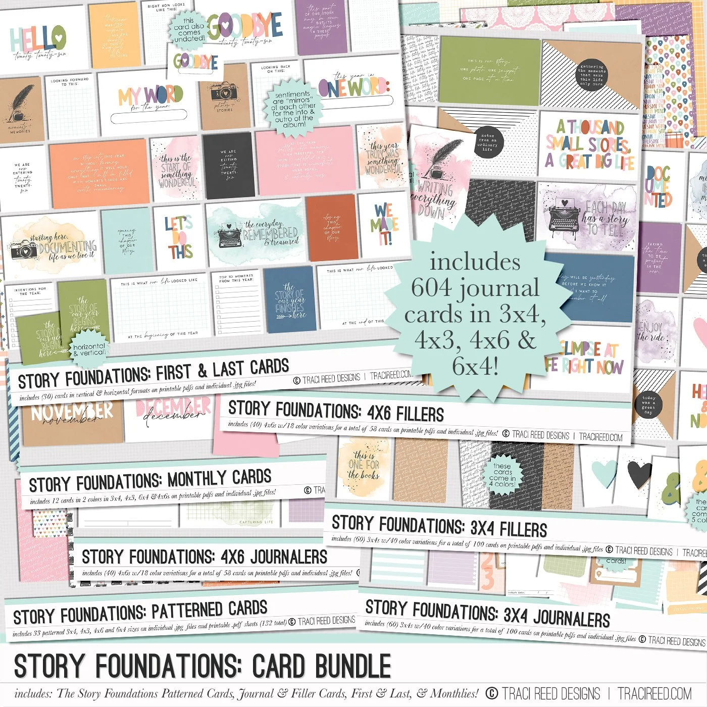
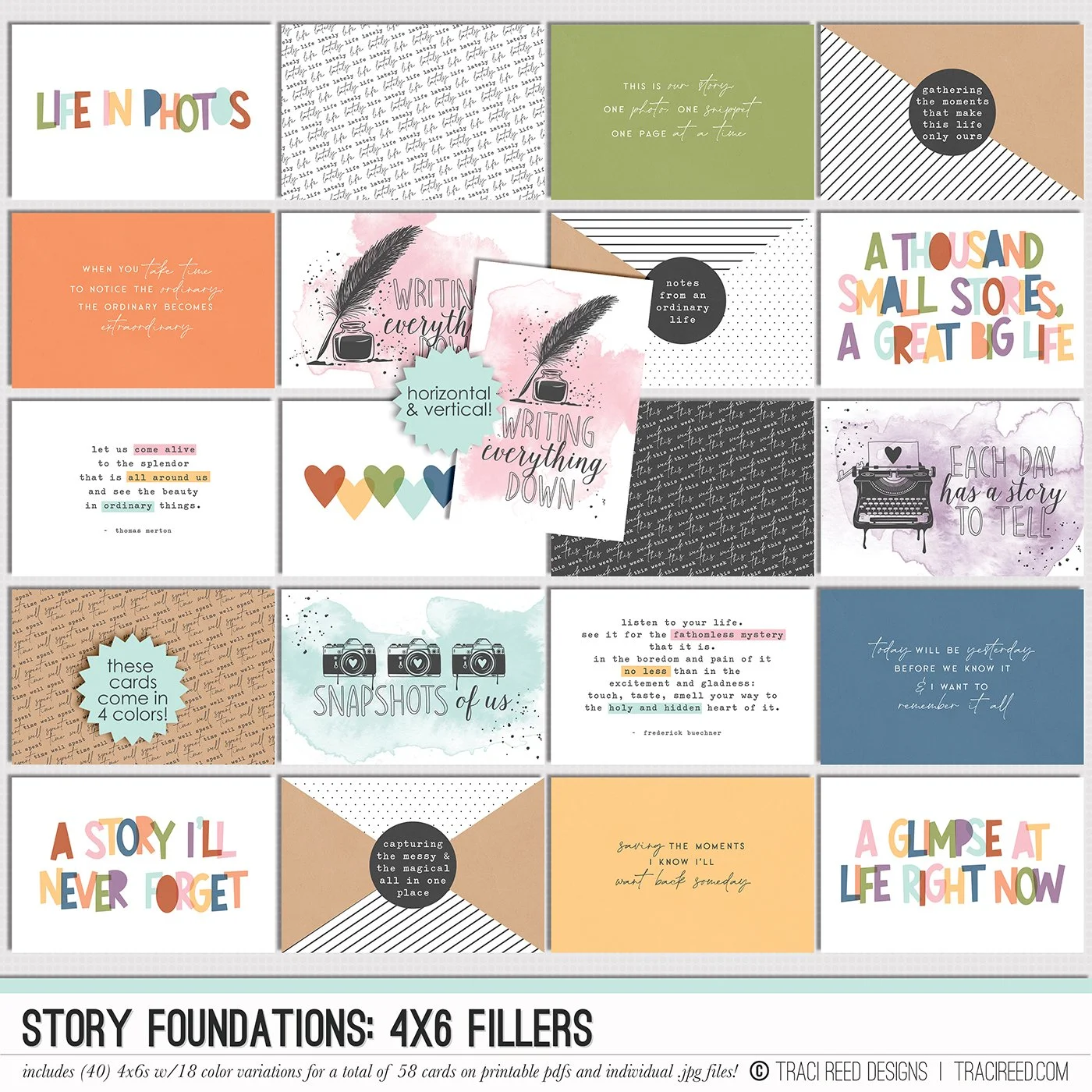
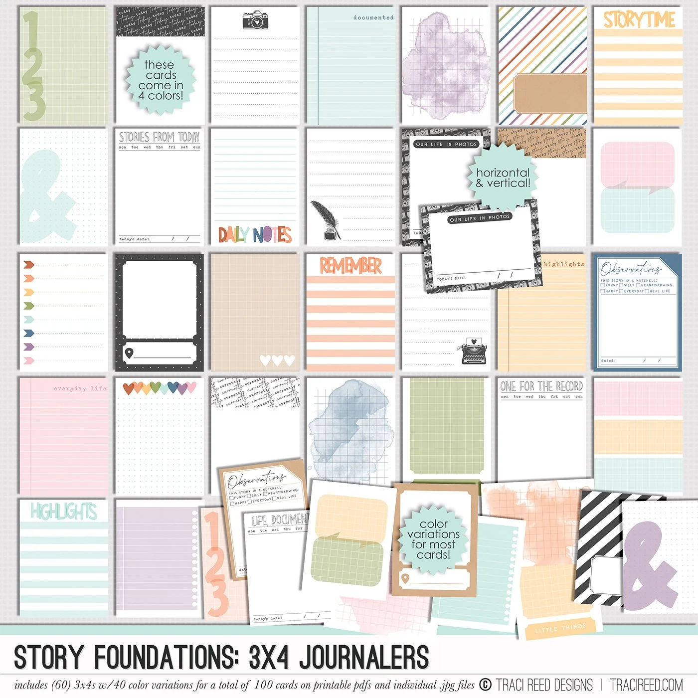
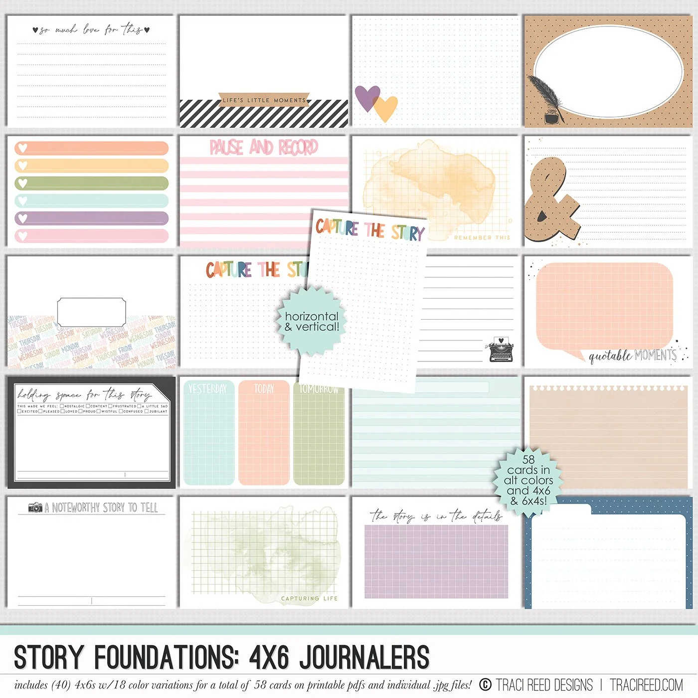
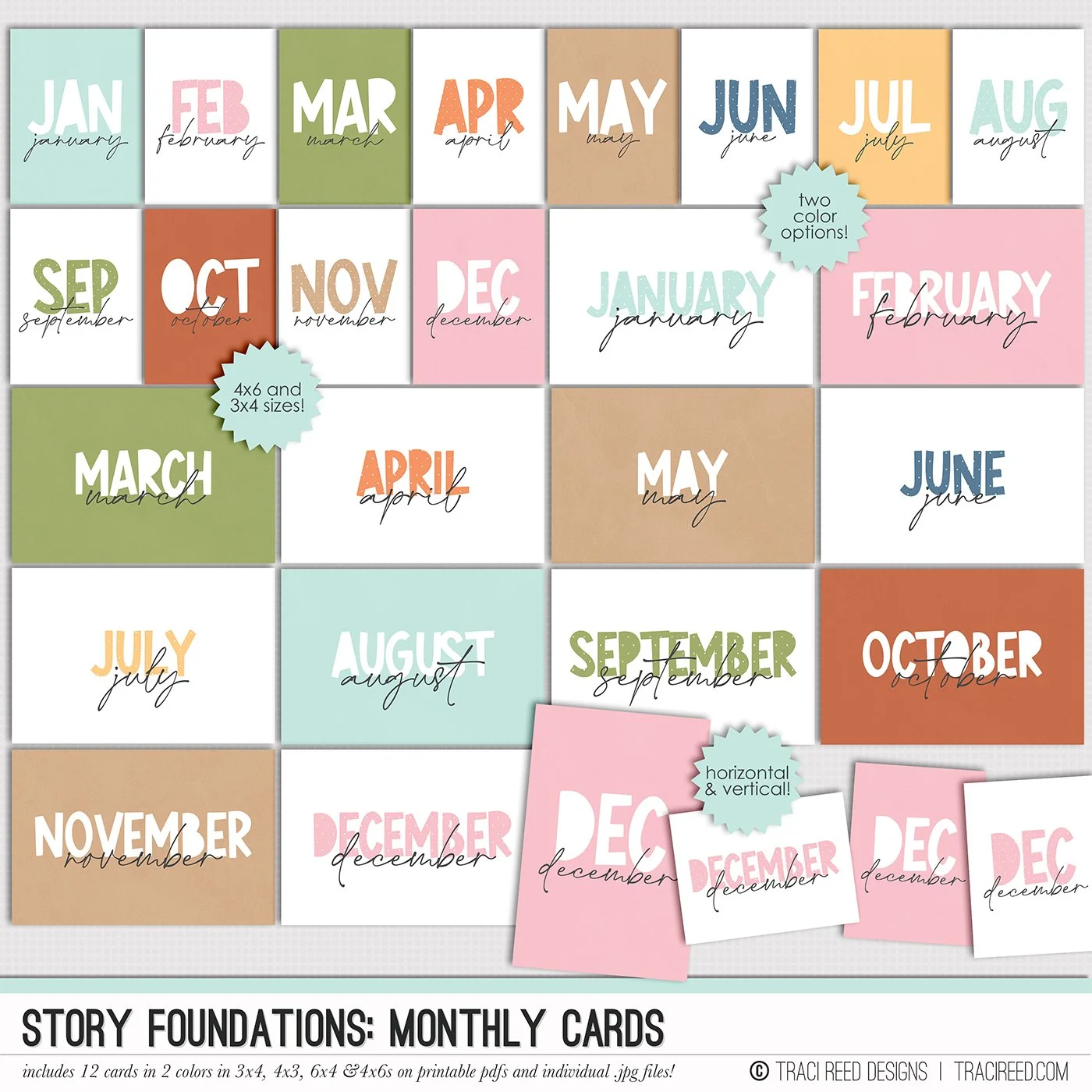
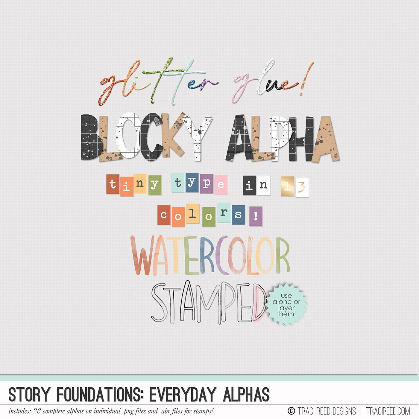
Hey y’all! This is Cheryl with Watch Cheryl Scrap, and today I’m excited to share a layout I created using Tracy Reed Design’s Story Foundations. I’m on Traci’s creative team, and the layout I’m showing you today is based on clean line clustering.
Now, if you’re familiar with my videos or have seen my layouts in galleries or on social media, you know my current style definitely leans maximalist. So talking about clean line clustering might sound a little unexpected, but that just goes to show that this approach works beautifully in both a maximalist style and a more minimalist design.
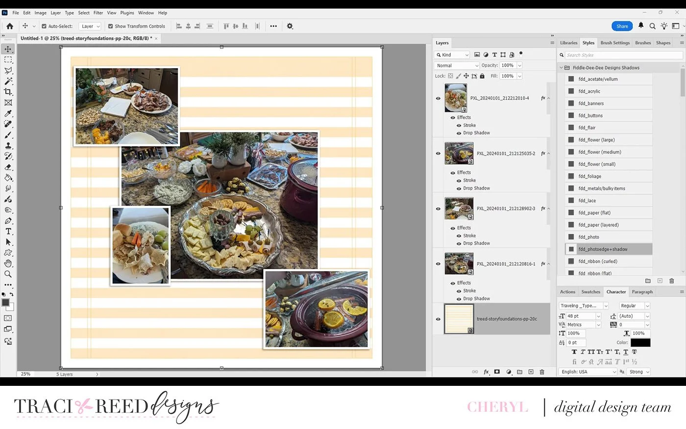
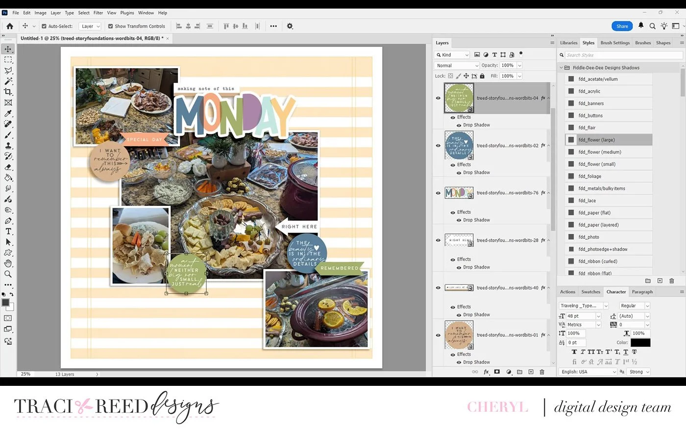
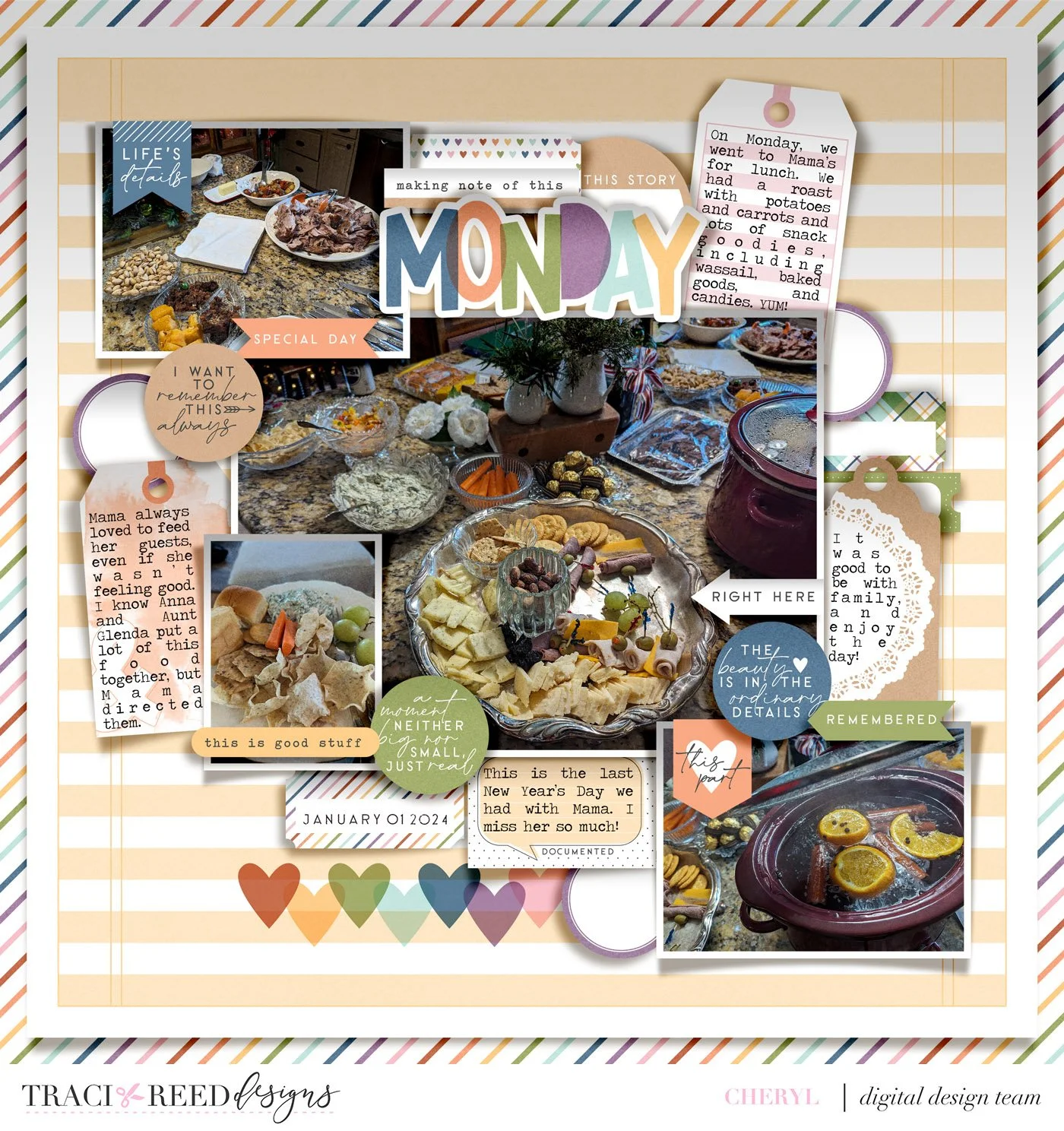
I started with what I like to call a neutral background, something very clean, with simple lines and plenty of white space around the edges. Once I added my photos, I established my first clean line. Starting in the upper left and moving down to the lower right, the photos guide your eye visually across the page. I made the center photo larger to anchor the design.
From there, I began adding my embellishment clusters, using what I like to call a triangular circle. I placed one cluster at the top center where the title “Monday” is, a second cluster in the lower right, and a third cluster on the middle left side of the page.
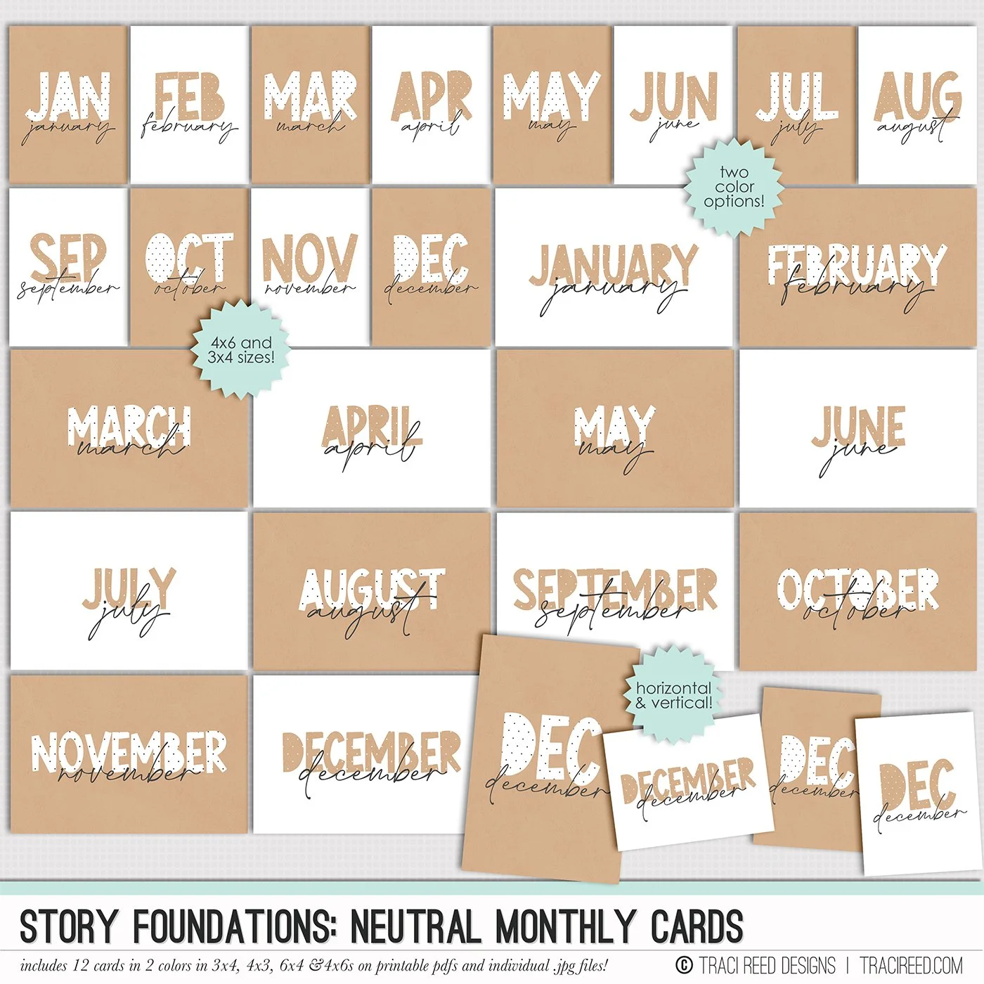
As I build these clusters, I’m very intentional about repeating elements. You’ll notice I’ve already added my title, three labels with text, and two tags—and I’ll be adding a third tag at the top with a pink stripe. I’m also pulling in consistent colors and textures. For example, I used a small circular craft tag at the top, which ties into the tag on the right that includes a little doily, and that same craft texture shows up again on the left.
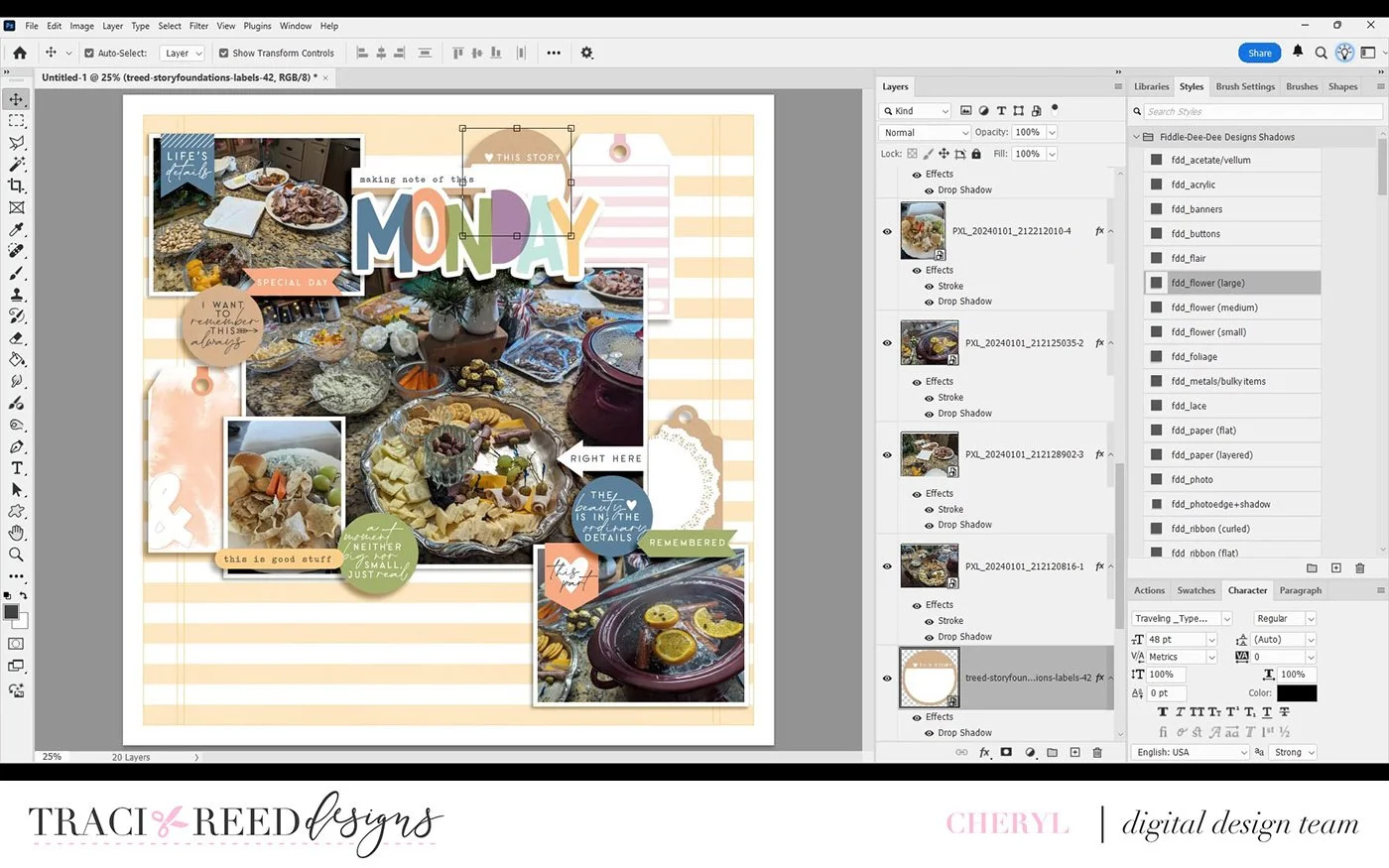
Next, I start adding labels. Even though they feature different patterns and colors, they’re all the same shape, which helps keep everything cohesive as I fill in around the clusters. This is where the idea of the triangular circle really comes into play—while the main clusters form a triangle, the embellishments themselves move in a circular flow around the layout, leading your eye again and again across the page.
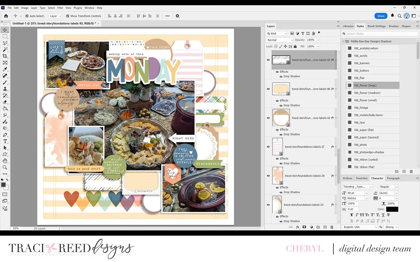
Most of the embellishments are flat, but I’ll add shadows later to give the illusion of dimension, as if some pieces are popped up with foam dots. Throughout the process, I focus on repeating both the types of elements and the colors to keep everything balanced.
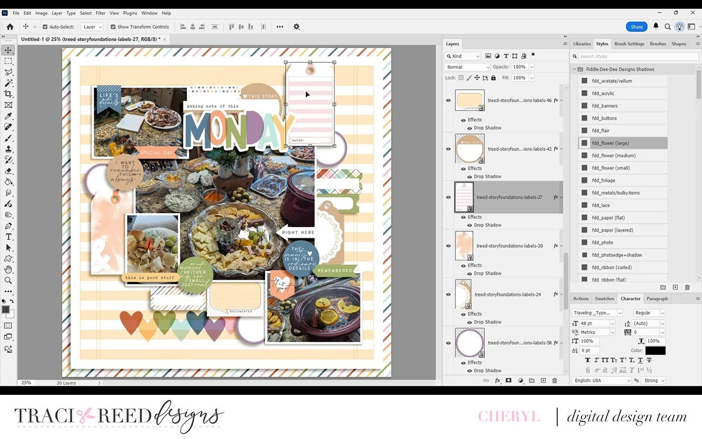
I also add a striped paper to the main background, and at the end, I gather everything together (my photos and embellishment clusters) and resize slightly so it sits nicely centered on the page. I really love how it turned out. I’ll be adding my journaling off camera.
I hope this walkthrough helps you—whether you’re more of a minimalist or a maximalist—and that you pick up a few tips and tricks to try on your next layout. Thanks so much for watching!