The Anatomy of a Scrapbook Page with Cheryl
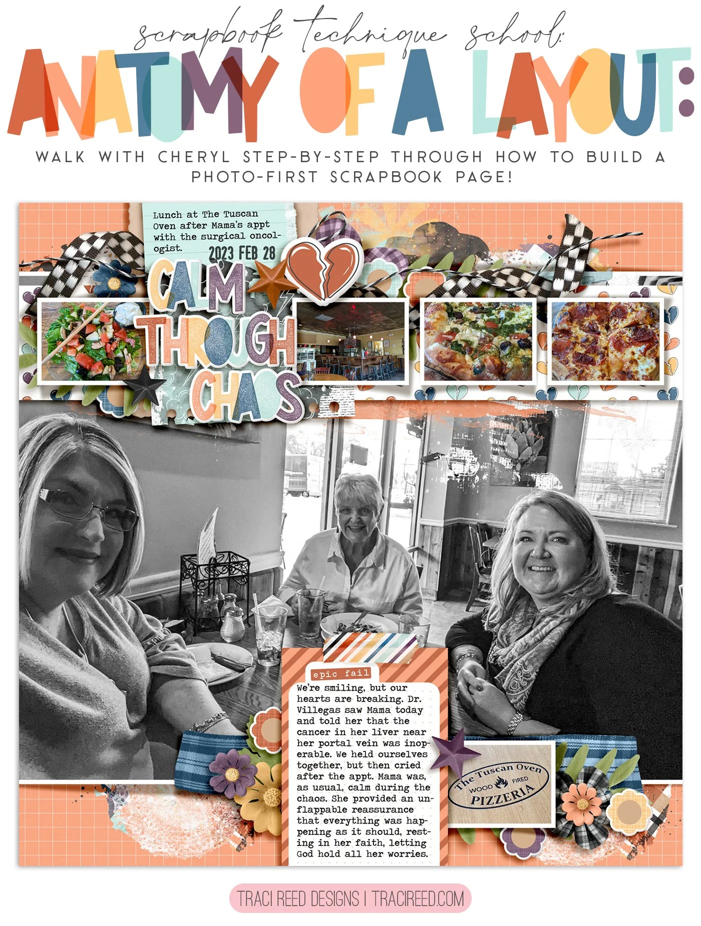
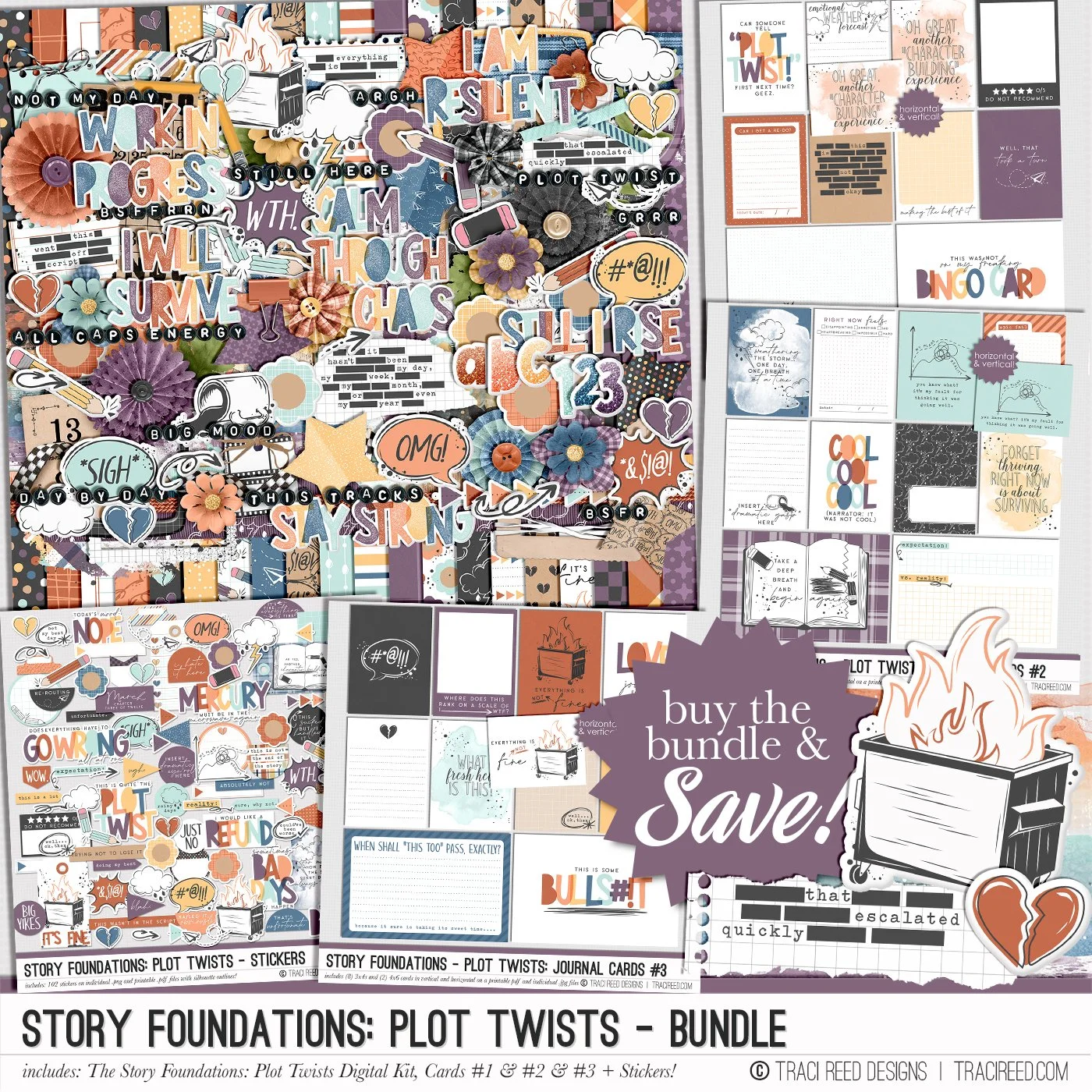
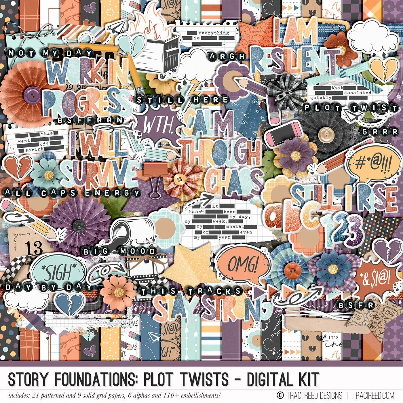
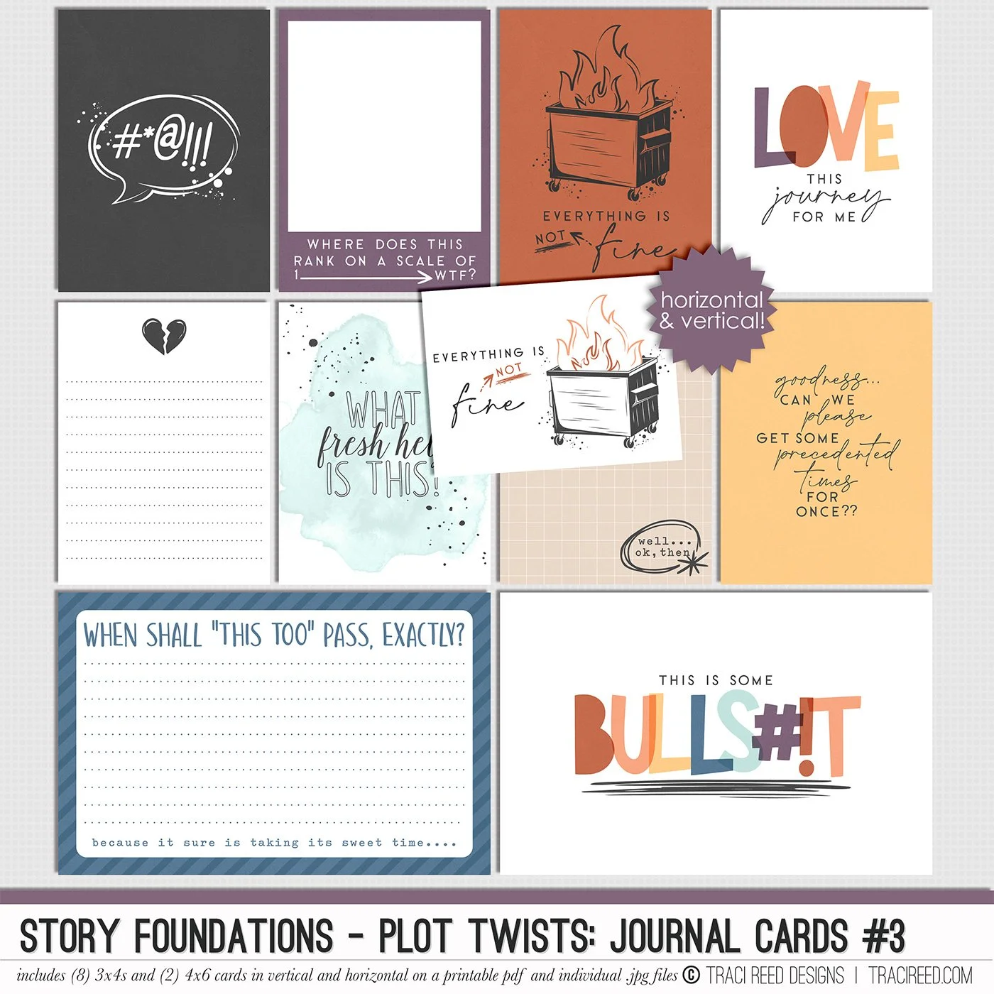
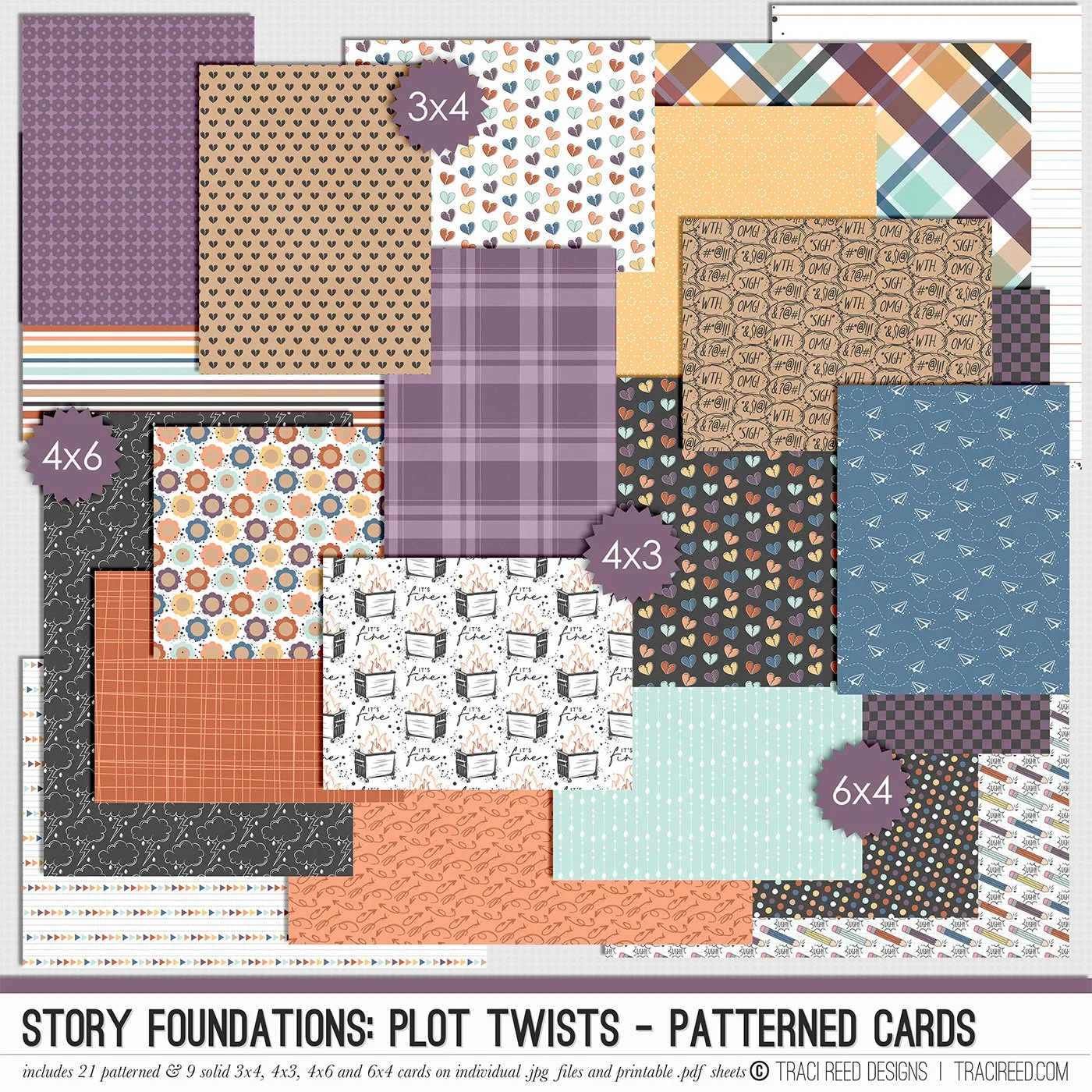
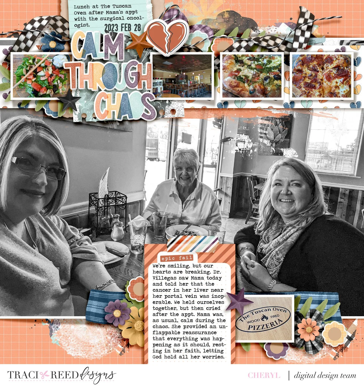
Hey y’all! Today I’m sharing a layout I created as part of the creative team for Tracy Reed Designs using the Story Foundations: Plot Twists kit, which is the March collection.

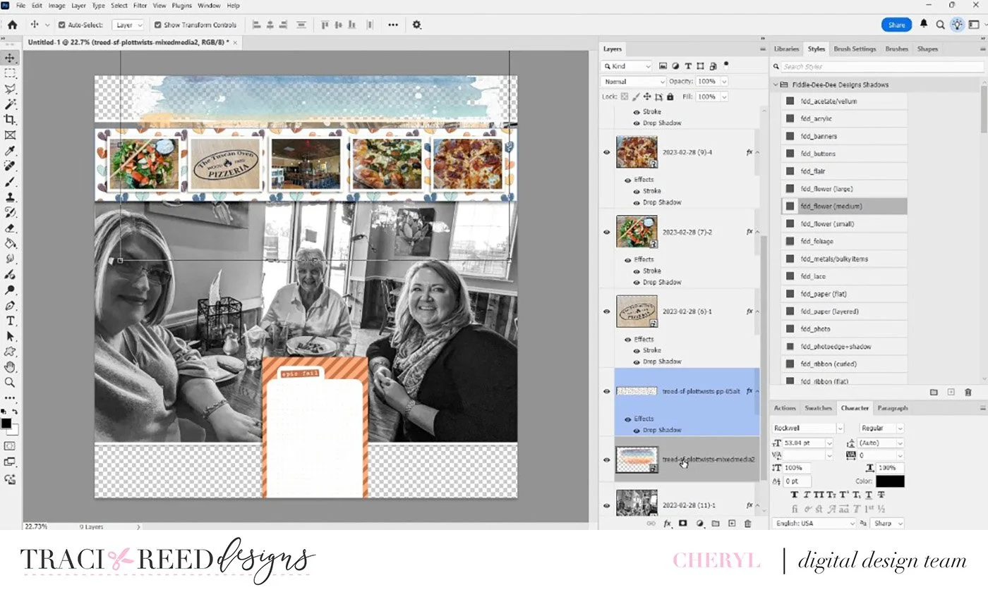
For this page, I started with a design approach I use pretty often: one large focal photo paired with several smaller supporting photos. The main photo is of me, my mom, and my sister, and I really wanted that image to be the centerpiece of the layout. I took the photos of the food, resized them, and lined them up across the top of the page. Since there wasn’t anything important at the top of the main photo that needed to stay visible, this arrangement worked perfectly.
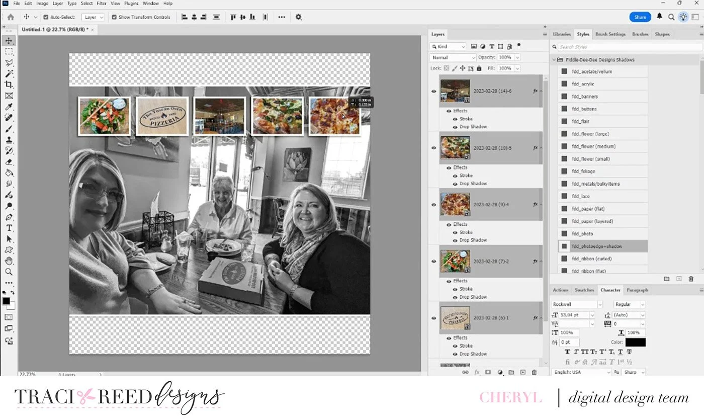
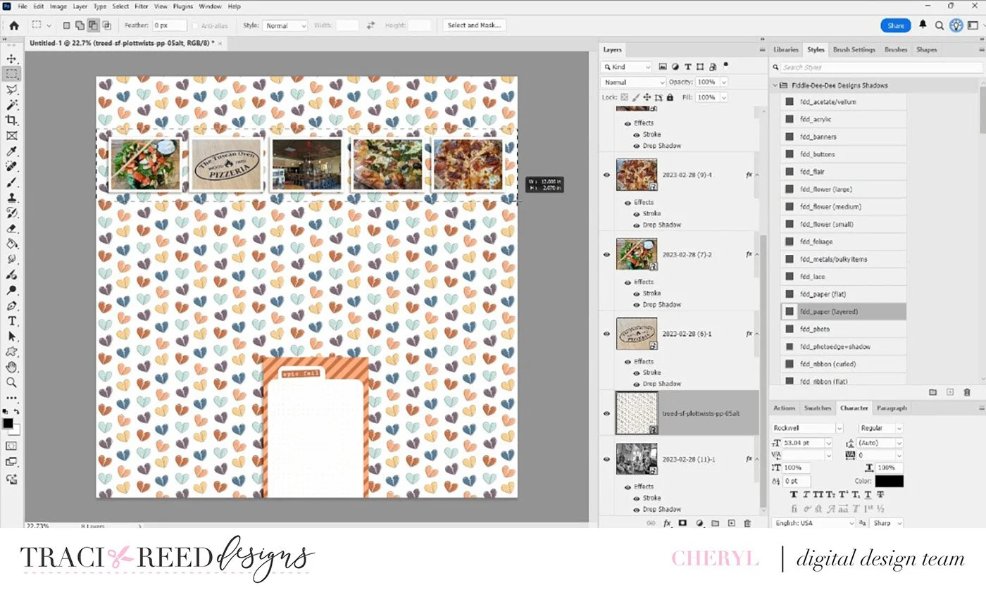
You’ll see here that I’m using the Rectangular Marquee Tool, which is one of my absolute favorite tools. I used it to cut a strip from a patterned paper with little broken hearts. That strip helps the smaller photos stand out a bit more and adds some visual interest across the top of the page.
Another thing I almost always incorporate into my layouts is mixed media—that might be paint, stamping, or something similar. In this case, I added a mixed-media element over the large photo and clipped it directly to the image so it blends in naturally.
Next, I started building the background and placing my journaling spot. The journaling card actually covers part of a pizza box in the photo, which I felt was totally fine since the story I’m telling is less to do with the food and more to do with a doctor’s appointment my Mama had earlier in the day. I ended up choosing the orange journal card because it tied in really well with the warm colors from the food photos.
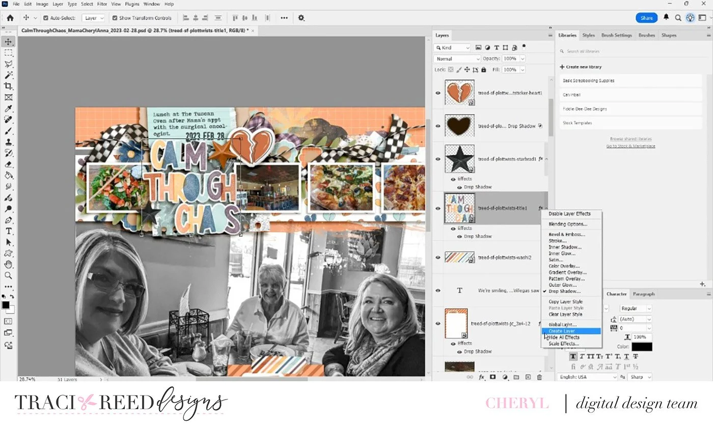
For the title, I used “Calm Through Chaos.” I also pulled the little logo photo from the restaurant and placed it near the bottom next to the journaling card. To help the title stand out, I layered paper behind it. I love doing this as it adds depth and makes the title feel more grounded on the page.
At this point I started adding elements that just felt right for the story. For example, there’s a ribbon with a kind of racing-flag pattern. I chose that because the day itself felt a little out of control, like everything was moving too fast, so that element visually represents that feeling.
From there I continued layering, adding florals, foliage, and other embellishments. I tend to follow the rule of three when placing clusters. In this layout, I have the larger cluster near the top and then two smaller clusters on either side of the journaling card at the bottom. That triangle structure helps keep the page visually balanced.
Another detail I love adding is string elements. In this case, I duplicated the string and rotated it slightly to fit the design. That’s a trick I use frequently to make elements work exactly where I want them.
Now, one of the biggest techniques I use on almost every layout is creating custom shadows. If you right-click the FX icon on a layer in the Layers panel, you can create a separate shadow layer. After that, I double-click the shadow layer at the corner of the bounding box and use free transform tool to shape and adjust it. This allows me to create much more realistic shadows and gives the layout the dimension of a physical scrapbook page.
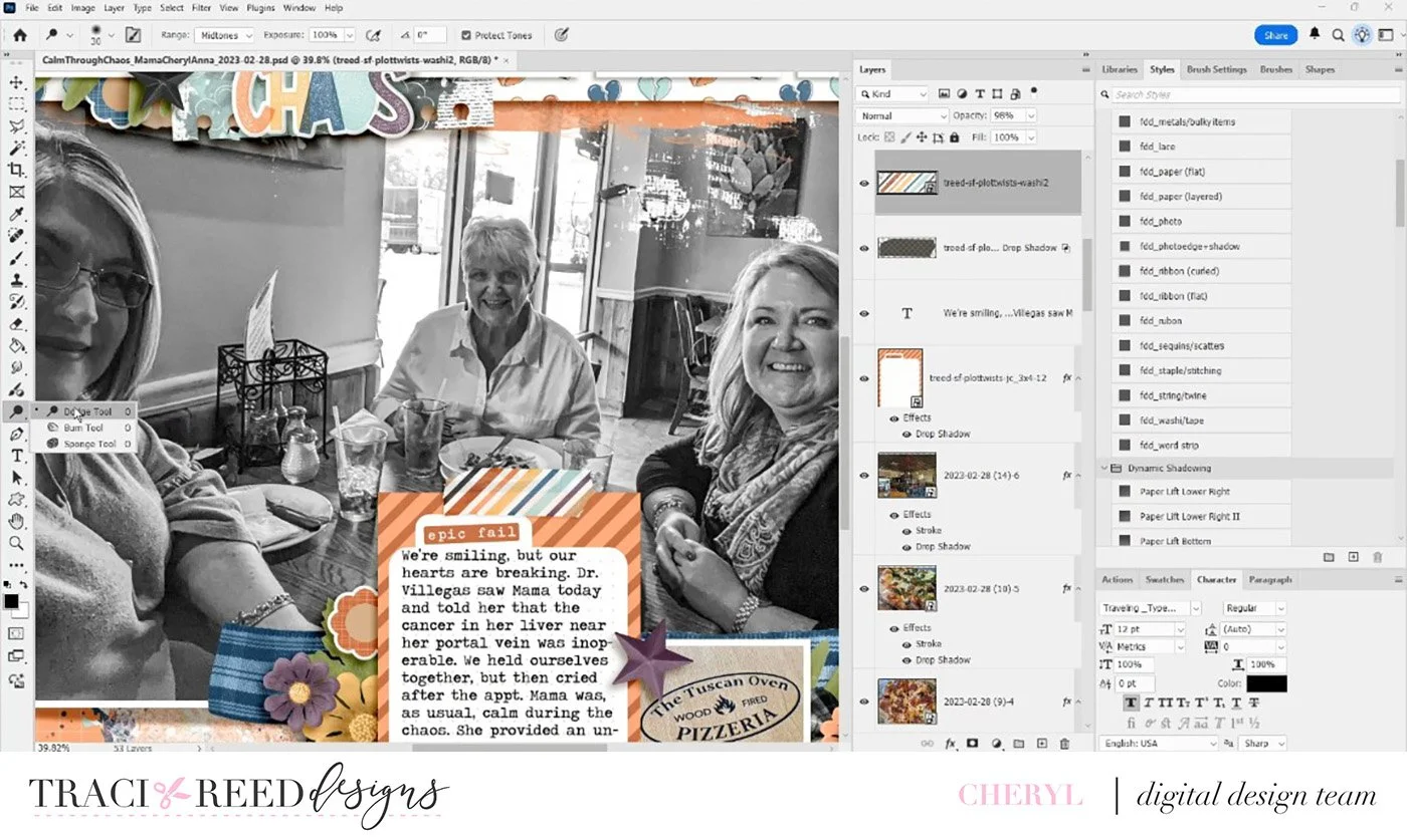
For the washi tape on the journaling card, I used the Burn and Dodge tools to make it look like the tape has been pressed down with a fingernail along the edge. That subtle shading makes it look like the washi is really stuck to the photo.
These dimensional touches, especially custom shadows, are something I include on nearly every layout I create. I hope you enjoyed watching this process and that it inspires you to try out some new digital tools or techniques in your own scrapbooking!
Thanks so much for watching, and I’ll see you next time!
Process Video
Story Foundations: Plot Twists