Tutorial: Creating a Tone-On-Tone Layout that Still Pops with Kristin
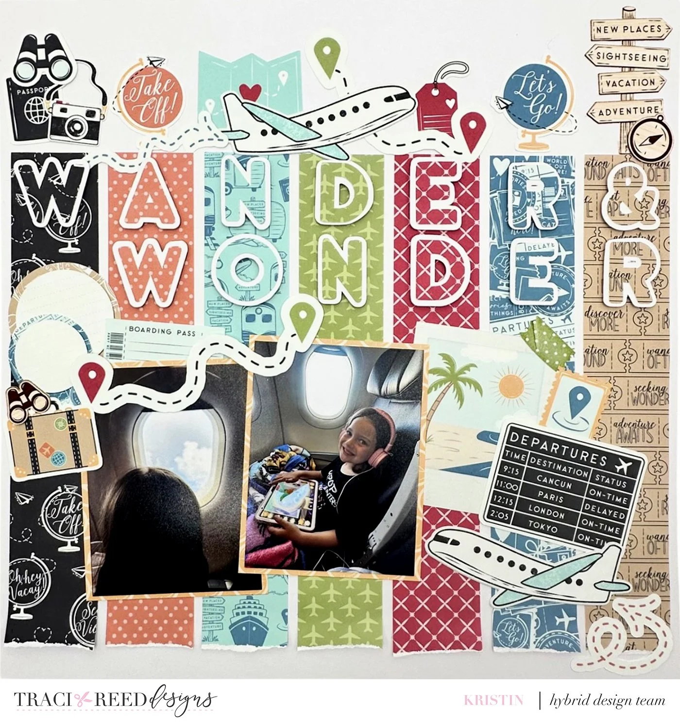
One of my favorite ways to build a scrapbook layout is in a tone-on-tone theme. It is a great way to create an eye-catching page. Layering similar shades of ephemera and papers creates texture, dimension, and cohesiveness of a layout. The title can be tone-on-tone as well and the trick is not allowing it to get lost on the page.
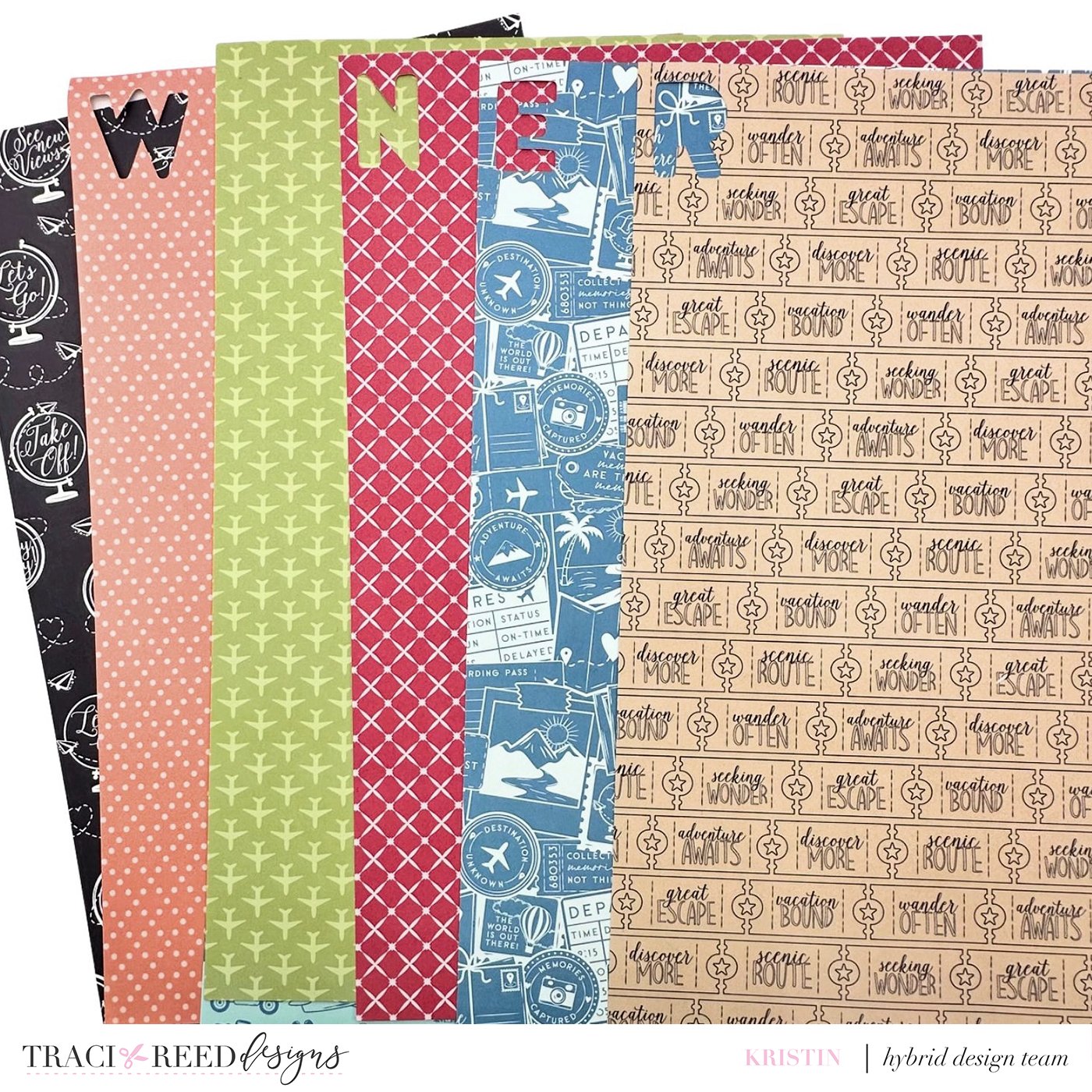
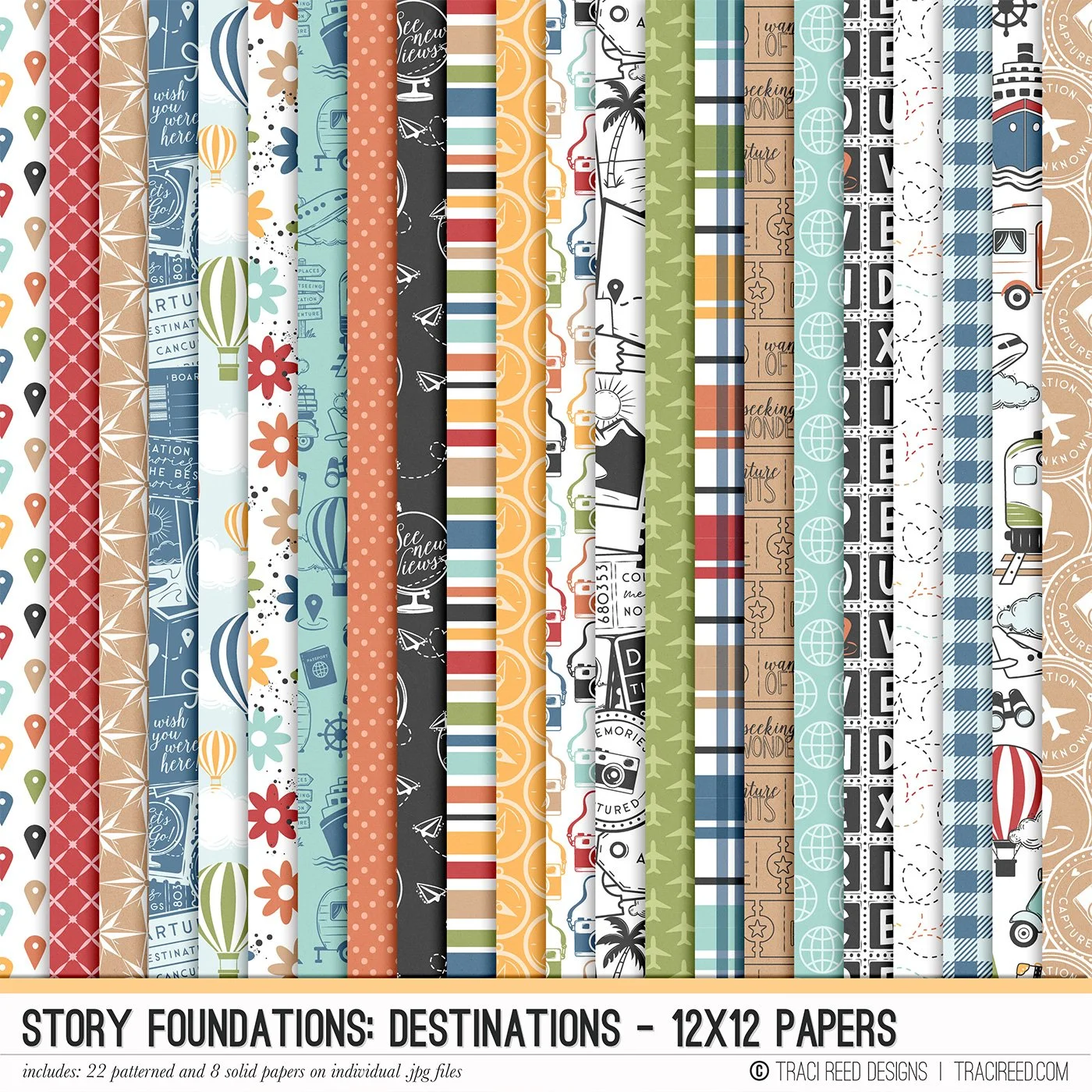
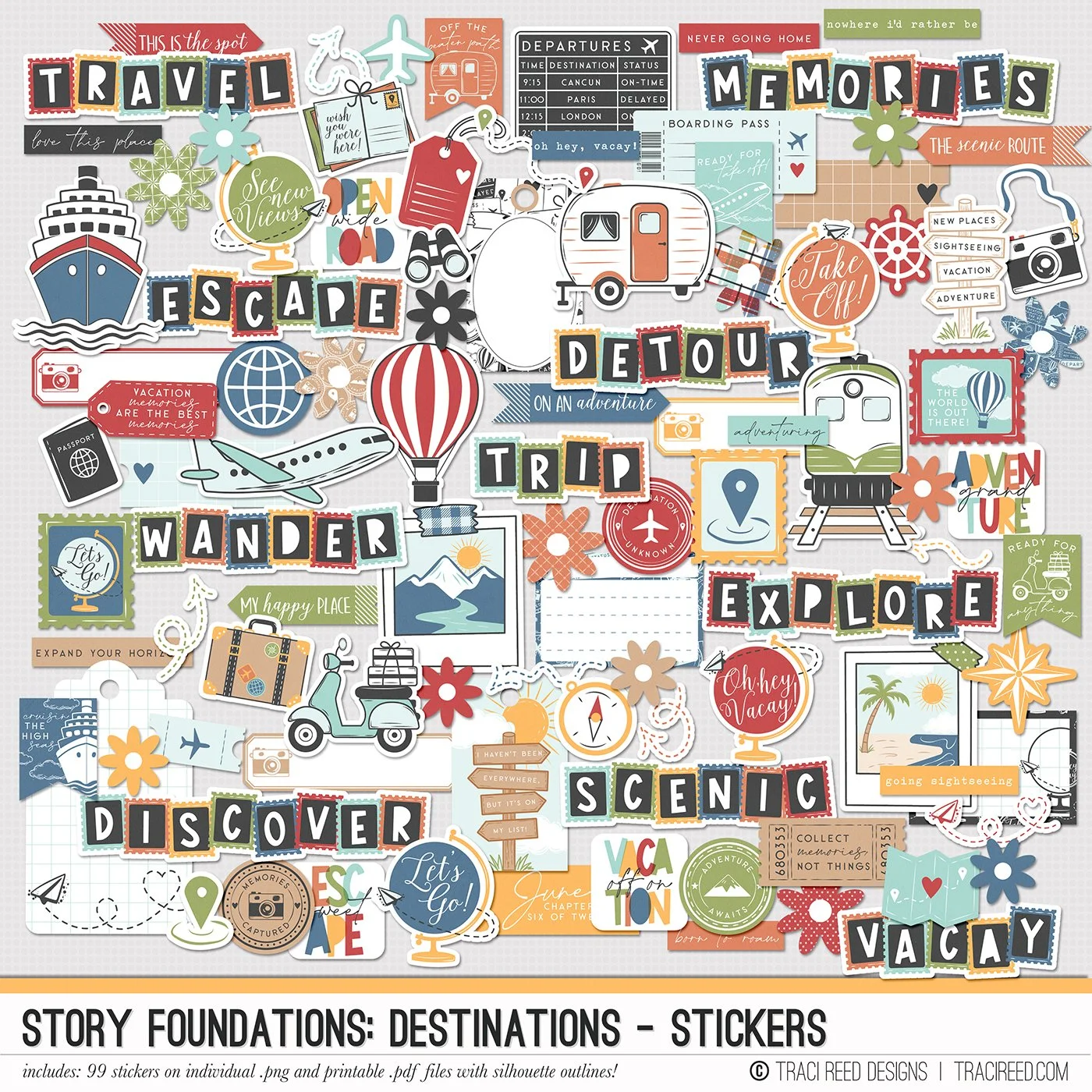
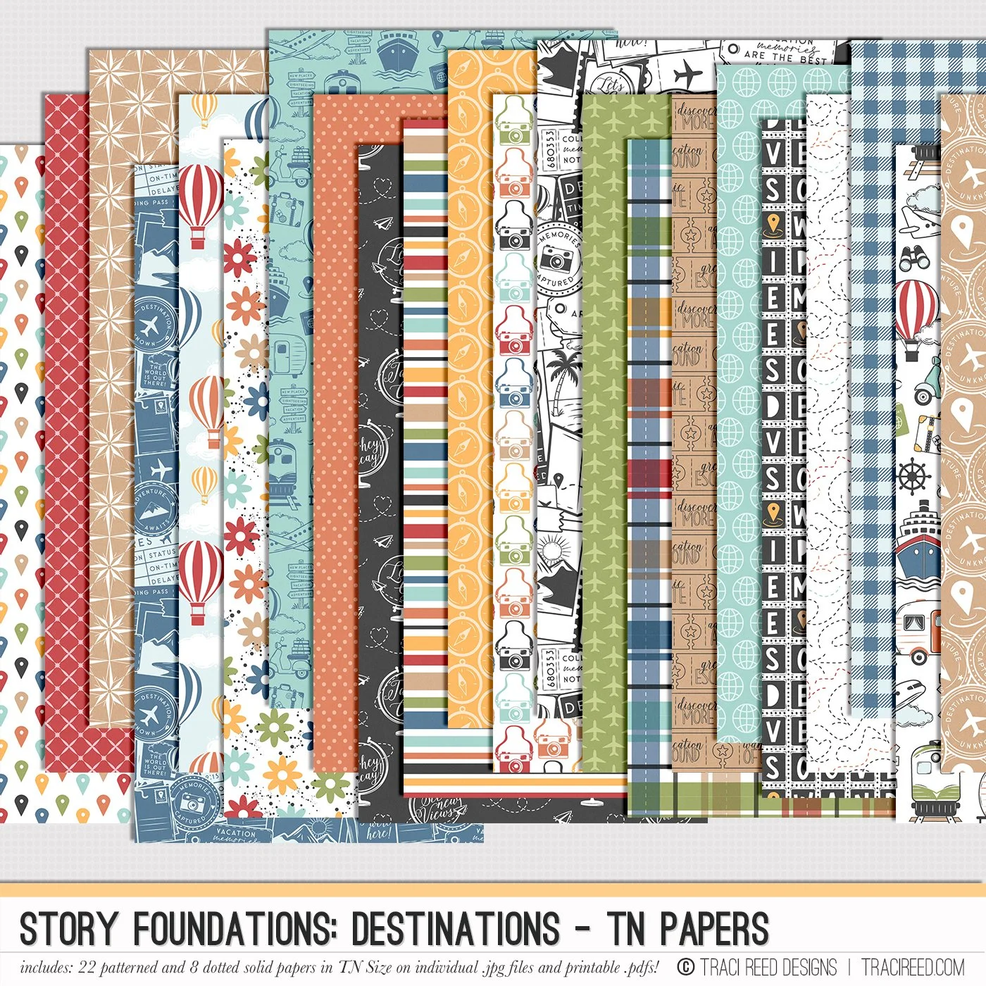
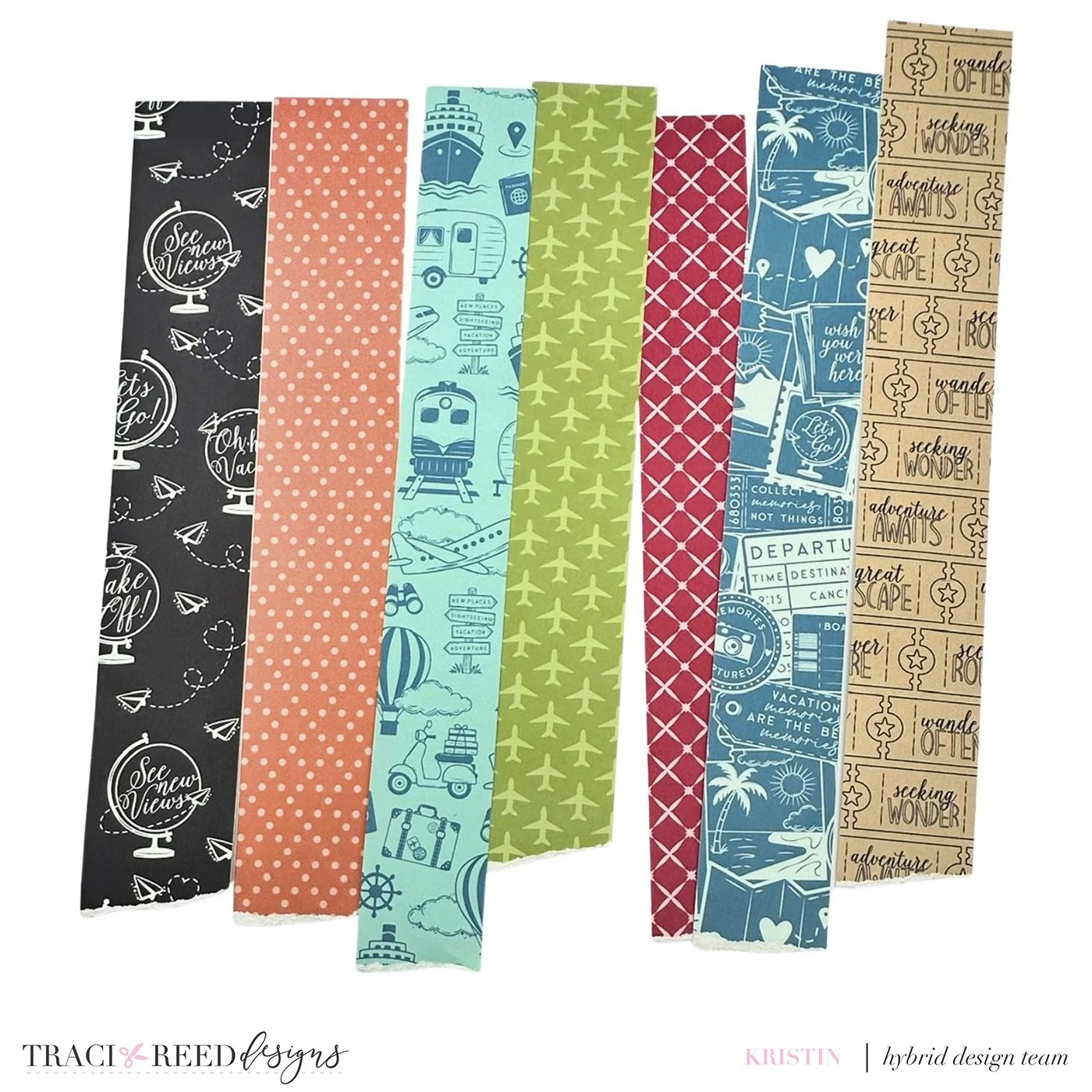
First, I printed off papers from the Story Foundations: Destinations collection that had some pattern to it but I chose papers with less complex patterns so that it wouldn’t be too overwhelming to the eye. I used the alpha set that was in the collection but opted to do a basic cut rather than a print and cut so that I could cut the alphas out in the papers that I had chosen for this layout.
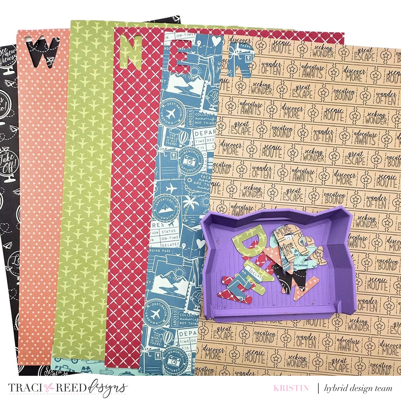
After cutting the alphas out, I then cut the paper into strips and tore the ends of the strips off to give them a more distressed appearance.
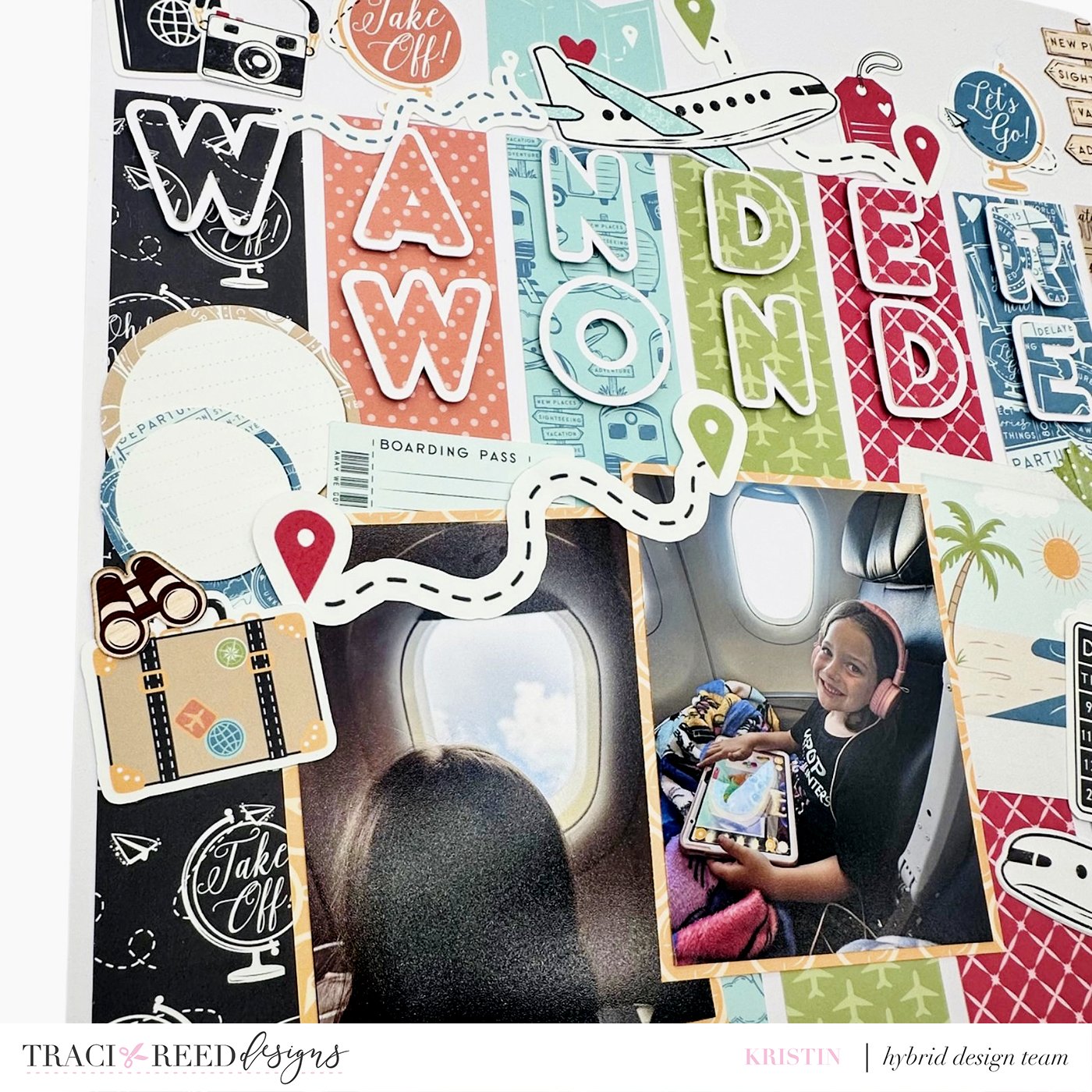
To prevent the alphas from fading into the background, I chose to cut them out with a thin white offset. This ensures that I am still getting that tone-on-tone appearance and also creating a title that still stands out! I then adhered the paper strips to plain white cardstock I had in my stash and added the title to the strips. I left an area of white space above my title area.

In order to create added interest and texture to the title, I chose ephemera from the collection that would continue the tone-on-tone theme and added them to the white space above the title. This really helps to draw your eye to the title.

To complete the layout, I added my photographs that I had matted with a yellow patterned paper from the collection and clustered some additional ephemera pieces around the photographs. I chose not to embellish tone-on-tone in this portion of the layout so that your eye would be drawn back down on the page from the title to the photographs.