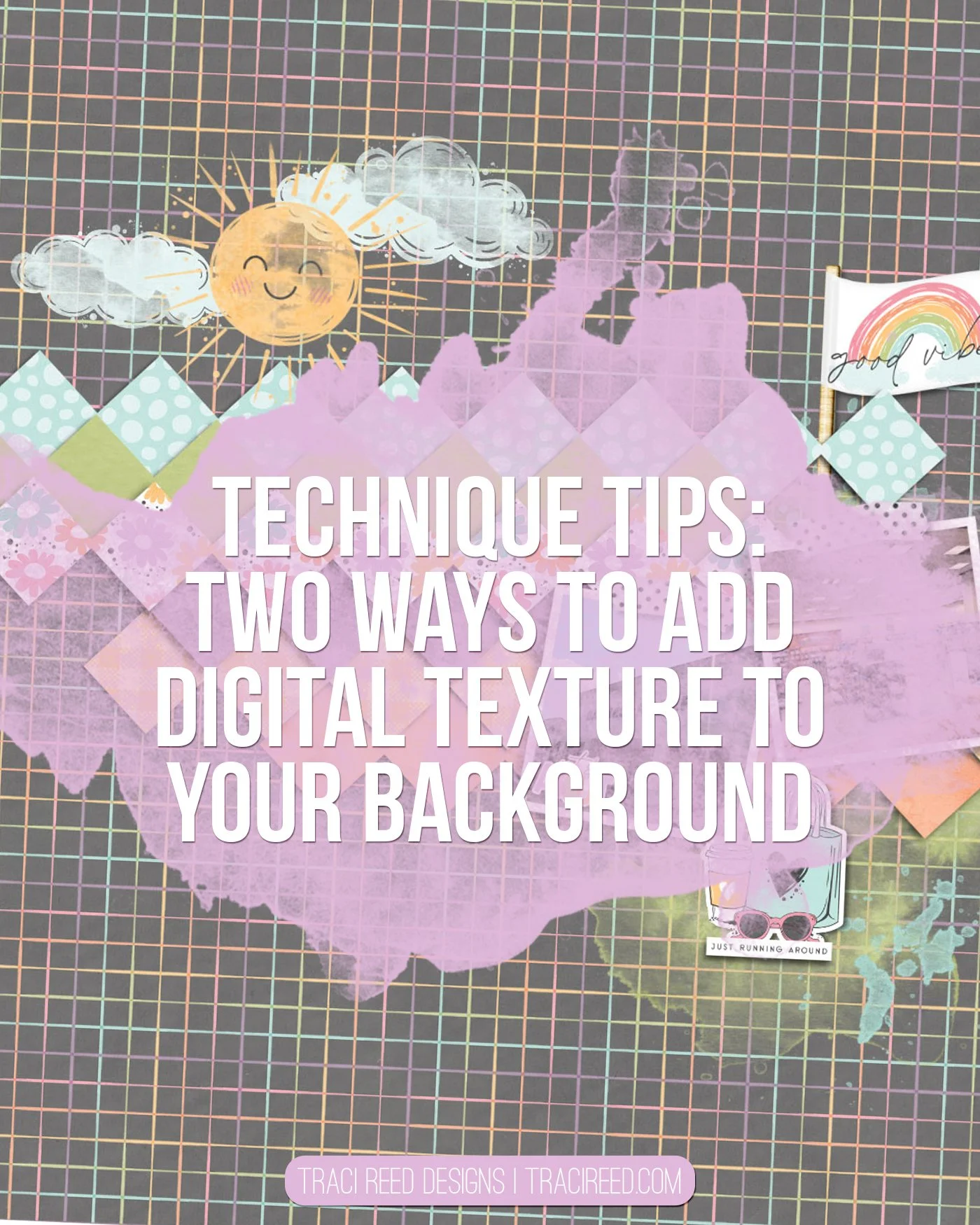
Two Digital Tricks for More Depth with Laura
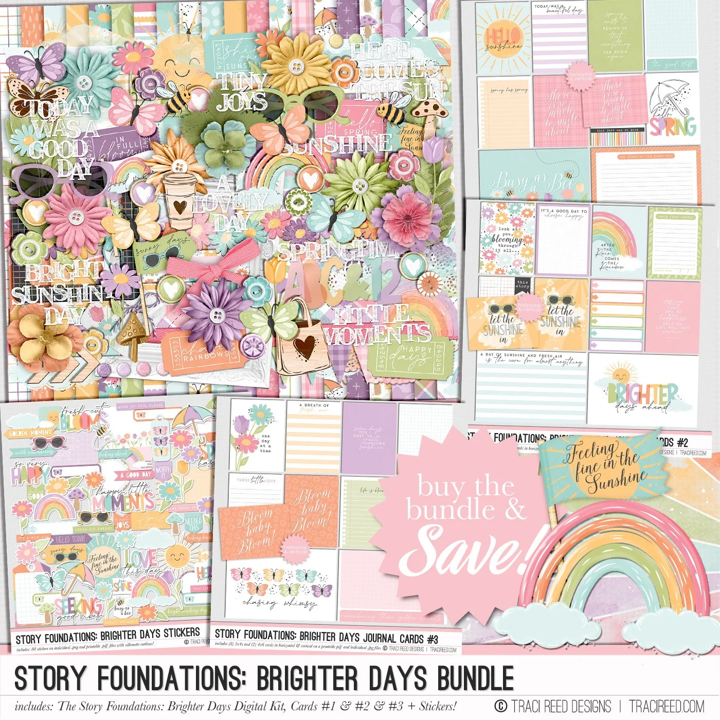
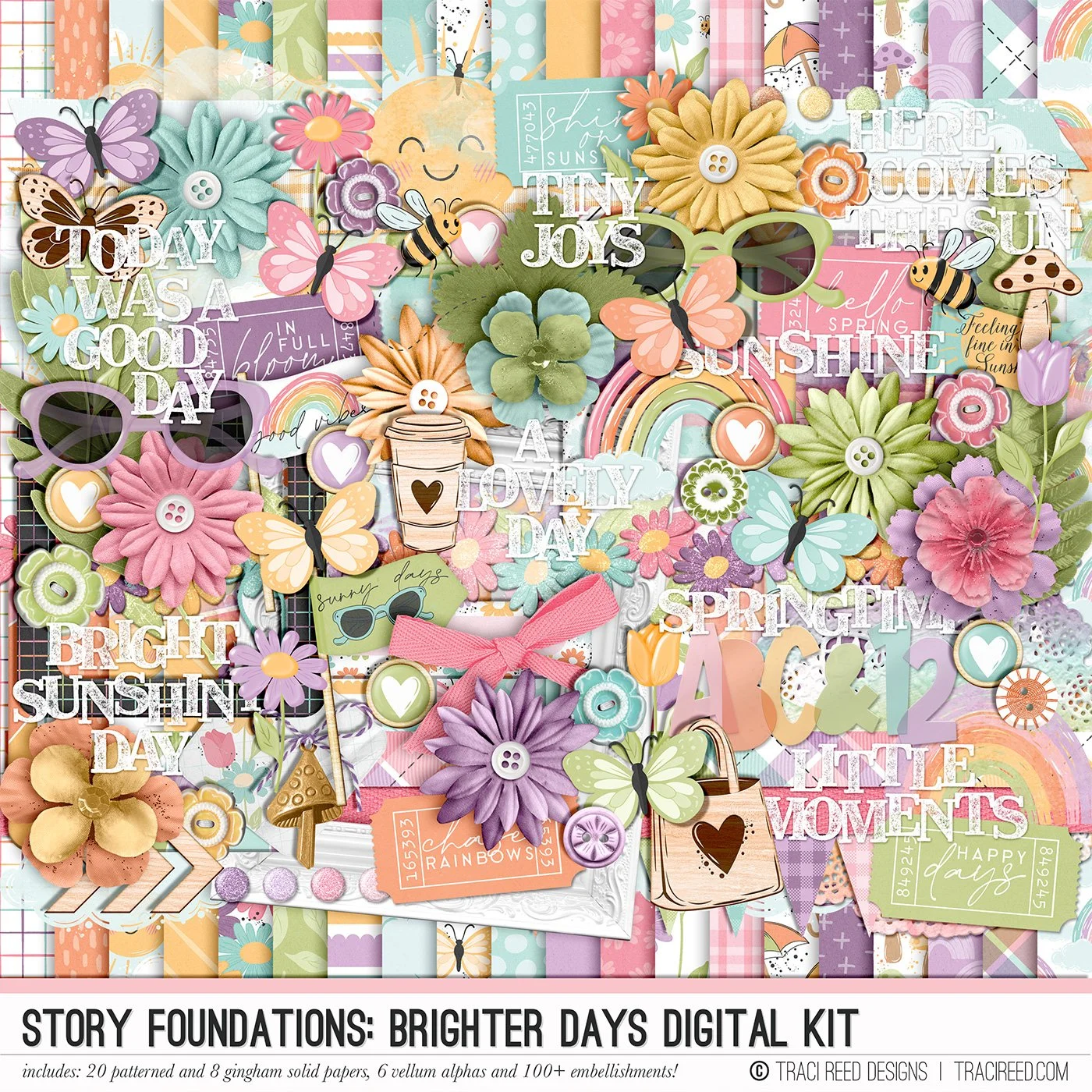
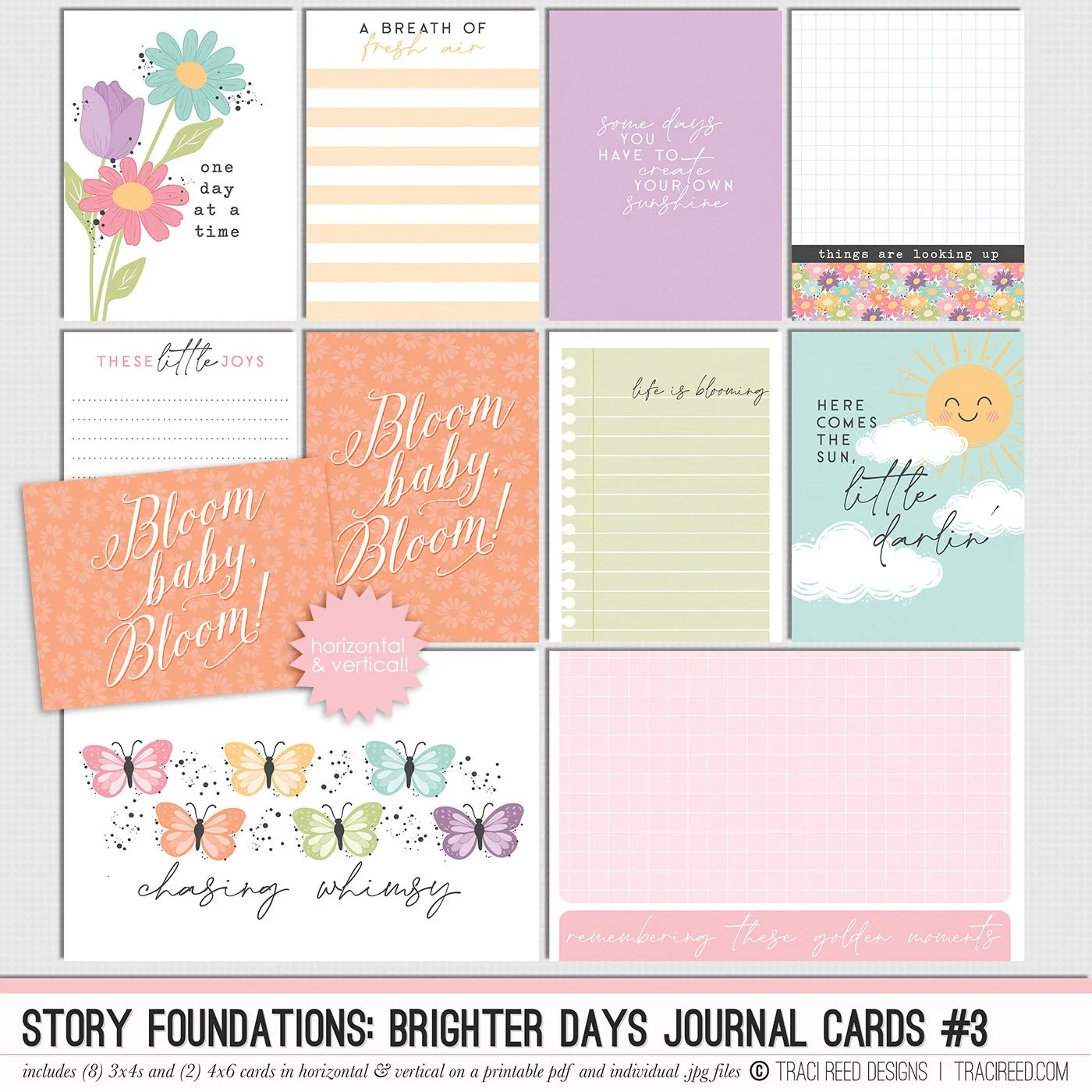
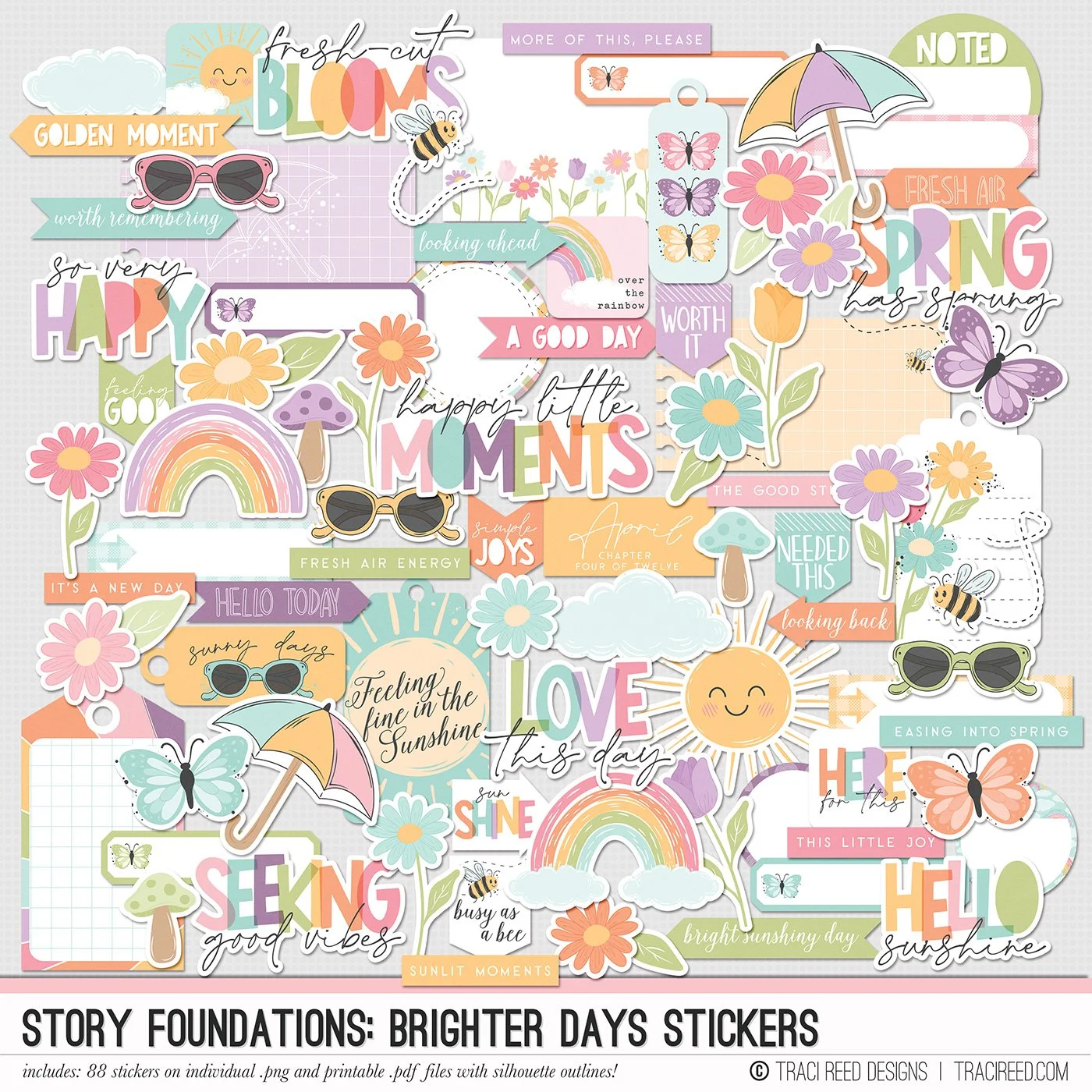
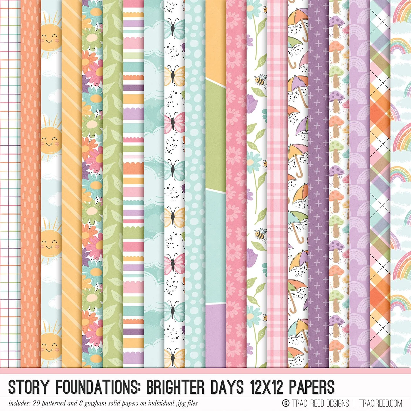
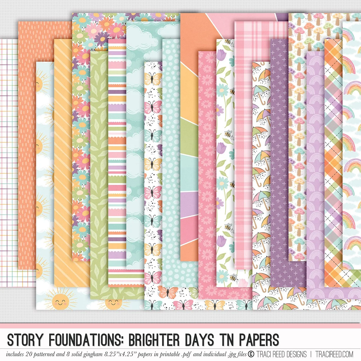
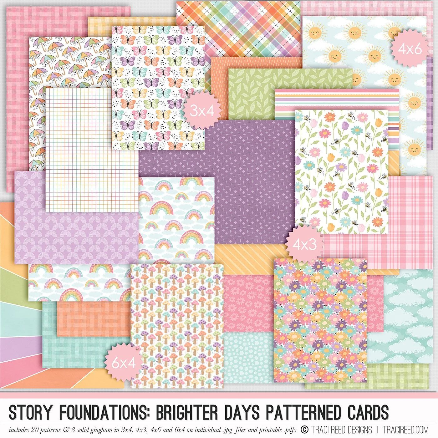
This newest edition to the Story Foundations is so perfect for Spring. It is bright, colorful, and over all happy vibes. For my layout I mixed the Story Foundations: Brighter Days and Out and About.
After 7 months I finally got the great news that my broken foot was healed!!! So after the doctor I took a little trip to Barnes and Noble. It was so nice and weird to be able to walk around without a medical boot on. To be able to peruse around and enjoy the day. So I obviously had to document this day.
When it comes to creating digital layouts I always have two go to things that I do. One is making the background one of the colorful or busy background pattern papers. Then add a vellum overlay. I will often turn the transparency to 50% or a little lower depending on the design and layout. The vellum overlay I use has some texture to it.
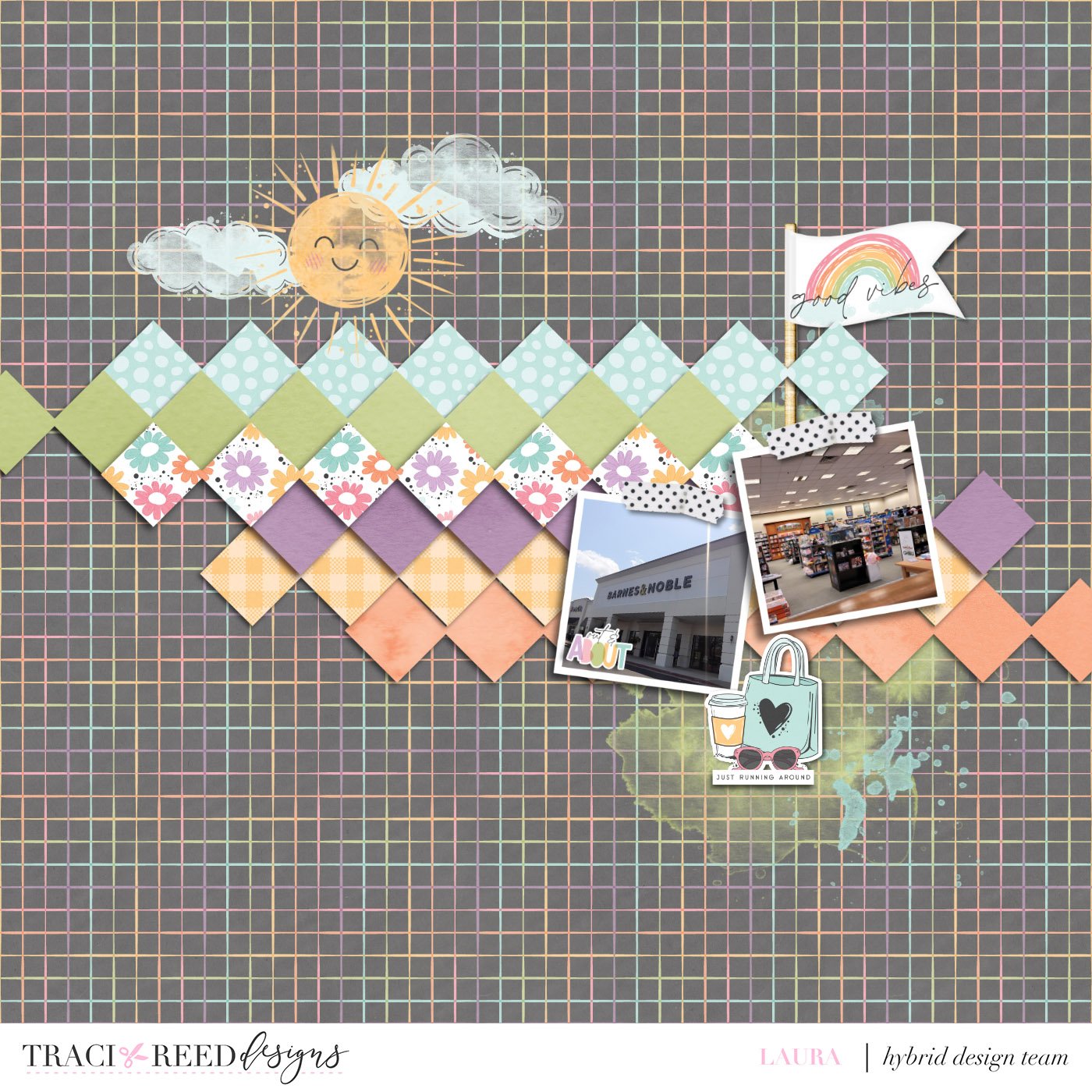
The second go to thing I love to do is find the splatter or the paint transparency’s that often come in collections. These help give an artistic feel and add texture. If I think that the transparency is a little too transparent then I will duplicate it one or two times to help make it show better. Sometimes they are the opposite and I will lower the transparency.
What I love about the Story Foundations collection is that there is something for everyone to be able to document about their day, week, month, or year. It is a great cohesive collection throughout so you are able to mix and match and get a lot more out of a collection.