5 Tips for Multi-Photo Layouts with Traci
When you're documenting a big experience—like a concert, vacation, or milestone—it’s tempting to include all the photos. But fitting multiple images on a single scrapbook page can sometimes feel like a visual overload. The key? Creating a strong sense of flow and intentional design so that your story feels dynamic rather than cluttered.
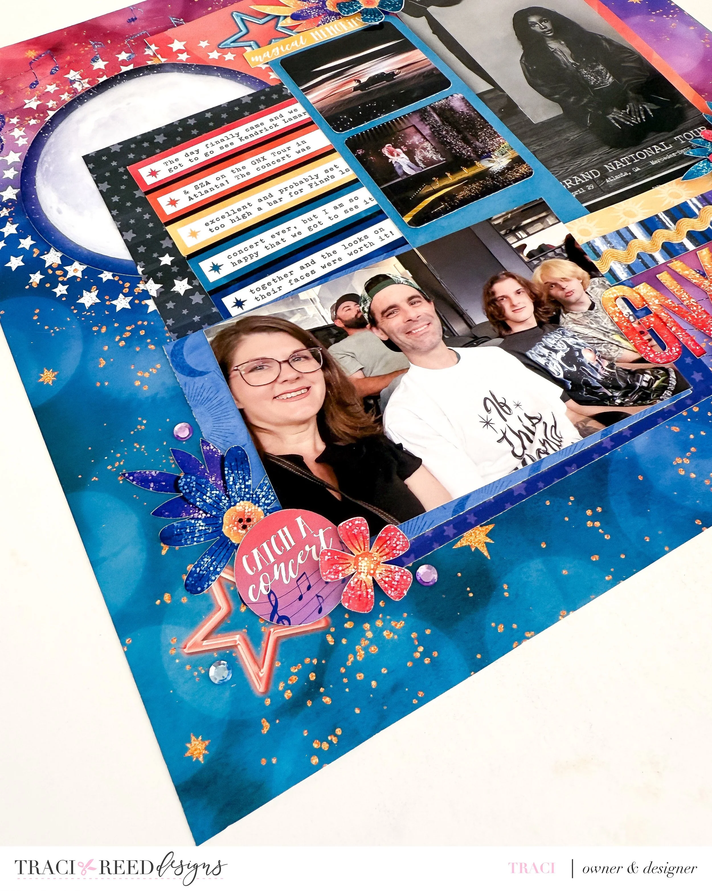
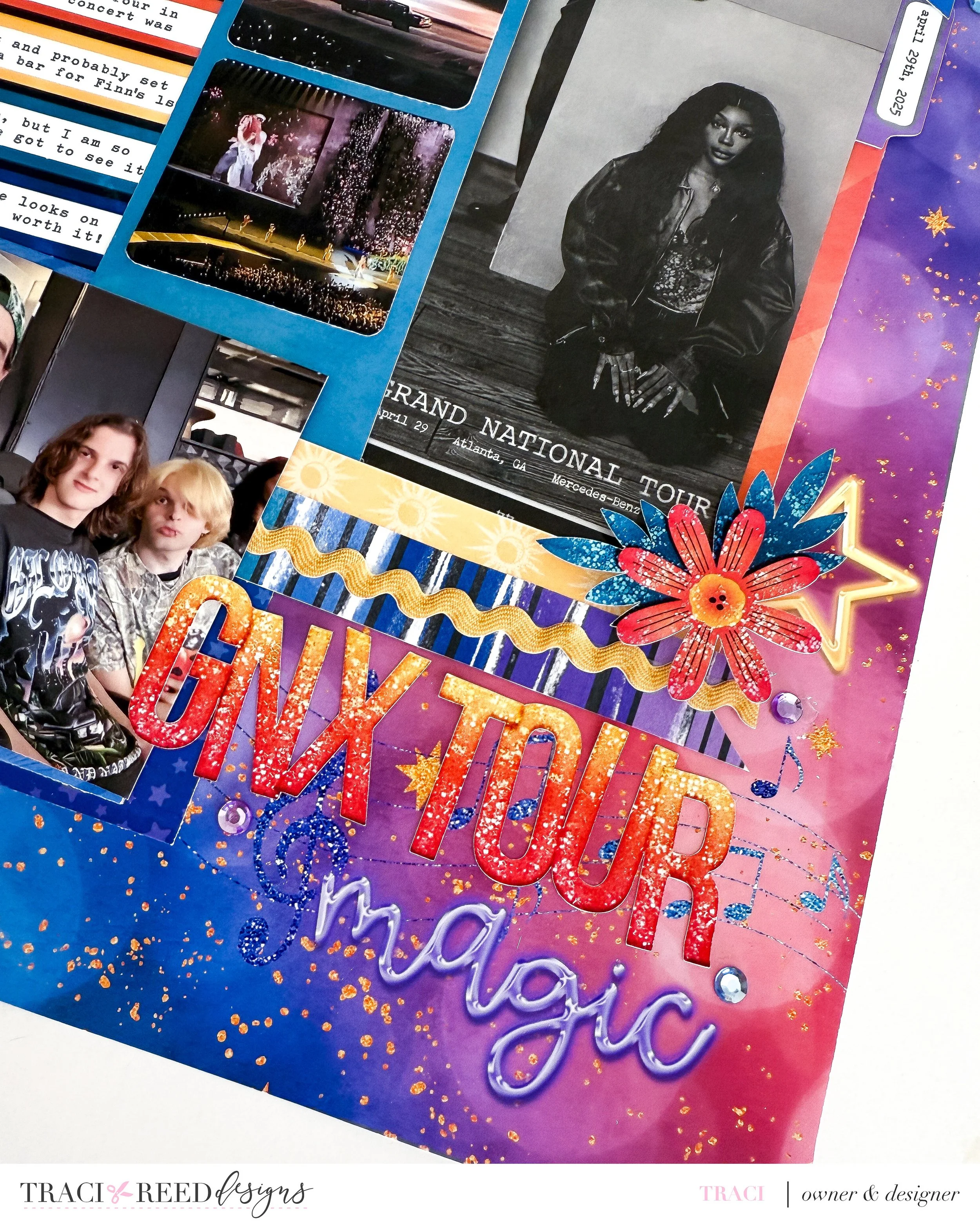
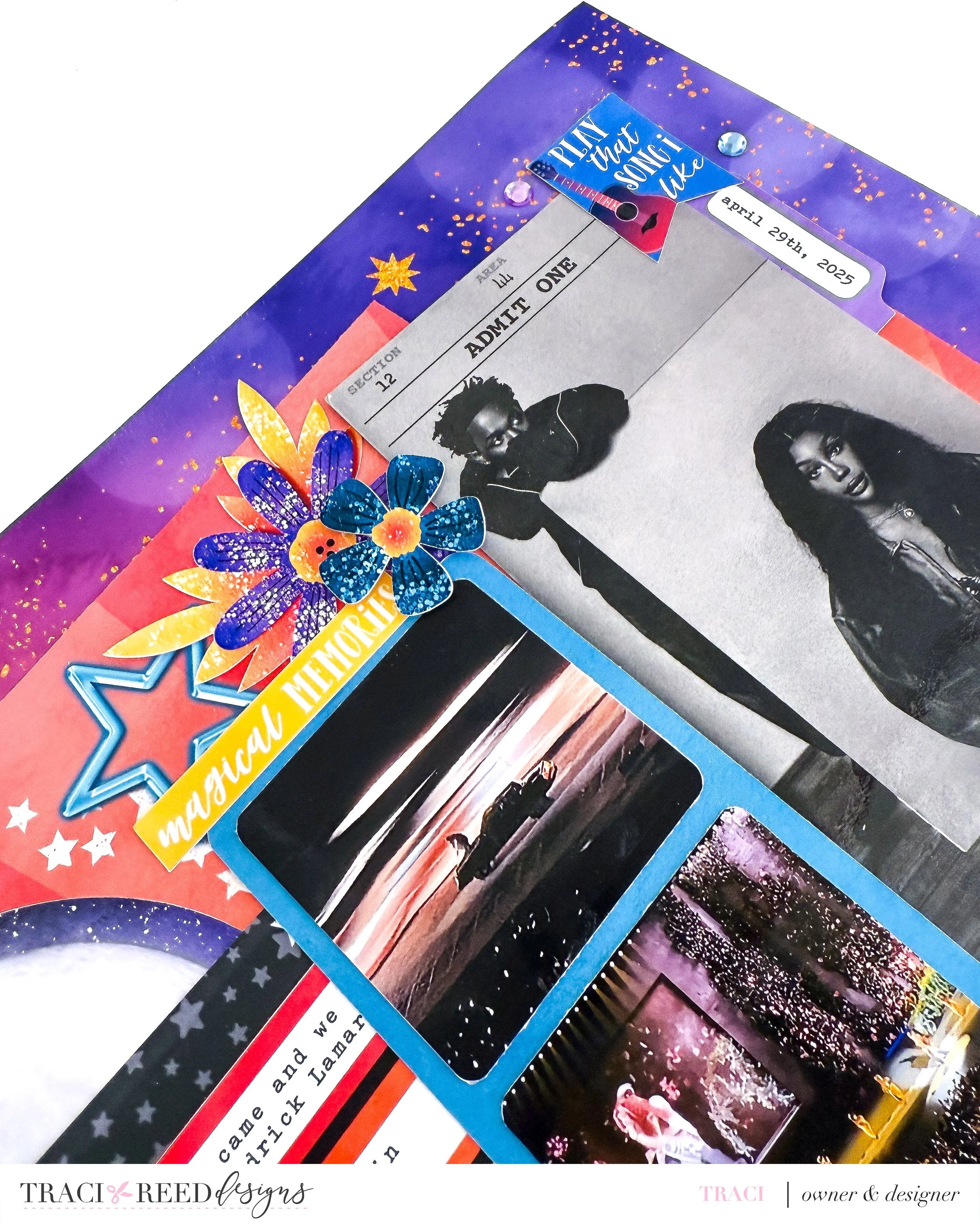
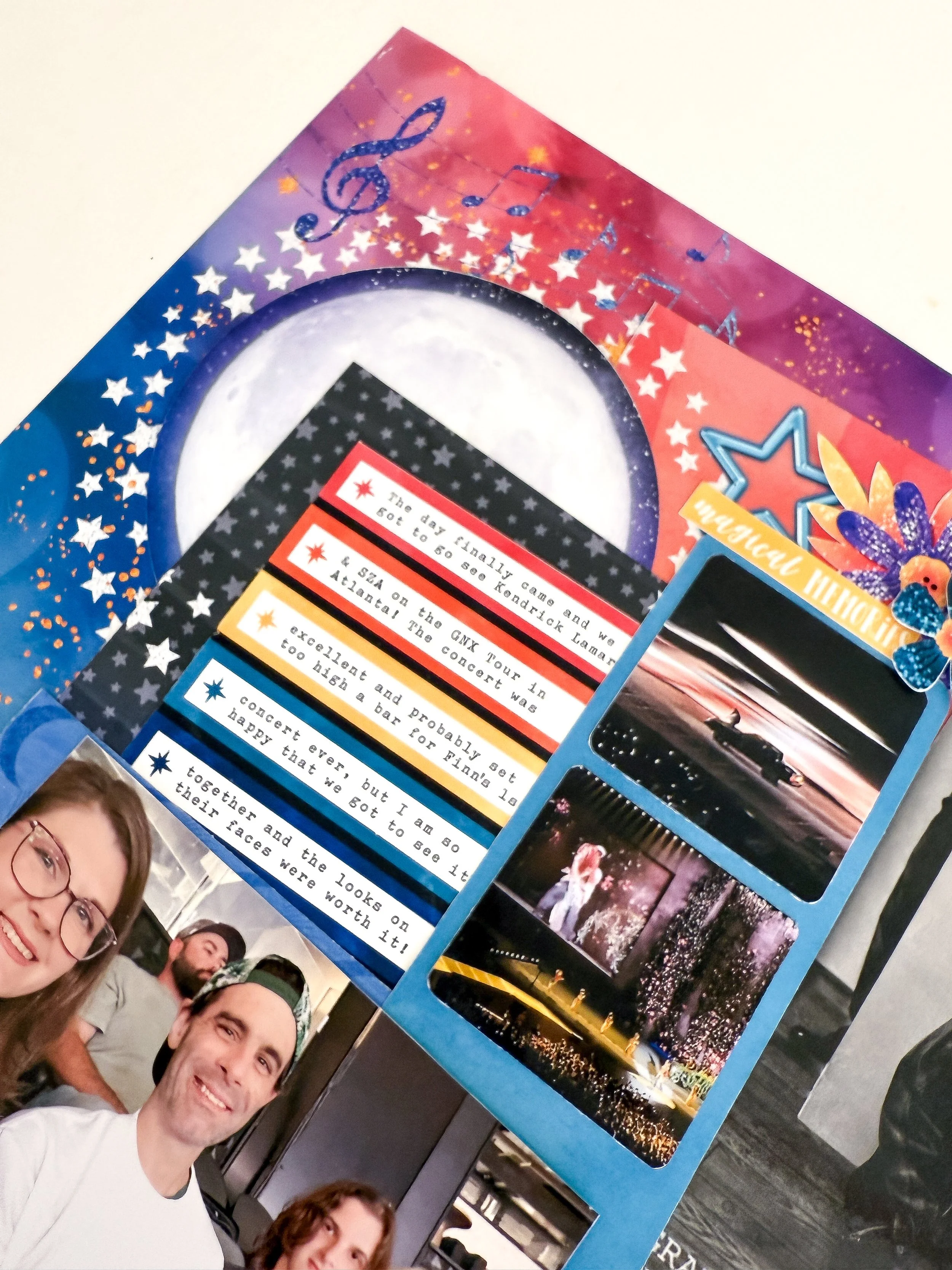
In this layout, I wanted to capture the magic of seeing Kendrick Lamar and SZA on the GNX Tour in Atlanta—a night full of energy, emotion, and unforgettable moments. I had several photos and ephemera I wanted to include: a family selfie, two performance shots, a large “ticket” handed out at the door, and of course, journaling to set the scene. Here’s how I made it all work together:
Anchor with a Focal Point
The large family photo in the bottom left corner acts as the anchor for the layout. I framed it with embellishments and gave it visual weight by placing it over darker, bolder background elements. This draws the eye in first and gives the story a human connection before you move on to the concert imagery.
Use Layers and Shapes to Create Movement
Instead of lining everything up in rows, I layered the smaller square concert photos and ephemera pieces in a loose vertical stack, almost like a filmstrip (with the help of Cindy’s Creative Clusters.) The circular moon element and flow of musical notes also help the viewer’s eye travel from left to right and back again—adding movement and energy to the story.
Let Color Guide the Story
I kept the background vibrant and cosmic to reflect the epic feel of the show, but I repeated the same deep blues, purples, and pops of orange and pink throughout the page. This helped unify all the individual elements, even though they’re varied in size and subject matter.
Embrace Dimensional Embellishments
Clusters of stars, florals, and layered labels add depth and interest without overwhelming the photos. Strategic placement of embellishments—especially around the corners of photos—helped me frame key images and transition the eye naturally to the next part of the story.
Journal with Purpose
I broke my journaling into sections using the colored labels on the journal card that echo the starry background and add rhythm to the page. This choice gave the text visual presence without taking over the design and made it easy to share multiple moments and impressions from the night.
If you have a bunch of photos you want to include on a layout, don’t be afraid to go for it—just remember to anchor your story, guide the eye, and let your design elements do the heavy lifting. The result can feel just as immersive as the experience itself.


