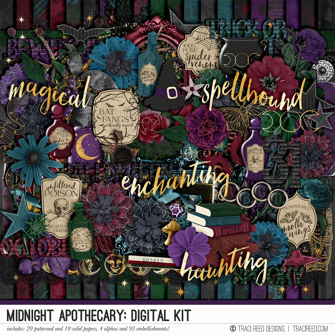
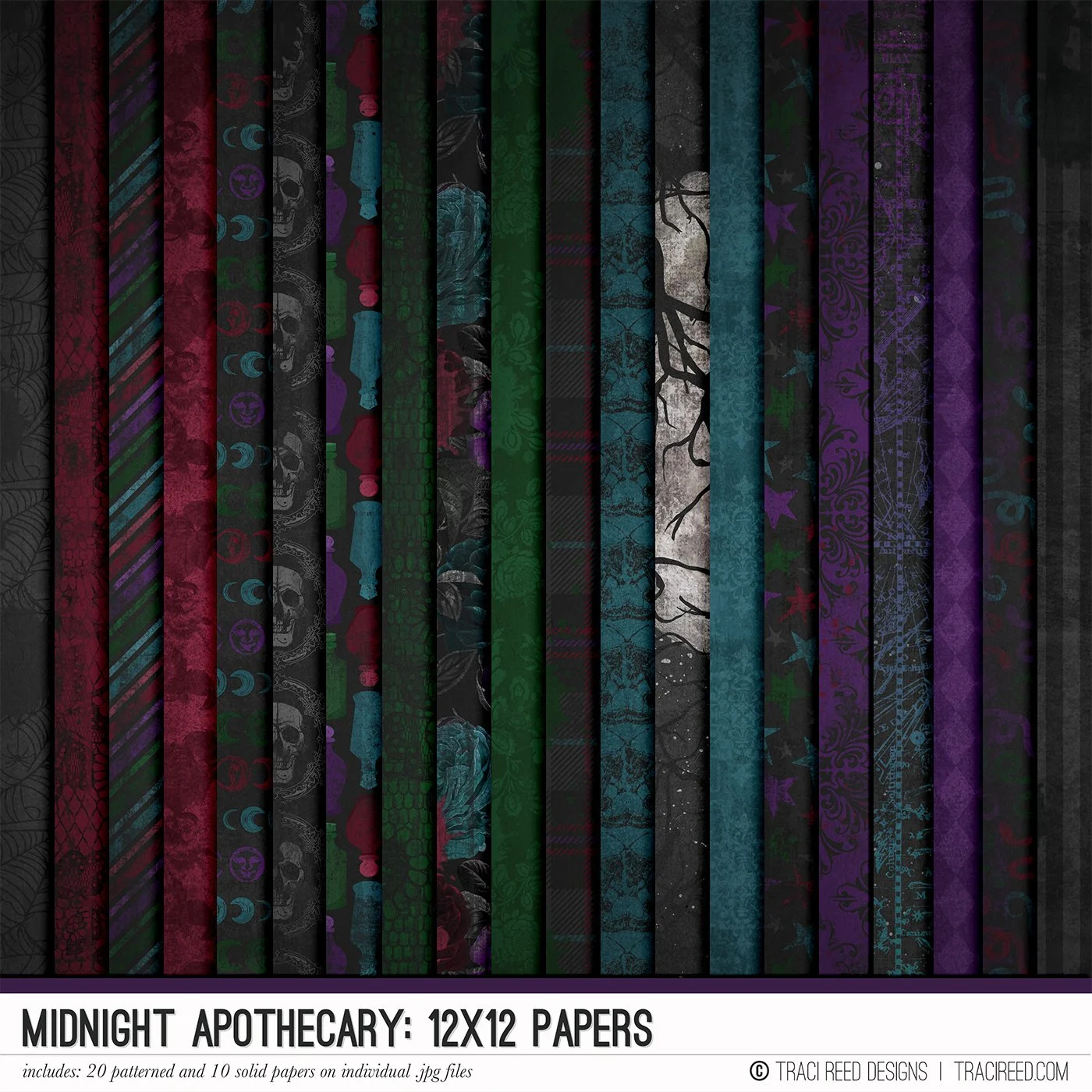
Creating a White-Space Layout with the Midnight Apothecary Collection
My scrapbooking style is clean, and I like lots of white space, I think it relaxes the eye and enhances the papers and photos.
With that in mind, since the beautiful Midnight Apothecary collection has darker colors, I thought of a more centered layout, with a bit of mixed media and embellishment, but plnty of white.
I used stampers ink and the package technique to create a black background, followed by some splashes of red ink.
This 2-page layout is a great example of how the Midnight Apothecary collection can bring a story to life across a bigger canvas. The moody papers set the backdrop, and layering them side by side makes the spread feel cohesive but still full of variety. Each side works on its own, but together they tell a complete story.


It turned out nice, but I wasn't satisfied; I thought it would be too white for a Halloween layout. I still didn't know what to do to improve it, but the collection itself provided the solution!

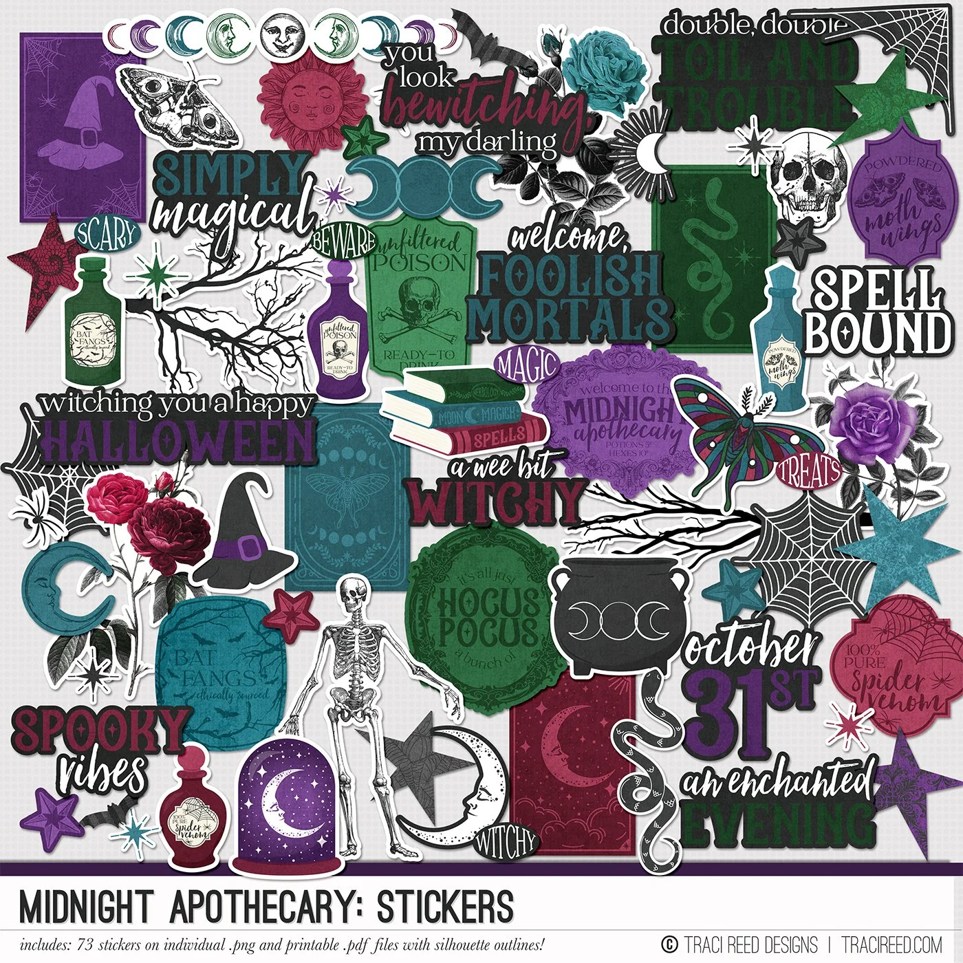
While choosing the stickers that best matched my project, I spotted the spider web in the corner and was inspired! I printed it in two sizes (I love this advantage of digital collections: we can print in different sizes and as many times as we want!) and ended up using both.

I couldn't resist adding some hanging spiders!

So, sometimes, when the project is stagnant, all you have to do is look at your own collection and inspiration may come!