Festive Color Challenge Using Make Merry with Shayla
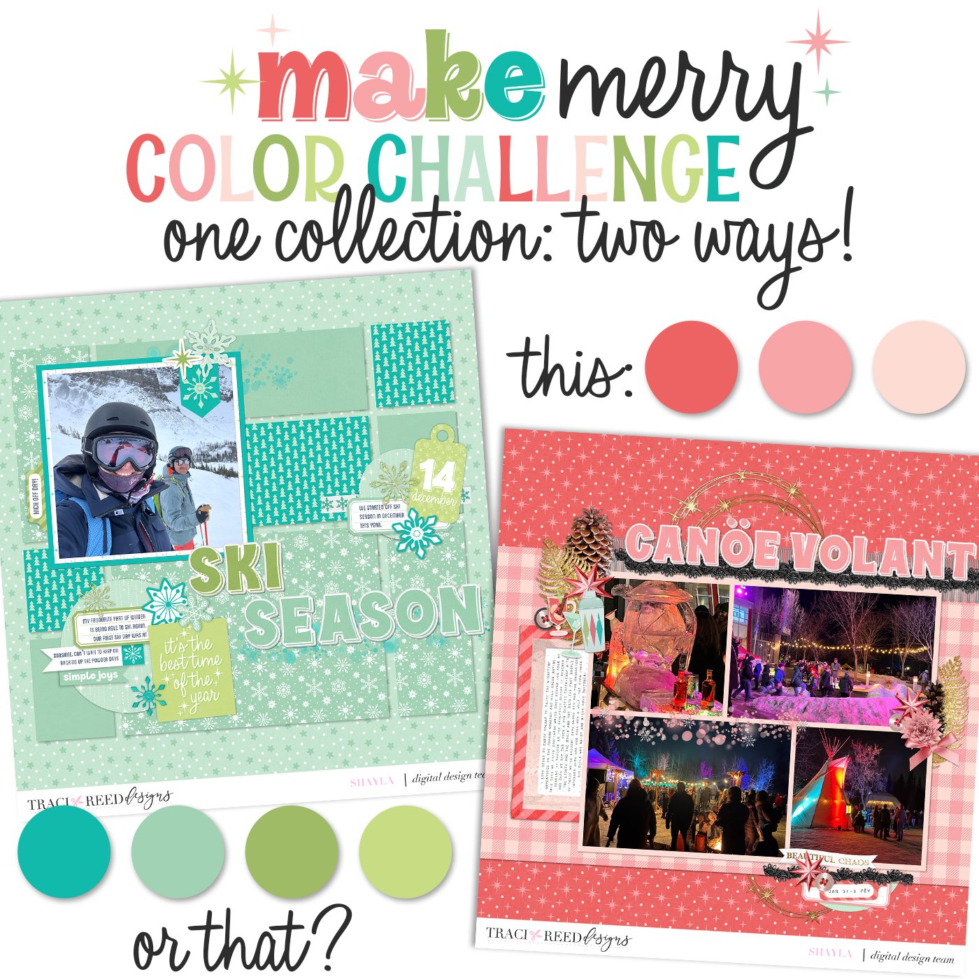
Hello friends! With darker days and winter approaching most of us tend to hunker down and try to create a cozy vibe. Whether you want to call it ambience, atmosphere, or vibes that curation is important to keep our minds bright. Together we’re going to explore how to recreate those same impressions on our scrapbook layouts by focusing on the colour palettes we use.
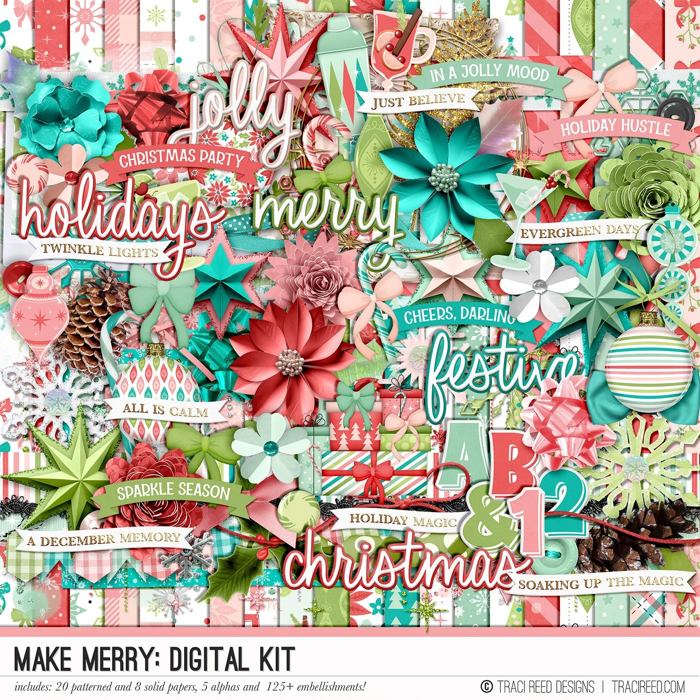
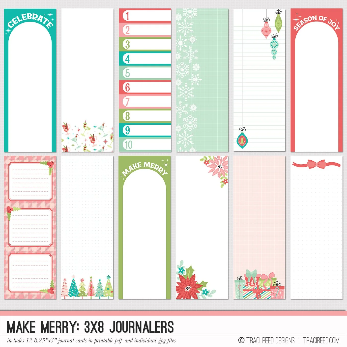
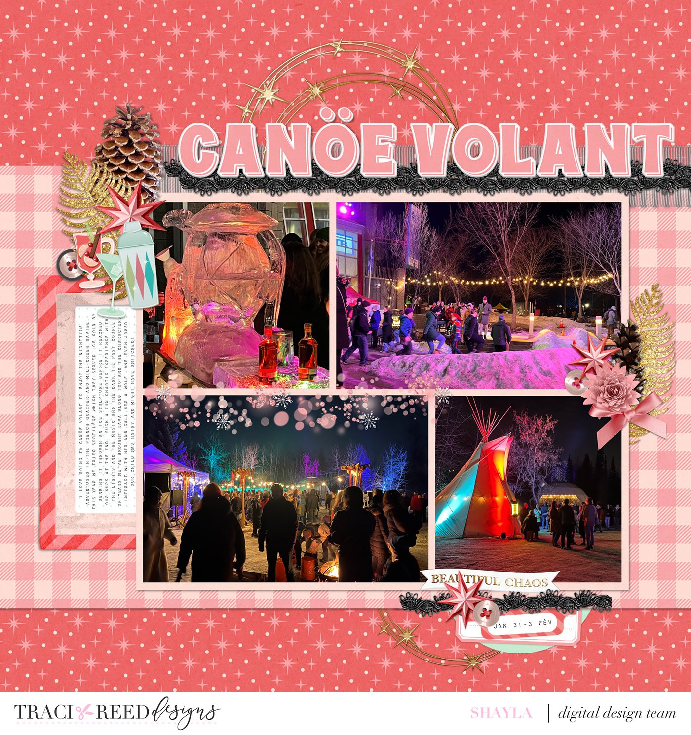
I’ve got two examples of layouts with very different moods made with the same scrapbooking collection, Make Merry: one is a layout documenting the first day of ski season, while my second is a layout capturing the chaotic memories of my favourite early February outdoor festival. For both layouts I’ve kept with very tight colour palettes to bring across a specific feeling.
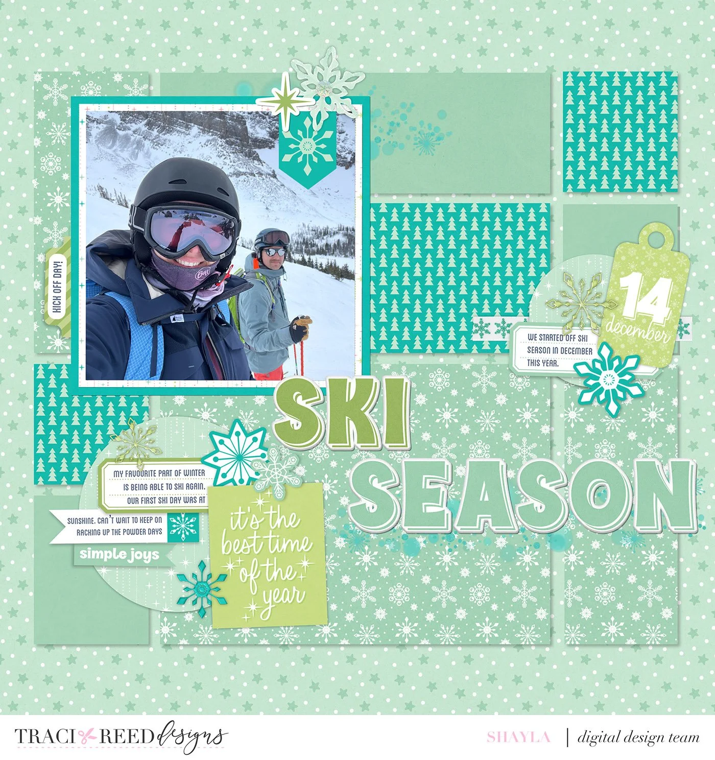
When I think of ski season I think of cool tones and bright whites, definitely snowflakes, and of course I think of evergreen trees. Make Merry has all of that and more! I started by selecting my base papers. I kept to mostly light blue patterns and solids but I wanted the sense of fun to come across so I added in a bright pop with the teal evergreen pattern. For visual interest I added in the third colour of light green and I began spreading my colour palette around the page using layered embellishments. My finishing touches were the ink splatters under my title and photo, along with adding a gem-like snowflake to each of my embellishment clusters. This layout certainly reads as fun in the snow now!
This next layout is a total switch to party mood. Each year, the city’s French Quarter hosts a Métis festival at the beginning of February. The vibes are music, a riot of lights and colour, good food, and celebration. This festival makes me feel all warm and fuzzy inside, even though it often takes place during some of our coldest deep freezes. I chose to use all pink-toned papers to bring across the warmth. The gold gilded embellishments and folded paper stars also speak to the celebration atmosphere. In order to ground the dark nighttime photos, I used the black ribbon, dark brown pinecones, and black button in my clusters. Of course, I couldn’t resist an opportunity to use some of the adorable cocktail embellishments on this layout. I placed them in the cluster next to my photo of the Sortilège booth (it’s a Canadian maple syrup whiskey). I also thought the “Beautiful Chaos” word ribbon was extremely fitting to finish off this fête layout.
As you scrapbook your holiday and winter layouts this season I encourage you to think about the ambience you experienced in the moment and try to link it to colours that would help tell your story and bring back the mood every time you or your loved ones look back over the finished scrapbook pages. Happy crafting!