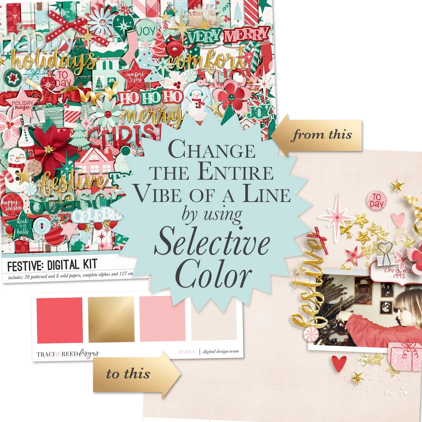
Narrow Down a Festive Palette for More Impact with Hanna
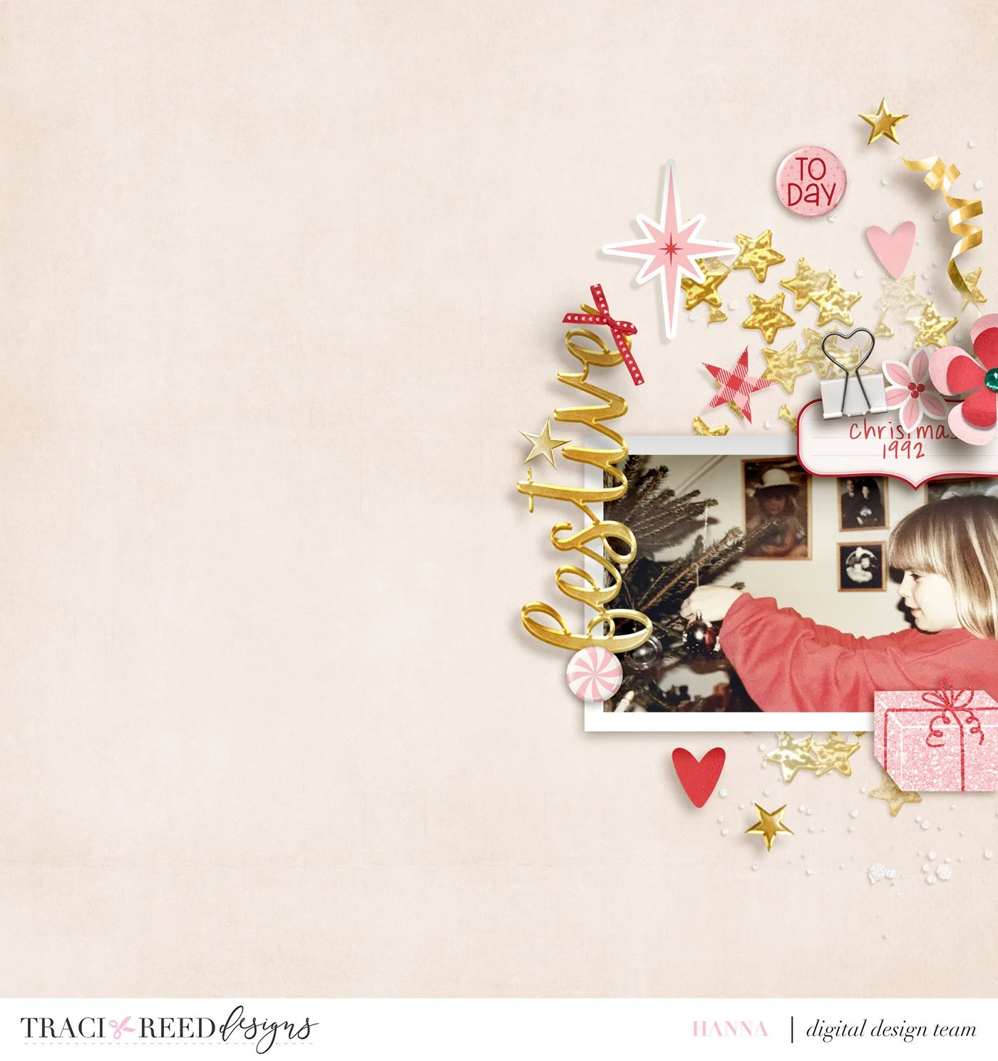
During these very busy times with it being the holidays, you might not have a whole lot of time to scrap. I’m staying with my parents for a couple of days, and we’ve been going through some boxes with old photos. I came across this photo of me in a pink sweater, decorating the Christmas tree.
I love the vintage feel with the soft colors. So, for this layout, I want the focus to be on this single photo, and I love to match colors with it. I went through my stash and landed on the Festive collection:
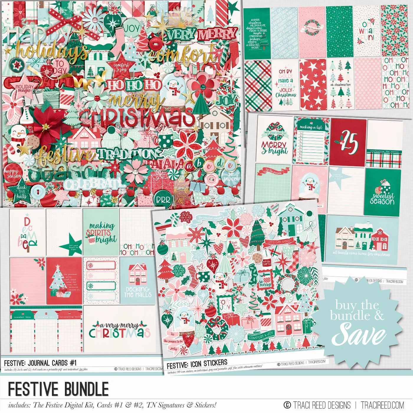
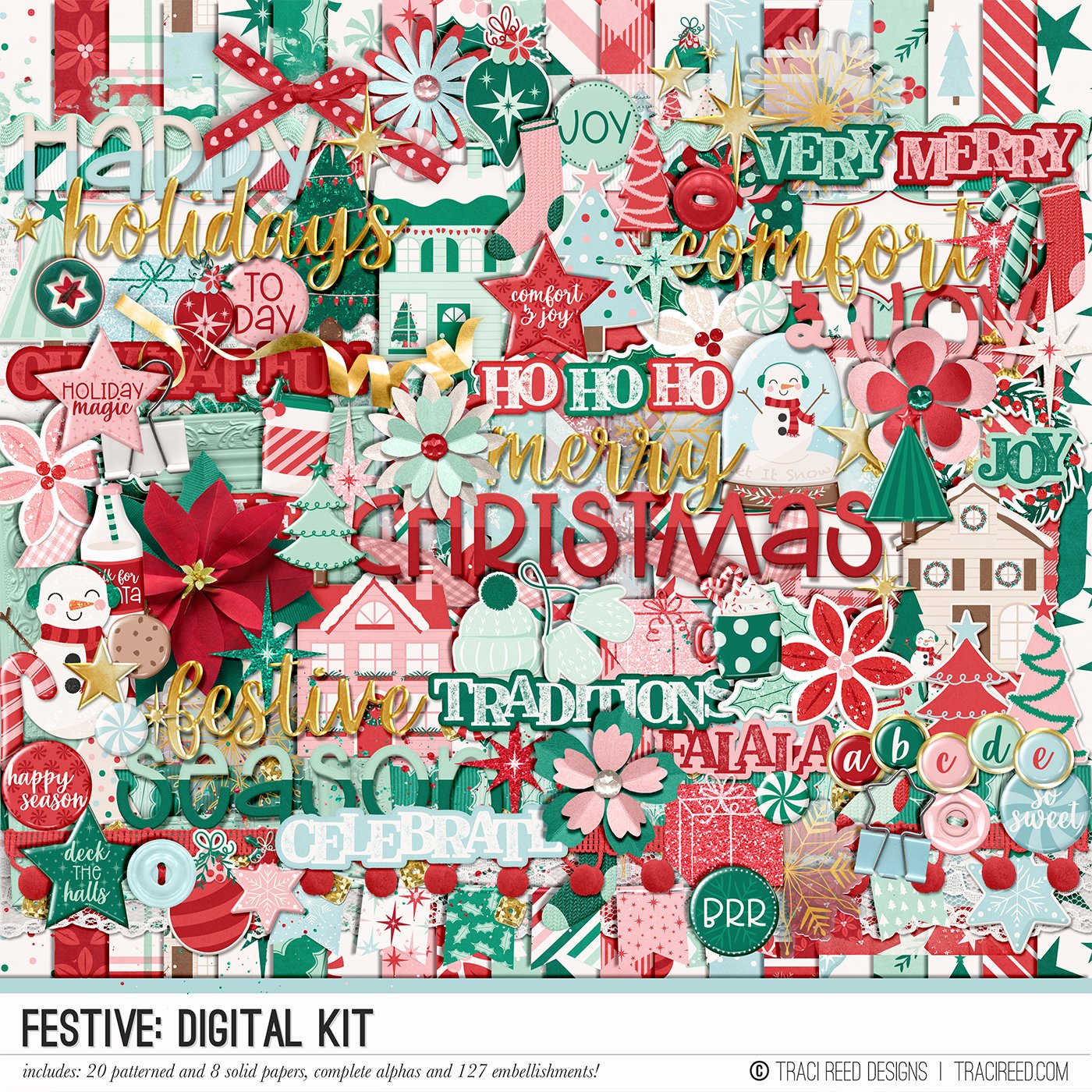
Sleigh your scrapbooking game with my newest holiday collection: Festive! Picture this: cozy vibes, warm hues of cranberry and evergreen, a sprinkle of cotton candy pink and mint, and let's not forget the touch of sky blue to make it pop!
This EXTRA LARGE collection is packed with all the good stuff – cute Christmas trees, jolly snowmen, festive ornaments, hot chocolate that's practically a hug in a mug, candy canes for that extra sweetness, and the whole holiday gang including wreaths, poinsettias, stars, and charming little houses.
Wrap up your holiday memories in this cozy and fun vibe – it's like giving your scrapbook a festive sweater! So, get ready to dive into the cozy chaos of the holidays and make your memories shine bright. Let the scrapbooking magic begin!
Check out the full collection, unboxing, and example layouts on the blog!
BUNDLE INCLUDES:
Festive Digital Kit, Cards #1 & #2 Icon Stickers , and TN Signatures!
BUNDLE DOES NOT INCLUDE:
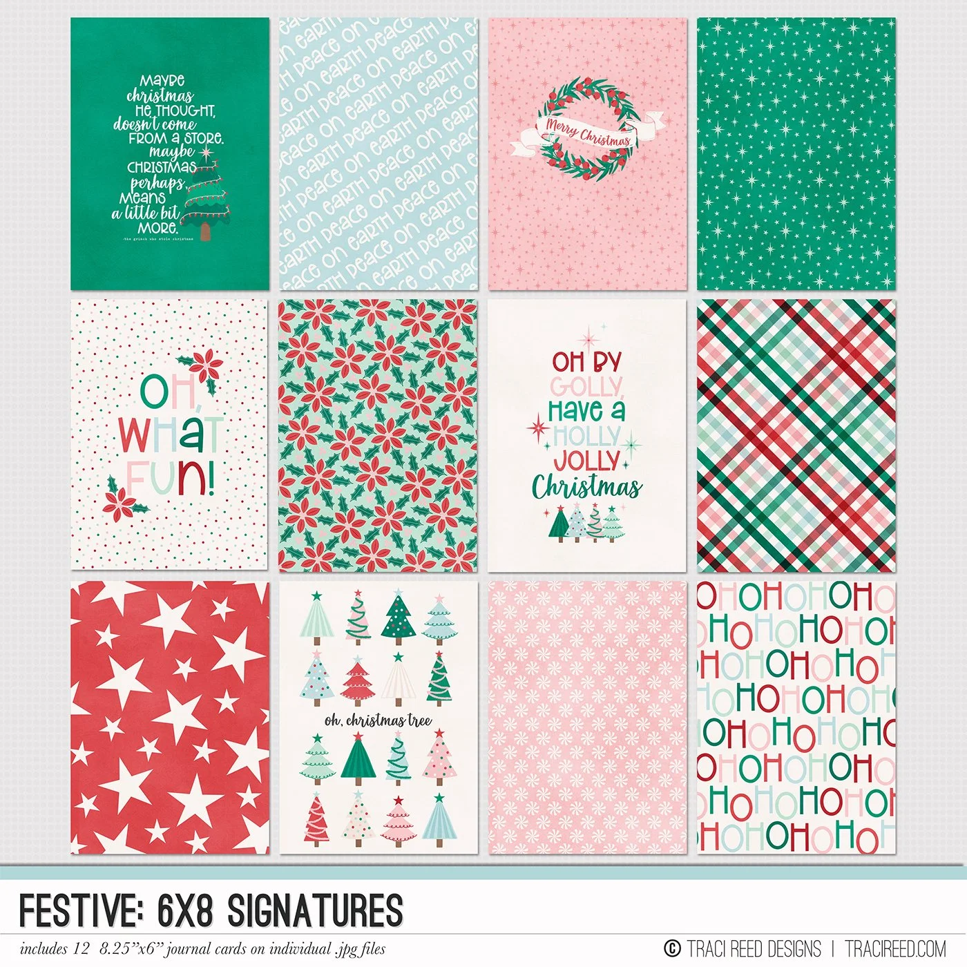
Festive 3×8 Journalers, Festive 6×8 Signatures, Festive Christmas Tree album, Festive Currently Tags, Festive Patterned Cards, Festive Chipboard Alphas, Festive TN Journalers, or Festive TN & 6×8 Papers!
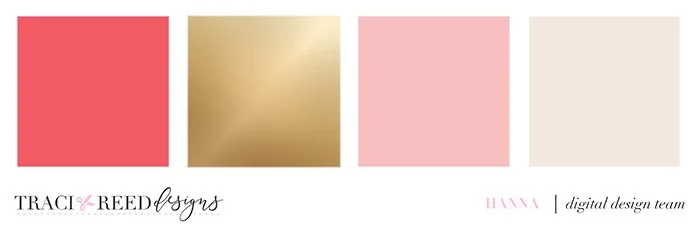
And focused my layout on the colors pink, cream, red and a touch of gold to create a warm and festive feeling and these complement my photo. I select all the ellies in these colors and then start to build the layout.
I edited the photo to lighten it and make it feel even more vintage. I chose a cream background without patterns to have room for the photo to breathe. I then added a rubon stamp and scattered some other elements over it like stars and hearts. A curled ribbon really feels festive, and I added a blingy present too.
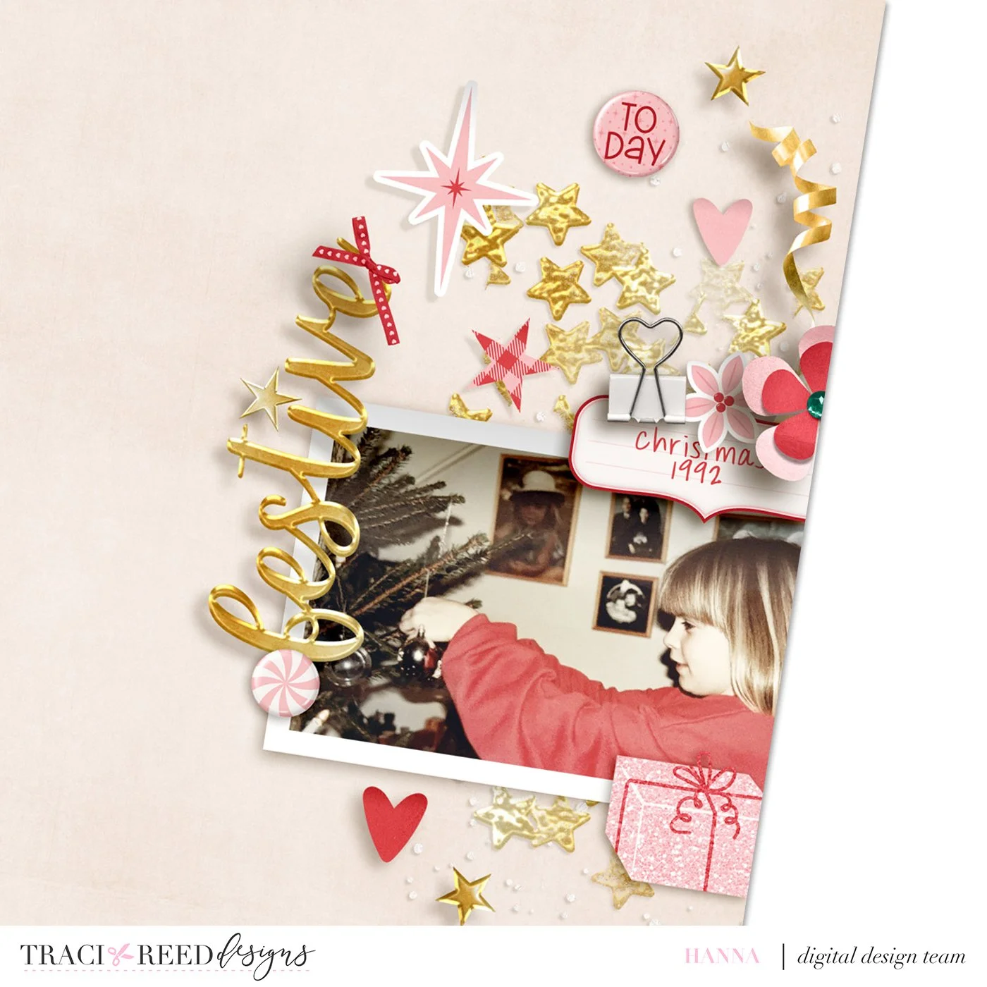
I made a small cluster with a clip to put on top of the photo, so I have some place to add a year or date and I put a ribbon on the title to give it extra dimension. I also love to place everything on one side of the page when I use white space, so it really draws the focus. I’m not a big fan of journaling and since this photo is pretty self-explanatory, I only put the year on it to finish the layout. There you go, a single photo that draws in the eye on a super quick layout with white space and some festive elements and colors to ring in the season!