How To Create A Monochromatic Layout That POPS! with Theresa
Hi friends, it’s Theresa here and let me tell you, I love color! Color is one of my favorite reasons that I love scrapbooking so much - and also why I love the beautiful collections from Traci Reed Designs. Another hit this month is the True North collection, the most ocean-inspired collection pulling in all the fabulous blues, bits of pink and red, and even a touch of mint. A few weeks ago my child River traveled up the East Coast of the USA and took this fabulous photo at the Portland Head Light in Portland Maine. They asked me to create a layout for their scrapbooks using this photo, and with the True North collection I was excited to do just that!

Their stunning photo speaks sea and sky to me, which inspired me to create a monochromatic layout. But this one has a special POP to it, that I’ve achieved with the POPS of red, and I’d like to share the details of how I made this happen.
These are all the elements you need to create a monochromatic layout that POPS:

First: Begin with a photo that follows a fairly monochromatic color scheme. This photo says blue, with the expansive sky and the beautiful ocean waves. The red roof of the lighthouse building is the only contrast, and that red roof inspired me to also include the POPS of red in my layout.
Second: Add patterned papers that echo your monochromatic color scheme. I chose a full background patterned paper with blue and a very subtle white geometric pattern. It will not compete with our beautiful photo. For the first POP of color, I decided to use the red solid cardstock to frame the photo. This is unexpected, as normally I might use white to frame the photo, but the red catches your eye beautifully.
Third: Select and print elements and stickers from the True North collection that feature your dominant color, in this case blue. The title will be very prominent with the blue alphabets, and the stars and label and word strip continue our blue theme. However, I did include two elements that feature another POP of red: the lighthouse sticker and the ship’s wheel.

This is what my layout looked like in Photoshop prior to printing. I’ve sized the photo how I wanted it in a prominent position at the bottom, and then I also sized the alphabet, ship’s wheel, and lighthouse so they would be the best size. Notice that the POPS of red from the lighthouse and the ship’s wheel are going at the top of the layout, to mirror the red framing of the photo.

After printing and cutting everything I needed, putting the layout together was smooth sailing! I popped up the alphabets for the title using pop dots, and then I connected them all with the blue and white twine. The title is secured using two light blue brads and I also added just the tiny word strip and blue star underneath the last word. The lighthouse cluster stands tall above with its POP of red, again to offset the red frame and also to add just a tiny bit of something in that space at the top.

At the bottom of the layout the rocks ground the photo and also provide a lovely spot for the label. I kept this cluster again very simple with the date, a few words, and the anchor and star (all blue). Of course, repeating the trend across the layout, I also added the tiny red word strip again for the POP of red!
I’ve prepared my process video so you can see more details here:
Thanks so much for joining me today! I hope you are inspired to create something monochromatic with a POP! of color too!


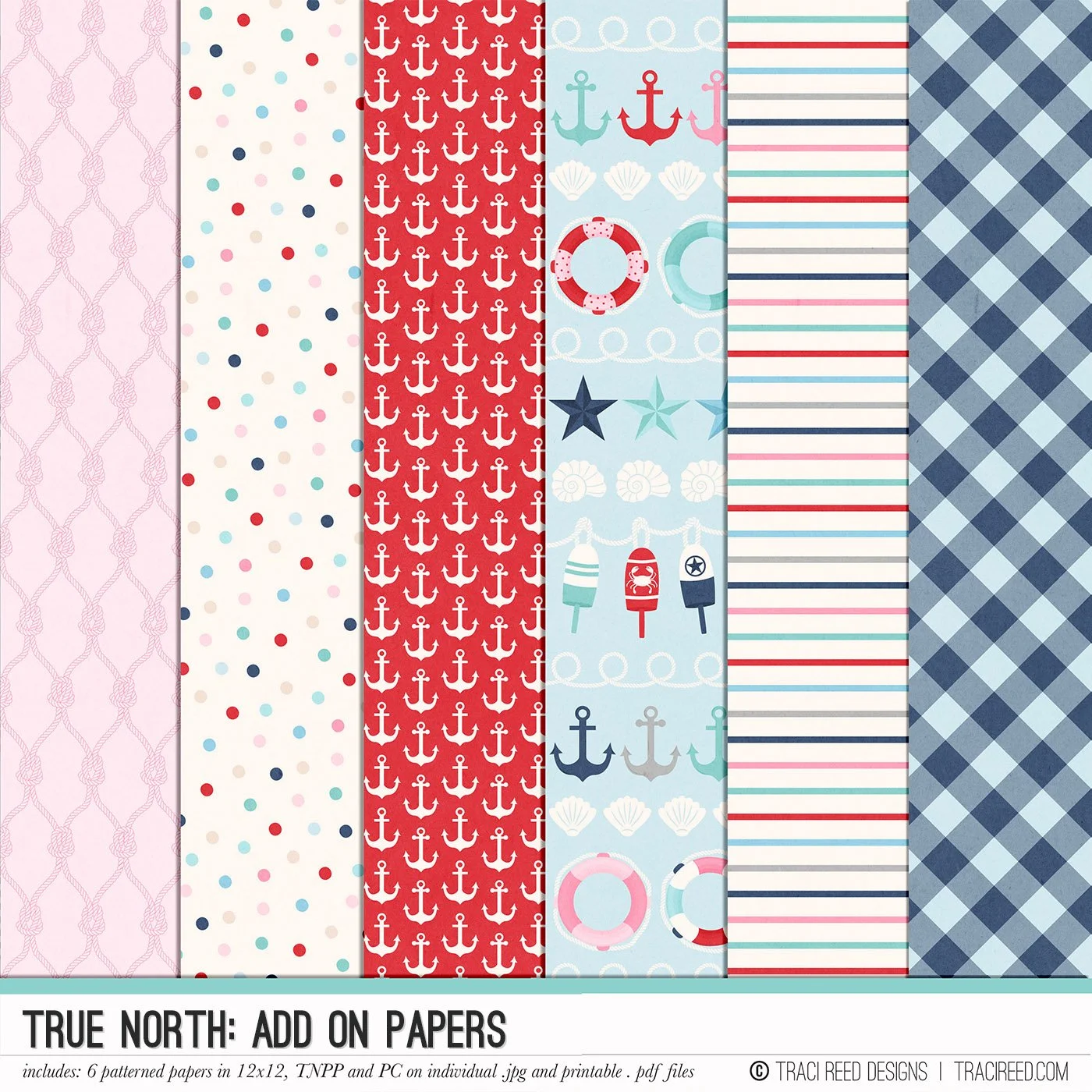
Are you looking to capture the charm of your oceanside memories that don’t involve palm trees? The True Northscrapbook collection is perfect for your adventures along the stunning shores of the not-so-tropical beaches all over the world. Whether you're documenting vacations, sailboat excursions, or creating layouts about yourself, this collection celebrates life’s meaningful moments with a nautical vibe.
With its "nautical with a twist" color palette, True North offers a fresh, modern take on traditional nautical themes. The collection features bold, hand-drawn illustrations of lighthouses, boat docks, sailboats, and whimsical sea creatures like whales and crabs. Unique colors such as seafoam, aqua, and pink blend harmoniously with classic red, white, and navy for a vibrant yet sophisticated touch. From easy-to-print stickers and cards to charming papers, every piece is designed to inspire creativity and help you capture those special moments!
Check out the True North blog post for all the team’s example layouts and the unboxing video!
BUNDLE INCLUDES:
Digital Kit, Cards #1, #2, #3 and Stickers!
BUNDLE DOES NOT INCLUDE:
TN Papers or Patterned Cards