Don't Know Where To Start? Anchor Your Layout with a Bold Journal Card!
This layout started with one bold design choice: the “Bottomless Mimosas” quote card from the Besties Who Brunch collection. Its bright colors and playful vibe perfectly captured the tone I wanted—fun, joyful, and a little cheeky—so I used it as the visual anchor for the entire page. Everything else radiated out from there.
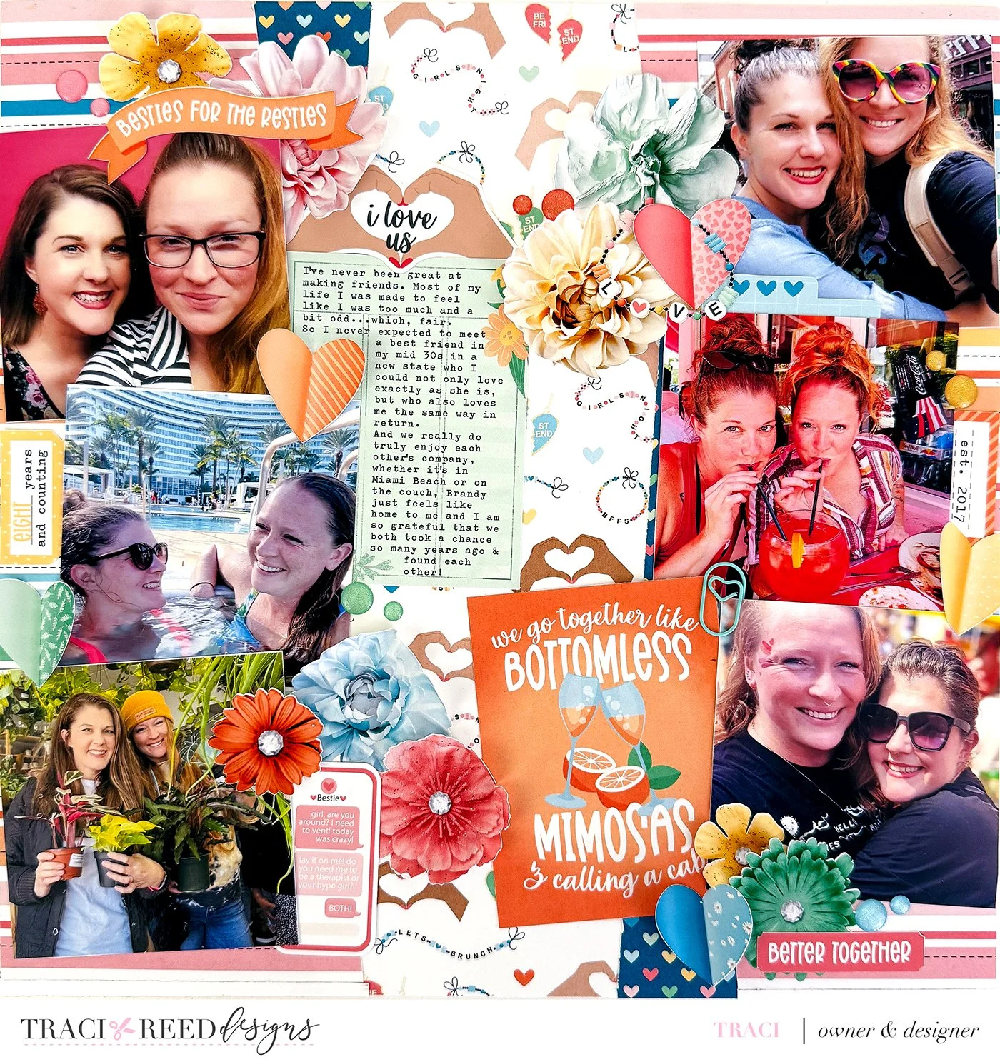
I built the layout around a strong vertical flow, letting the eye move down the page through a mix of photos, layered embellishments, and heartfelt journaling. The background paper with the tiny scattered icons added just enough movement without competing for attention. I brought in large florals to echo the energy of the quote card and added clusters of hearts and word strips to balance the composition.

Color-wise, I leaned into the warm oranges, corals, and pops of navy from the collection to keep everything feeling cohesive. The mix of photo sizes gave me flexibility and made it easier to tell a longer story without overwhelming the layout. Centering the journaling helped it feel grounded and important, right where the story belongs.

Layouts like this are a great reminder that a bold title card or journaling piece can do a lot of heavy lifting in both design and storytelling. When you're not sure where to start, grab the card that makes you smile and let it set the tone for everything else.